Statistical Modeling
One of JMPs core strengths is readily accessible statistical modeling along with associated interactive statistical graphics. In this chapter, we discuss several JMP PRO platforms that are recommended for modeling wide genomic data.
Modeling of Genotype Data
The genotype data used in this chapter is from a genome-wide association study of trait and genotype data from rice (Oryza sativa) cultivars by Zhao, et al., 20111. The data was kindly provided by the authors, opened in JMP, and saved as the rice_diversity1.jmp table shown below.
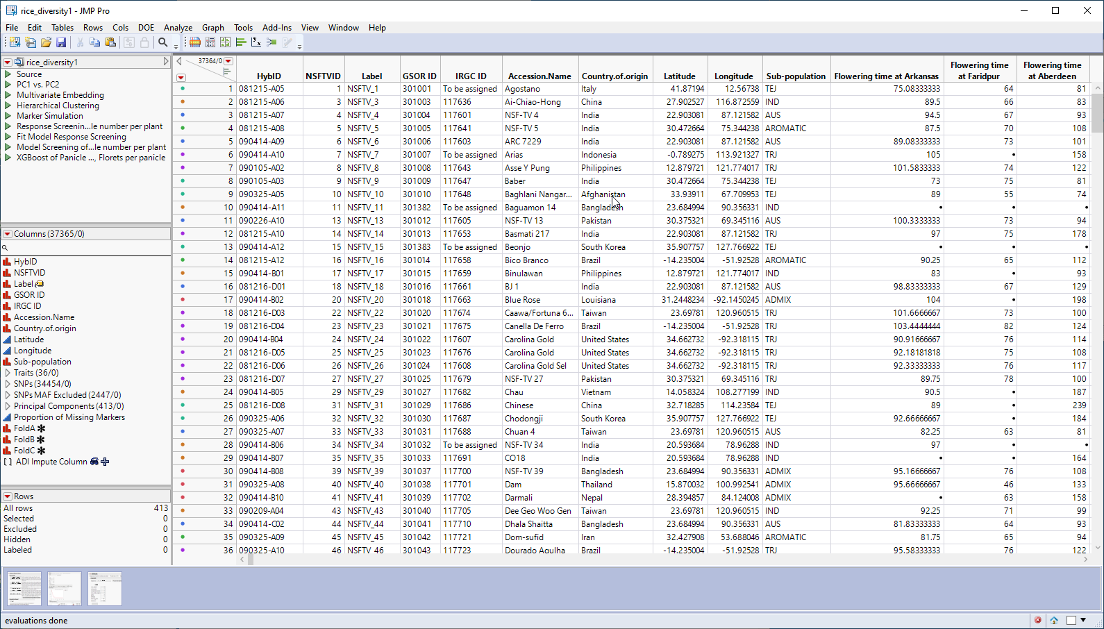
This table is a wide![]() A data table in which variables are columns and samples are rows. table with 413 samples in rows and 37365 columns listing annotation, trait and genotype data. The 34454 genotype columns are collected into a group named SNPs, for convenience. The 413 individual hybrids used in this study were from multiple countries and grown at different sites throughout the world. Thirty-six traits were assessed in the study. in this example, we analyze for only one: panicle number per plant. The SNP genotypes are numerically encoded with 2 designating individuals homozygous for the less common allele, 0 representing individuals homozygous for the most common allele, and 1 representing the heterozygotes.
A data table in which variables are columns and samples are rows. table with 413 samples in rows and 37365 columns listing annotation, trait and genotype data. The 34454 genotype columns are collected into a group named SNPs, for convenience. The 413 individual hybrids used in this study were from multiple countries and grown at different sites throughout the world. Thirty-six traits were assessed in the study. in this example, we analyze for only one: panicle number per plant. The SNP genotypes are numerically encoded with 2 designating individuals homozygous for the less common allele, 0 representing individuals homozygous for the most common allele, and 1 representing the heterozygotes.
Response Screening
This platform is available under the Analyze > Screening menu. Response Screening automates the process of conducting tests across a large number of responses and, thus, is a good workhorse for performing statistical testing for a large combination of basic Y by X models. This platform works best for simple experimental designs. The Ys and Xs can be either Continuous or Nominal, enabling screening for the four types of basic models. The test results and summary statistics are presented directly in the report, or in data tables to enable further data exploration.
| 8 | Open the rice_diversity1 JMP table. |
| 8 | Click Analyze > Screening > Response Screening. |
| 8 | Select the Panicle number per plant column from the Traits group as the Y, Columns. |
| 8 | Select the SNPs group as the X. |
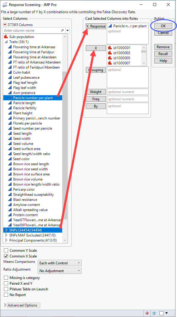
| 8 | Click . |
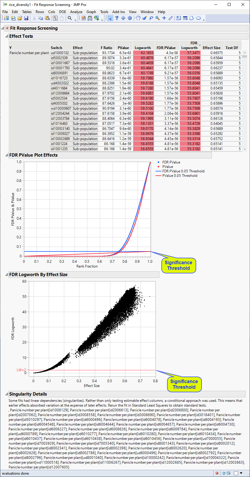
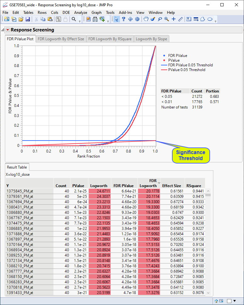
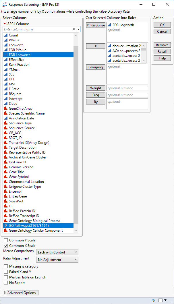
The following report is generated:
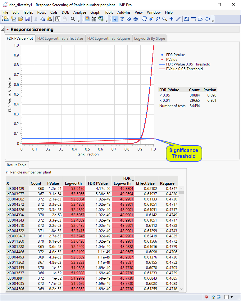
The Results table provides statistics for each of the markers analyzed.
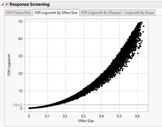
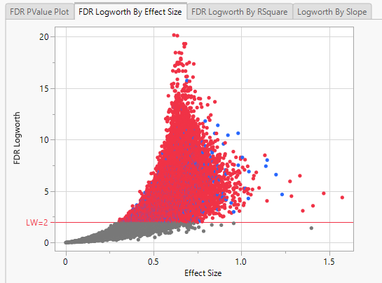
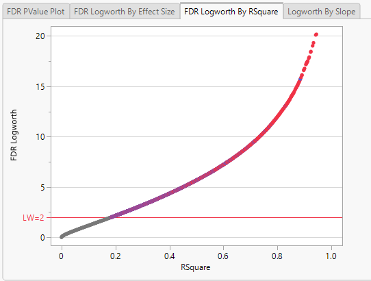
In this plot, the majority of SNPs have p-values (and FDR p-values) below the 0.05 significance threshold. This plot indicates that the majority of SNPs are associated with some genetic effect on the number of panicles per plant. (Refer to The Response Screening Report for more information.) This is also seen in the FDR Logworth by Effect Size and FDR Logworth by R Square plots.
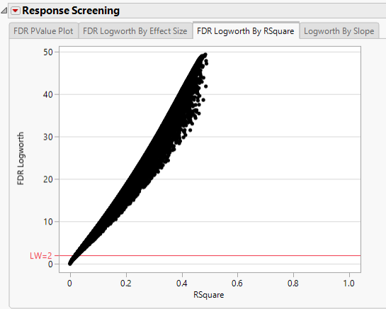
Note: Because Logworth values represent the -log10 FDR p-value, the observation is effectively the inverse of the FDR p-value. Hence, observations above the threshold represent significant genetic effects.
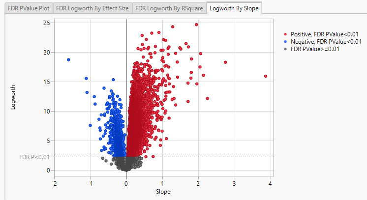
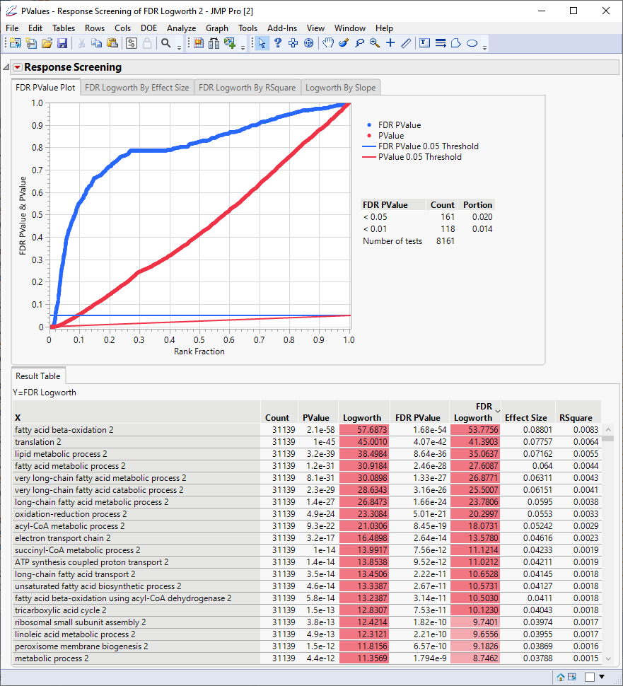
Finally, plotting the Logworth values by the slope of the regression yields a so-called Volcano Plot.
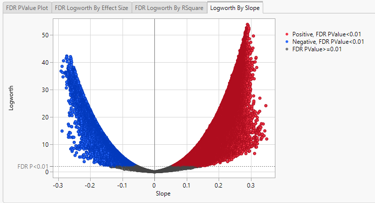
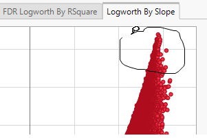
Volcano plots excel at revealing differences from the mean effect. Examine the volcano plot shown above. The higher the points are on the Y axis, the more significant the observation (remember, Logworth is a negative log function of the p-value). The farther to the right or to the left from 0 on the X axis, the greater the genetic effect (positive or negative, respectively) the locus has on the trait. You can use JMP Pro's lasso tool to select and subset the SNP markers that you want to investigate further.
Once you have identified genes/loci of interest, you can combine your data with gene identifiers, physical position, pathway information and other annotation information, to develop a deeper understanding of the role these genes play in growth and development that can lead to further investigations.
Fit Model, Response Screening Personality
For more advanced linear statistical modeling and testing, the Fit Model platform with Response Screening personality enables specification of additional fixed effects in a large number of linear models. The effects can either be the same for every model or switched out for each model.
GWAS Analysis of Rice Genotype Data
This example uses the rice_diversity1.jmp table described above.
| 8 | Click Analyze > Fit Model. |
| 8 | Select the Response Screening personality. |
| 8 | Select the Panicle number per plant column from the Traits group as the Y. |
| 8 | Select the SNPs group as the Switch. |
| 8 | Select Subpopulation and click to construct a model effect based on the subpopulation of the cultivars. |
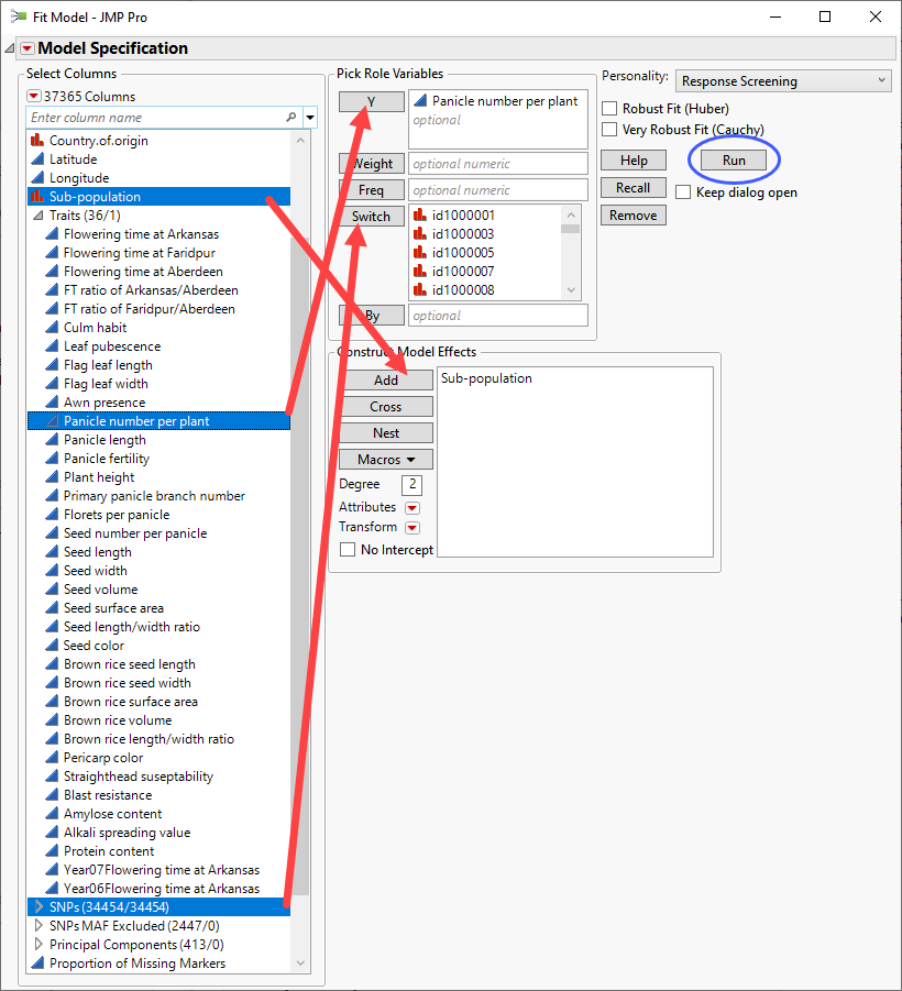
| 8 | Click . |
The following report is generated:
The plots shown here are highly comparable with the corresponding plots shown above.
Modeling of Expression Data
The expression data used in this chapter come from a study of the effects of in vivo and in vitro exposure to a specific PPARa signaling network-specific ligand GW7647 on differential gene structure and expression in rat hepatocytes by McMullen, et al., 20202. This study consists of two data sets, GSE70583 (in vivo data)and GSE70585( in vitro data). The data sets were downloaded from the Gene Expression Omnibus and imported as described in Importing Series Matrix Files. The resulting GSE70583_wide.jmp and GSE70585_wide.jmp data sets are described below. All columns containing gene expression data were grouped into the Genes group in both data sets.
Note: All expression data in this study was previously Robust Multichip Average (RMA)-normalized.
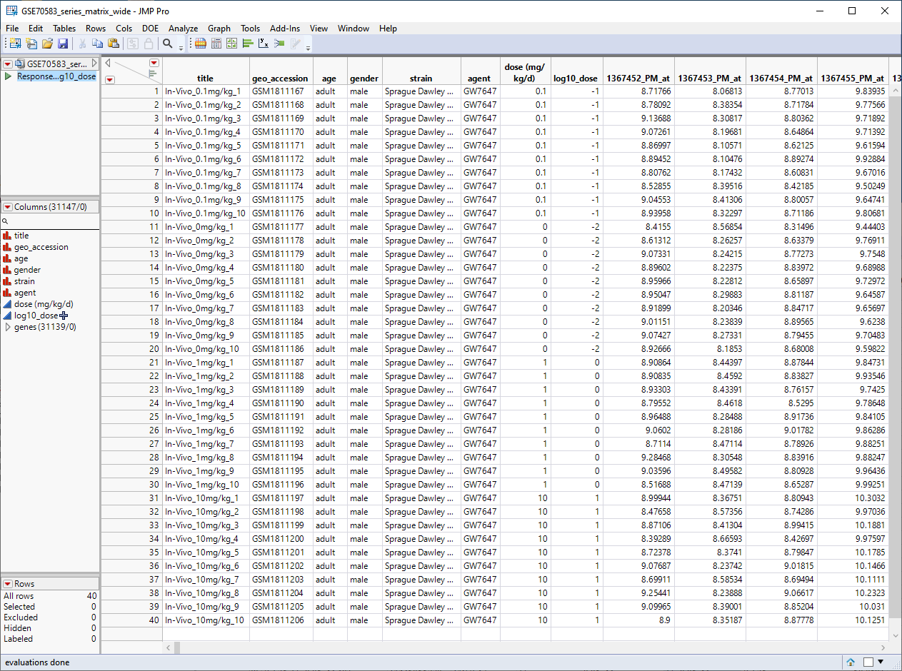
The GSE70583_wide.jmp table contains data from the in vivo experiments. Male rats were injected with 0. 0.1, 1, or 10 mg/kg of PPARa (10 rats for each concentration), euthanized, and then 31139 genes were assayed for differential expression. This wide![]() A data table in which variables are columns and samples are rows. table contains 40 rows and 31147 columns and is shown below.
A data table in which variables are columns and samples are rows. table contains 40 rows and 31147 columns and is shown below.
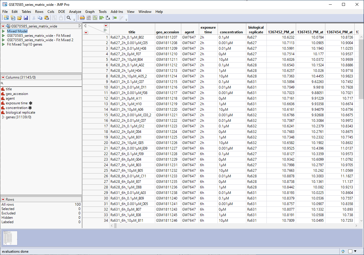
The GSE70585_wide.jmp table contains data from the in vitro experiments. Primary hepatocytes were isolated from male rats and cultured were cultured in 4 concentrations of PPARa (1 mM, 0. 1 mM, 0.01 mM, or 0.001 mM) for either 2h, 6h, 24h, or 72h, and then assayed for differential expression of the same for 31139 genes. This wide![]() A data table in which variables are columns and samples are rows. table contains 100 rows and 31146 columns and is shown below.
A data table in which variables are columns and samples are rows. table contains 100 rows and 31146 columns and is shown below.
Response Screening
As stated above, this platform is available under the Analyze > Screening menu. Response Screening automates the process of conducting tests across a large number of responses and, thus, is a good workhorse for performing statistical testing for a large combination of basic Y by X models. This platform works best for simple experimental designs. The Ys and Xs can be either Continuous or Nominal, enabling screening for the four types of basic models. The test results and summary statistics are presented directly in the report, or in data tables to enable further data exploration.
| 8 | Open the GSE70583_wide.jmp table. |
| 8 | Click Analyze > Screening > Response Screening. |
| 8 | Select the genes group as the Y, Response. |
| 8 | Select the log10_dose column as the X. |
| 8 | Check the Common Y Scale check box. |
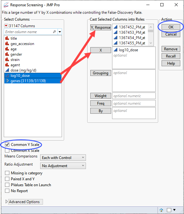
| 8 | Click . |
The following report is generated:
In this plot, the genes with p-values (and FDR p-values) below the 0.05 significance threshold are likely to exhibit significant differential expression. The genes with p-values (and FDR p-values) above the significance threshold are not. This is also indicated in the FDR Logworth by Effect Size and FDR Logworth by R Square plots.
Note: Because Logworth values represent the -log10 FDR p-value, the observation is effectively the inverse of the FDR p-value. Hence, observations above the threshold represent changes in expression.
Finally, plotting the Logworth values by the slope of the regression yields a so-called Volcano Plot.
Volcano plots excel at revealing differences from the mean effect. Examine the volcano plot shown above. The higher the points are on the Y axis, the more significant the observation (remember, Logworth is a negative log function of the p-value). The farther to the right or to the left from 0 on the X axis, the greater the change in expression (positive or negative, respectively). You can use JMP Pro's lasso tool to select and subset the genes that you want to investigate further (as shown above).
Once you have identified genes/loci of interest, you can combine your data with gene identifiers, physical position, pathway information and other annotation information, to develop a deeper understanding of the role these genes play in growth and development that can lead to further investigations.
Annotation Analysis
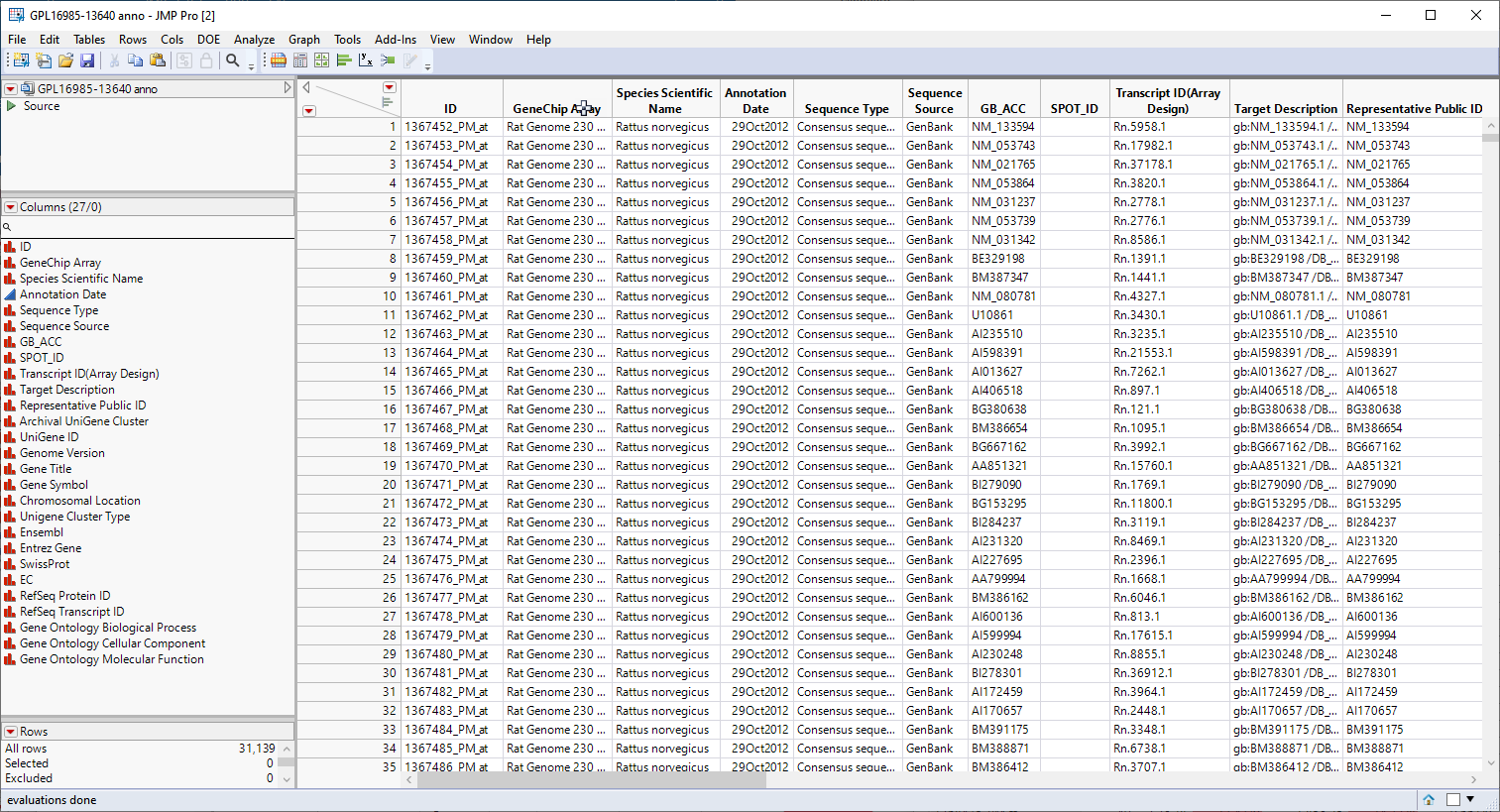
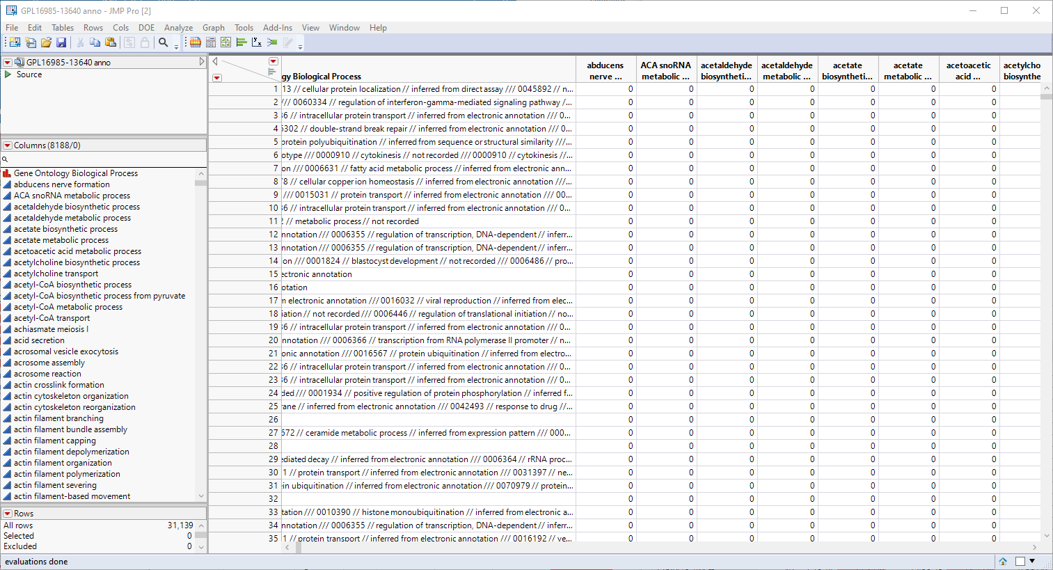
Genomic analysis does not just stop once the statistics have led you to identifying one or more genes that are responding to a particular stimulus or at a particular point in development. at this point, it is necessary to connect those genes to the biological systems and pathways of which they are a part. Much of this information is found in annotation data sets provided by the public databases or manufacturers in formats that are compatible with the chips and analysis systems used to study gene expression. The GPL16985-13640 anno.jmp table, shown below, contains a variety of biological and annotation information about the genes in this experiment, including gene ID, chromosomal location, pathway information, etc.
We will use the information in the annotation data set in combination to aggregate the gene level data that we have accumulated into pathway level results.
The first step in this analysis is to partition out the pathway information and create unique columns for each pathway with 0-1 indicators for association of each gene with each pathway. An indicator of "1" indicates association of the gene with the pathway, an indicator of 0, indicates no association. These columns are derived from the contents of the Gene Ontology Biological Process column, shown below.
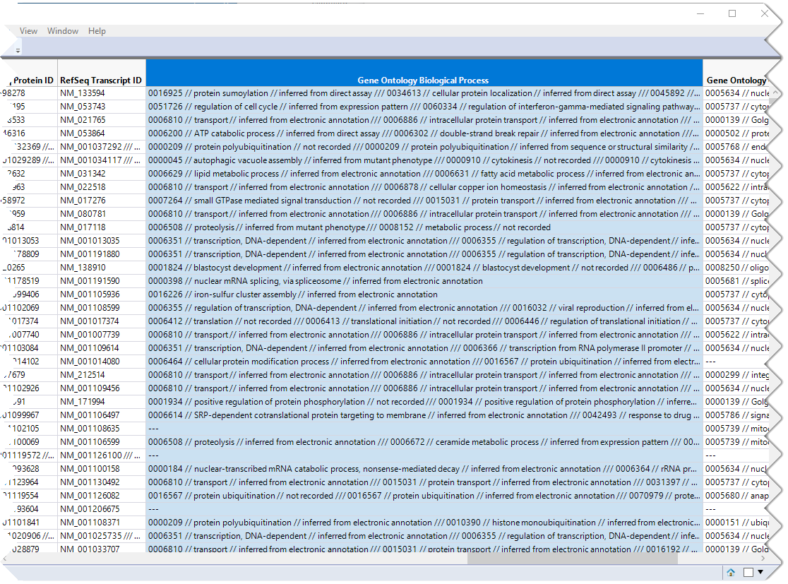
This column lists all known pathway associations for each gene. Individual pathways are separated from all others with a 3-slash delimiter(///). The nested 2-slash delimiters separate different information for each pathway.
To generate the columns for each pathway, select the Gene Ontology Biological Process column, as shown above.
| 8 | Click Cols > Utilities > Text. |
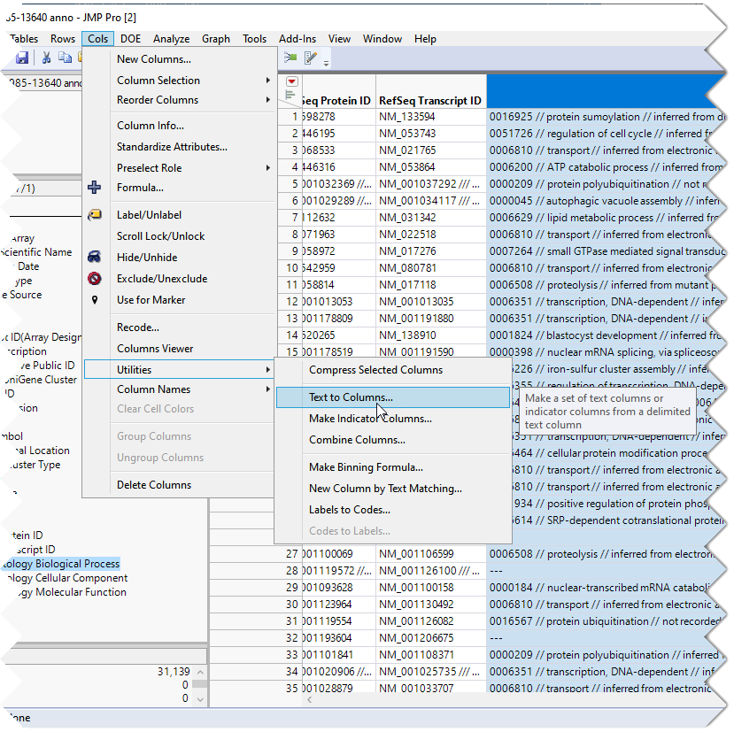
| 8 | Enter /// as the delimiter. |
| 8 | Check the Make Indicator Columns check box. |
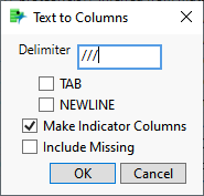
| 8 | Click . |
The indicator columns are added to the table just following the Gene Ontology Biological Process column.
Note: If you examine the Gene Ontology Biological Process column in the figure above, you will note the numbers at the beginning of the pathway descriptions. JMP will create indicator columns for these numbers as well as the columns for the pathway names. You should delete all of the "numbered columns before proceeding.
You will notice that most of the indicators are "0"s. This is because a "1" is listed only when the pathway is associated with a gene.
The new indicator columns were grouped into the GO Pathways group for ease of handling.
You should save the modified annotation table.
The next step in this analysis is to save the p-values from the analysis above to a separate table.
| 8 | Click  and select Save Tables > Save PValues. and select Save Tables > Save PValues. |
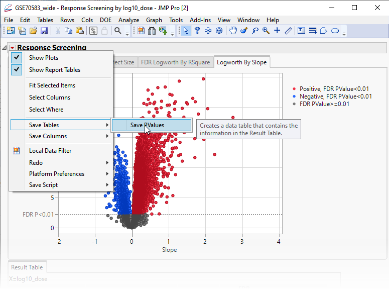
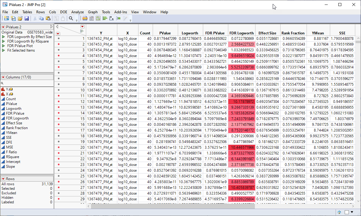
This action generates a new tall![]() A data table in which variables in rows and samples are in the columns JMP table containing the p-values and associated statistics from the Response Screening analysis above.
A data table in which variables in rows and samples are in the columns JMP table containing the p-values and associated statistics from the Response Screening analysis above.
The next step is to merge the tall p-value table with the tall annotation table.
Make sure the p-value table is the active table.
Click Tables > Update to open the Update utility.
Select the annotation table to update the p-value table.
Select the columns from each table listing the gene IDs and click .
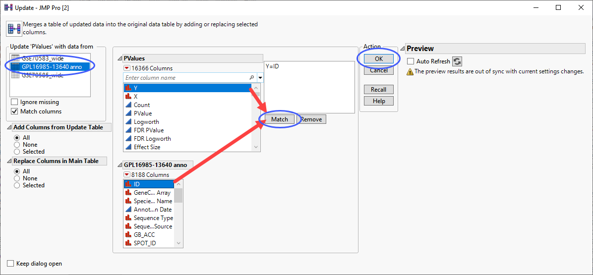
| 8 | Click . |
Now that we have added the annotation information along with the indicator columns to the PValues.jmp table, we can examine the association of the genes with the different pathways and determine the genes and pathways most affected by treatment of the cells with PPARa. To do this, we again use the Response Screening platform.
| 8 | Click Analyze > Screening > Response Screening. |
| 8 | Select the FDR Logworth group as the Y, Response. |
| 8 | Select the GO Pathways group as the X. |
| 8 | Check the Common X Scale check box. |
| 8 | Click . |
The following report is generated:
Click the Logworth By Slope tab to view the volcano plot.
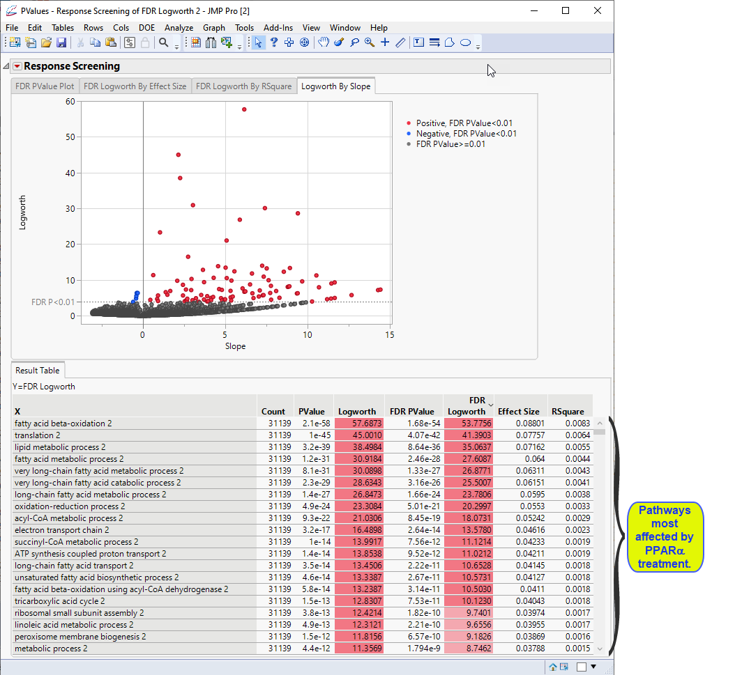
Examine the volcano plot shown above. The majority of the points (representing change in gene expression) are to the right. The farther to the right from 0 on the X axis, the greater the change in expression.The higher the points are on the Y axis, the more significant the observation (remember, Logworth is a negative log function of the p-value).
The table shows, in decreasing significance, the pathways most affected by the PPARa treatment. Most of these are involved in lipid and lipoprotein metabolism. These observations are consistent with those reported by McMullen, et al., 2020.
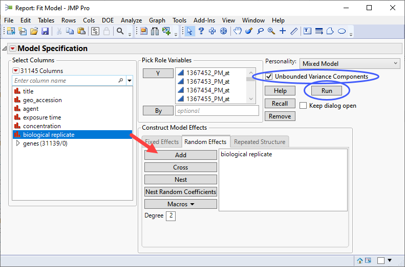
Fit Model, Mixed Model Personality
For even more advanced mixed linear models, the Fit Model platform with Mixed Model personality enables fitting even more advanced mixed models. These models can model covariance structure between observations and are slower to fit than the preceding Response Screening approaches.
Analysis of Rat Expression Data
This example uses the GSE70585_wide.jmp table described above. This table contains in vitro data from primary cultured rat hepatocytes incubated for 2h to 72 h with up to 5 concentrations of PPARa and represents a more complex experimental design.
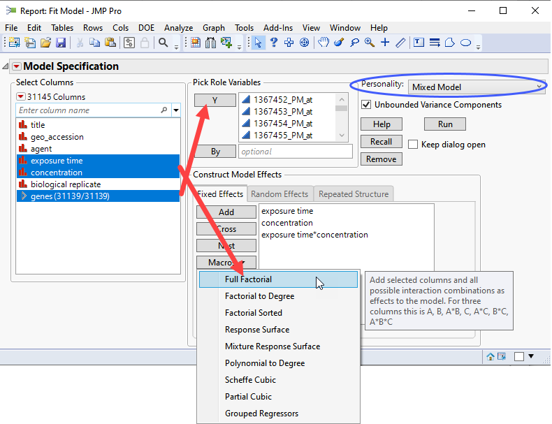
| 8 | Click Analyze > Fit Model. |
| 8 | Select the Mixed Model personality. |
| 8 | Check the Unbounded Variance Components check box. |
| 8 | Select the genes group as the Y. |
| 8 | Select exposure time, and concentration. Click and select Full Factorial to add each column and their interactions to the Fixed Effects pane. |
| 8 | Click on the Random Effects tab. Select biological replicateand click to specify it as a random effect. |
If you run this platform now, you will surface a dialog
To avoid surfacing a dialog for each column, click  and select Options for Many Responses and check all three check boxes.
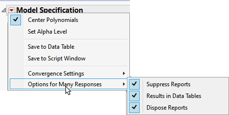
Note: Clicking the Results in Data Tables box places all of the analysis results in new data tables.
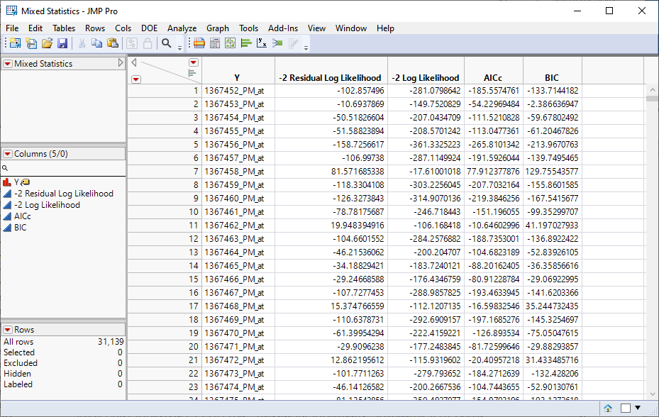
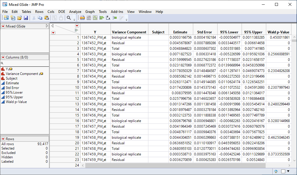
| 8 | Click . |
Four data tables are generated.
| 1 | Mixed Statistics.jmp: This table lists statistics on how well each model was fit. |
| 2 | Mixed GSide.jmp: This table lists variance components estimates. |
| 3 | Mixed Parameter Estimates.jmp: This table lists single degrees of freedom estimates for each model. |
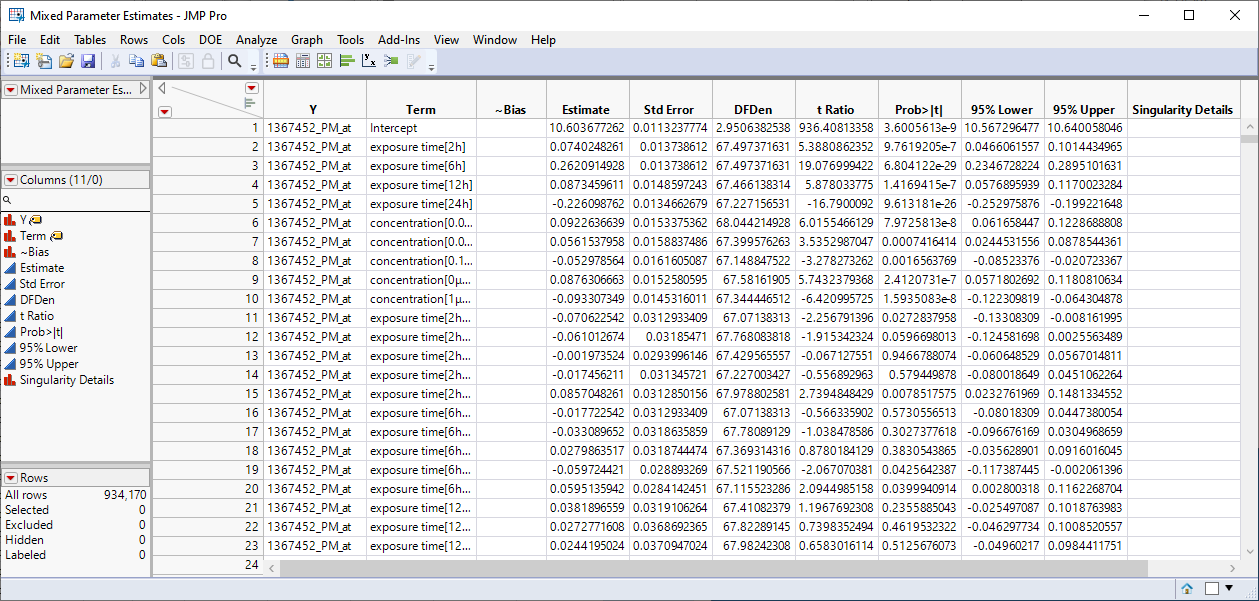
| 4 | Mixed Effects Tests.jmp: This table lists statistics for each of the gene expression measurements. |
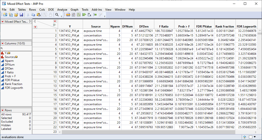
We can use the FDR Logworth statistic in the Mixed Effects Test.jmp table to identify genes that are most affected by the PPARa treatment for further analysis.
| 8 | Click Table > Sort to open the Sort platform. |
| 8 | Select FDR Logworth as the By column. |
| 8 | Highlight the specified FDR Logworth By column and click  to specify descending order. to specify descending order. |
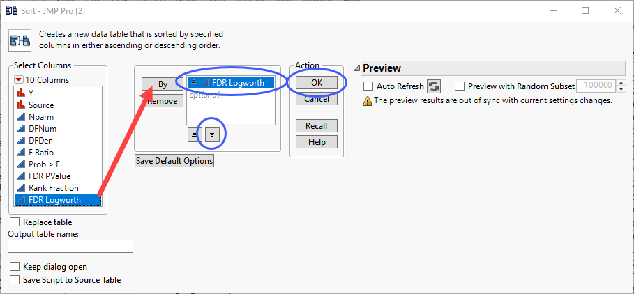
| 8 | Click . |
A new, sorted table is generated.
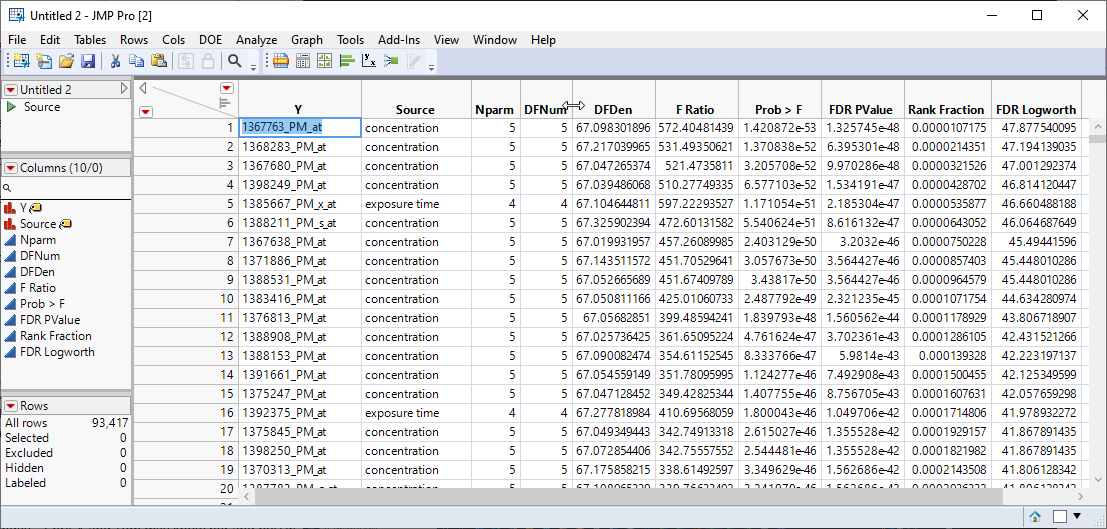
In this example, we are drilling down only on the gene with the highest FDR Logworth value. In your research, you will probably want to choose many more.
| 8 | Click in the Y cell(s) of the gene(s) to be investigated and click Ctrl-C to copy the names. |
| 8 | Select the original GSE70585_wide.jmp table and click Analyze> Fit Model. |
| 8 | Paste the names of the desired genes in the Y column box. |
| 8 | Select the Mixed Model personality. |
| 8 | Check the Unbounded Variance Components check box. |
| 8 | Select the genes group as the Y. |
| 8 | Select exposure time, and concentration. Click and select Full Factorial to add each column and their interactions to the Fixed Effects pane. |
| 8 | Click on the Random Effects tab. Select biological replicateand click to specify it as a random effect. |
Note: We are repeating the analysis shown above for one gene only. We are not suppressing the report, nor are we generating the four Results tables.
| 8 | Click . |
The following report is generated.
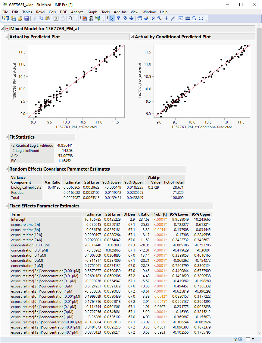
The plots show reasonable agreement between expression of the gene and what might be predicted from the data in the tables below.
To view the actual response of the gene to the different experimental conditions:
| 8 | Click  and select Multiple Comparisons. and select Multiple Comparisons. |
| 8 | Choose the interaction term as the effect. |
| 8 | Click the Show Least Squares Means Plot check box. |
| 8 | Click the Create an Interaction Plot check box. |
| 8 | Select concentration as the overlay term. |
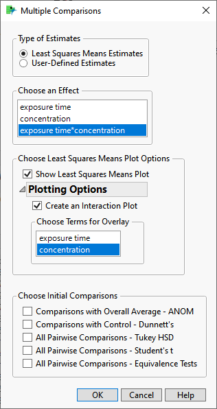
| 8 | Click . |
The following table and plot are added to the bottom of the report.
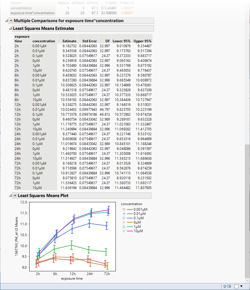
The plot shows that there were several orders of magnitude change in expression (remember, these data are log-transformed) resulting from PPARa treatment.