Adverse Events Distribution
The Adverse Events Distribution report summarizes subject counts and percents for adverse events by MedDRA term. The report displays a bar chart and a table sorted by frequency to help quickly identify the most commonly occurring adverse events (AEs). In addition, the report can be used to drill down into other event types, such as switching from all adverse events to only treatment emergent adverse events. By default, the report looks at how the adverse events are split between treatment groups, but options allow for further exploration by sex, race, country, and study site identifier as well as any combination of variables from the demographics domain. The report is also useful for exploring the distribution of the events by severity, seriousness, and other adverse event characteristics. Lastly, the report can be filtered based on adverse event variables creating displays such as only adverse events with at least a 5% occurrence.
Click below to view a video summary of this report or scroll to read detailed descriptions of the report results and options.
Methodology
The report subsets the data based on event type and additional filter selections as well as based on a unique occurrence algorithm. For event type, if a type other than all events is selected, the report filters the AE domain by comparing the adverse event start dates to the treatment start and end dates. For the additional filter, the report compares the AE domain against the selections and the filter and only keeps the records that meet the filter criteria. The unique record to display for each event is determined by sorting the data by Unique Subject Identifier (USUBJID), the group level, the term level, seriousness(AESER), severity (AETOXGR/AESEV), and the day the event started(AESTDY) and picking the first record for each term level. Once the data is subset accordingly, counts and percents are calculated for each adverse event.
Note: Records marked as not occurring (xxOCCUR = N) are excluded from this analysis.
Usage and Interpretation
The Adverse Events Distribution report was run with Nicardipine sample data set under several scenarios to demonstrate usage and interpretation of results.
Note: Click on the figures below to enlarge.
Example 1: Treatment emergent AE's that occur 5% or more displayed by severity.
In this example, report options were set as shown in the following table:
| Option Type | Option | Setting | |
|---|---|---|---|
| Data | Term and Group Level | Dictionary-Derived Term, ungrouped | 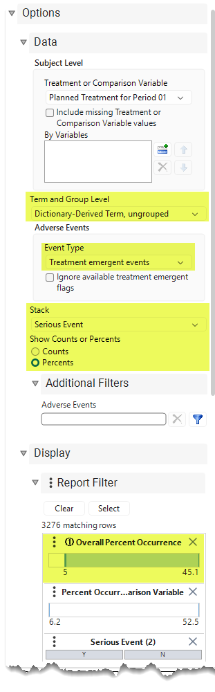
|
| Event Type | Treatment emergent events | ||
| Stack | by Serious Event | ||
| Show Counts or Percents | Percents | ||
| Display | Overall Percent Occurrence | Lower bound set to 5 percent | |
| All other options set to default. | |||
This report summarizes the adverse events which were categorized as Treatment Emergent and which had at least 5 percent occurrence rate across the study period. It allows us to identify the more prevalent AEs and evaluate their occurrence rates between treatment groups, with regard as well to the severity of these events. While no statistical testing is performed, there are observations to be made regarding the differences between treatment groups as well as relating to the severity of the AEs.
Figure 1: Bar Chart and Tabular Summaries
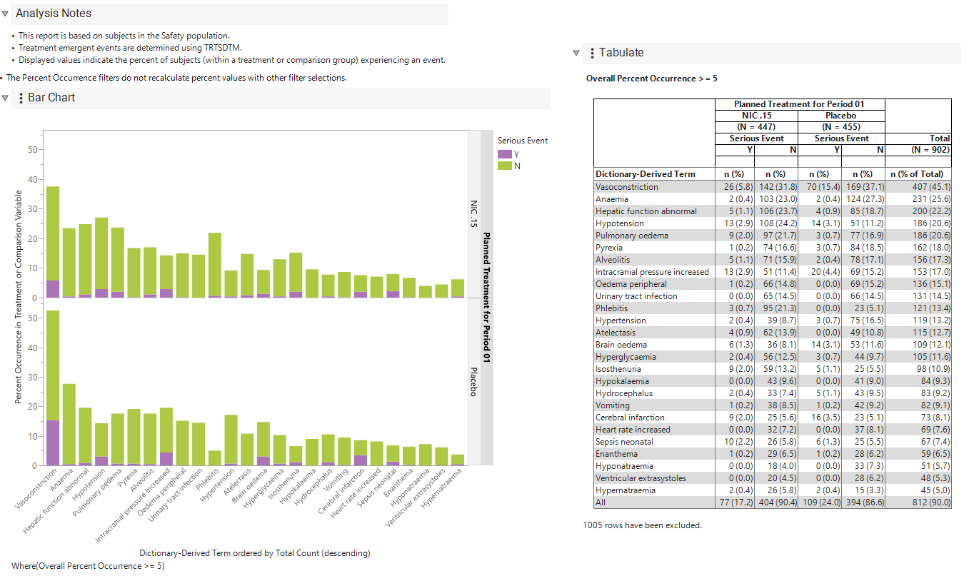
The Bar Chart and tabulate summaries show that based on the Dictionary-Derived Term, there were 26 different treatment emergent AE’s that occurred with at least 5% occurrence overall during the trial, listed in order of prevalence, starting with Vasoconstriction as most prevalent to the least prevalent, Hypernatraemia. Since multiple occurrences of events in the same subject are counted once in this report, we can see that 407 subjects (45.1%) experienced Vasoconstriction as a treatment-emergent event during the trial. From the bar chart we see visually that Vasoconstriction occurred with higher prevalence among those in the Placebo treatment group compared to those in the Nic .15 treatment group. Selecting any bar(s) in the bar chart highlights the cell(s) pertaining to those subjects in the table.
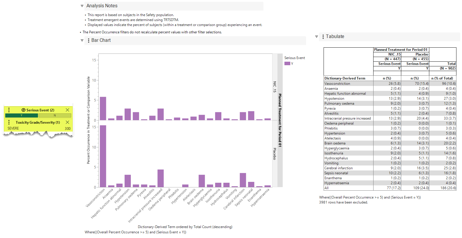
The bar chart also suggests that the severity of adverse events did not differ greatly between treatment groups, except for Vasoconstriction which was more likely to be serious for subjects in the placebo group (15.4%) compared to subjects in the Nicardipine group (5.8%). To show only the serious events, select the Serious Event = Y in the Display Report Filter and the chart and tabulate will be filtered accordingly as shown below:
Figure 2: Serious Event =Y
Example 2: Adverse Events of greater than 1% occurrence in any race group, subset to pre-treatment events of Moderate or Severe toxicity grade
 View/Hide Details.
In this example, report options were set as shown in the following table:
| Option Type | Option | Setting | |
|---|---|---|---|
| Data | Demographic Grouping | Race | 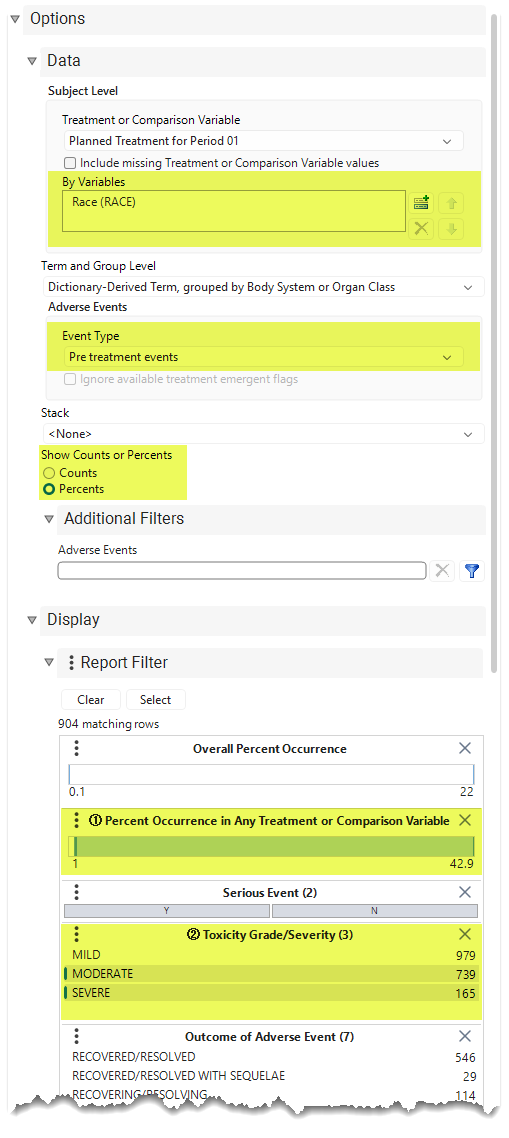
|
| Event Type | Pre treatment events | ||
| Show Counts or Percents | Percents | ||
| Display | Percent Occurrence in Any Treatment or Comparison Variable | Lower bound set to 1 percent | |
| Toxicity Grade/Severity | Moderate or Severe | ||
| All other options set to default. | |||
This report example summarizes the pre-treatment adverse events categorized as moderate or severe and grouped by body system or organ class for the dictionary-derived term for those events which had at least 1 percent occurrence rate in any of the race groups. It allows us to identify imbalances pre-treatment for moderate and serious adverse events across race groups. While no statistical testing is performed, observations can be made regarding the differences between race groups for these specific pre-treatment adverse events.
Figure 3: Bar Chart and Tabular Summaries
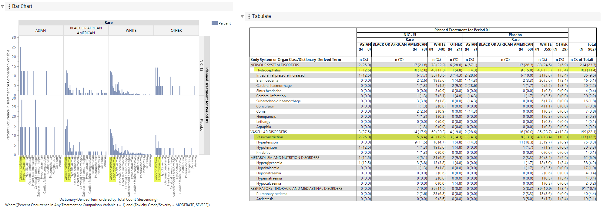
The bar chart and tabulate summarize adverse events which occurred in greater than 1% occurrence rate within any race group. Included are summaries by race for pre-treatment adverse events based on their Dictionary-Derived Term. The tabulate displays events according to their Body System/Organ Class classification, sorted by the most frequent to least frequent. The bar chart shows the events sorted by the most prevalent to least prevalent Dictionary-Derived term. From either the chart or tabulate display, we observe that Vasoconstriction was the most frequent pre-treatment event, occurring in 12.5 % of the patients overall, with Hydrocephalus being next most prevalent event occurring at 11.4%.
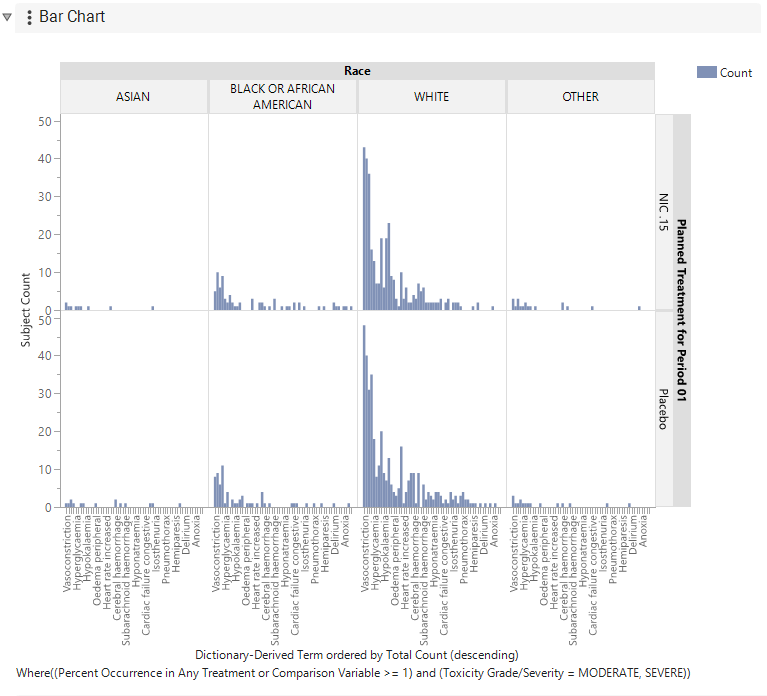
From the bar chart we see visually that during pre-treatment, Vasoconstriction was more prevalent among those in the Asian race group, who also saw relatively higher prevalence of “Intracranial pressure increased” compared to the other race groups. We observe that the number of Asian subjects in the trial was only 15, so these pre-treatment race differences may be a result of the smaller sample size and not supportive of a significant difference in pre-treatment events. The difference in sample sizes between race groups is evident in the tabulate column N’s and is easily seen in the Bar Chart display by selecting “Counts” instead of “Percentages” in the Show Counts or Percentages option, as shown below.
Figure 4: Viewing counts instead of percentages
Example 3: Serious adverse events with outcome of death which is related or possibly related to treatment, summarized by race and action taken with study treatment
View/Hide Details.
In this example, report options were set as shown in the following table:
| Option Type | Option | Setting | |
|---|---|---|---|
| Data | By Variables | Race (RACE) | 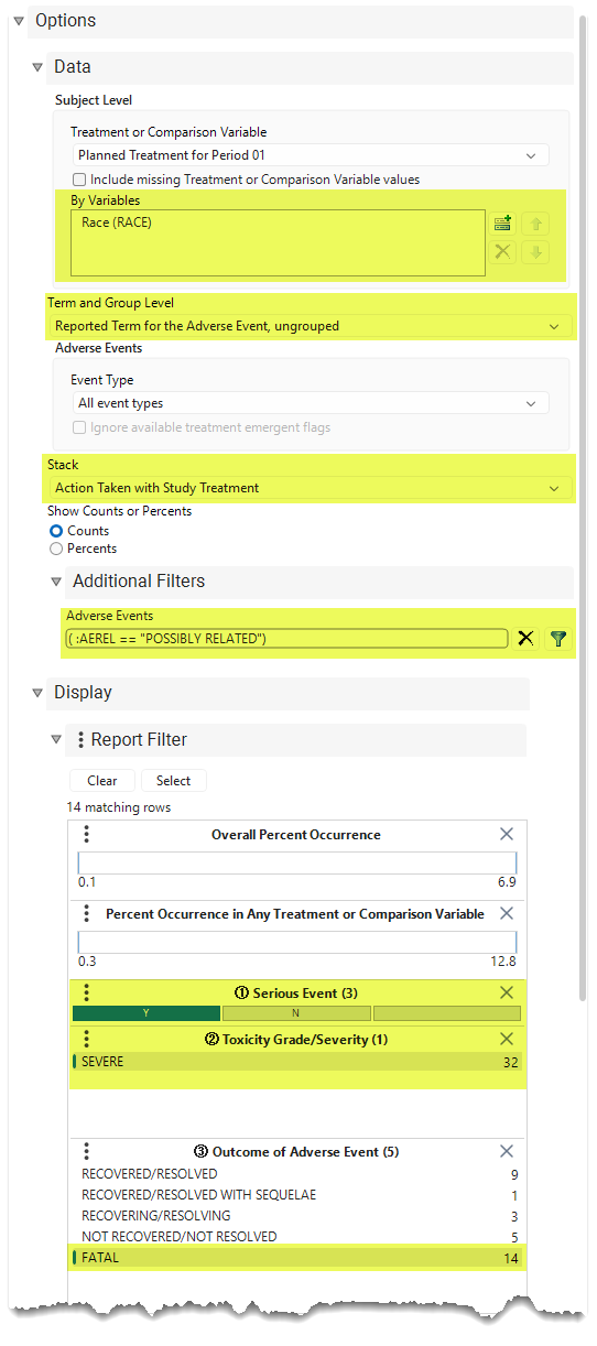
|
| Term and Group Level | Reported Term for the Adverse Event, ungrouped | ||
| Stack | by Action Taken with Study Treatment | ||
| Additional Filters | Select Domain ADAE, Column AEREL, values of “Possibly Related” and Related ( :AEREL == "POSSIBLY RELATED") | ||
| Display | Serious Event | Y | |
| Toxicity Grade/Severity | Moderate or Severe | ||
| Outcome of Adverse Event | Fatal | ||
| All other options set to default. | |||
This report summarizes serious adverse events based on the Reported Term for those events that had a fatal outcome which was classified as either "Related" to or “Possibly related” to study treatment. While no statistical testing is performed, this report gives visualization of these fatal events and the actions taken by treatment and race which may be important for regulators or others overseeing the conduct of the study and safety of study subjects.
Figure 5: Bar Chart and Tabular Summaries
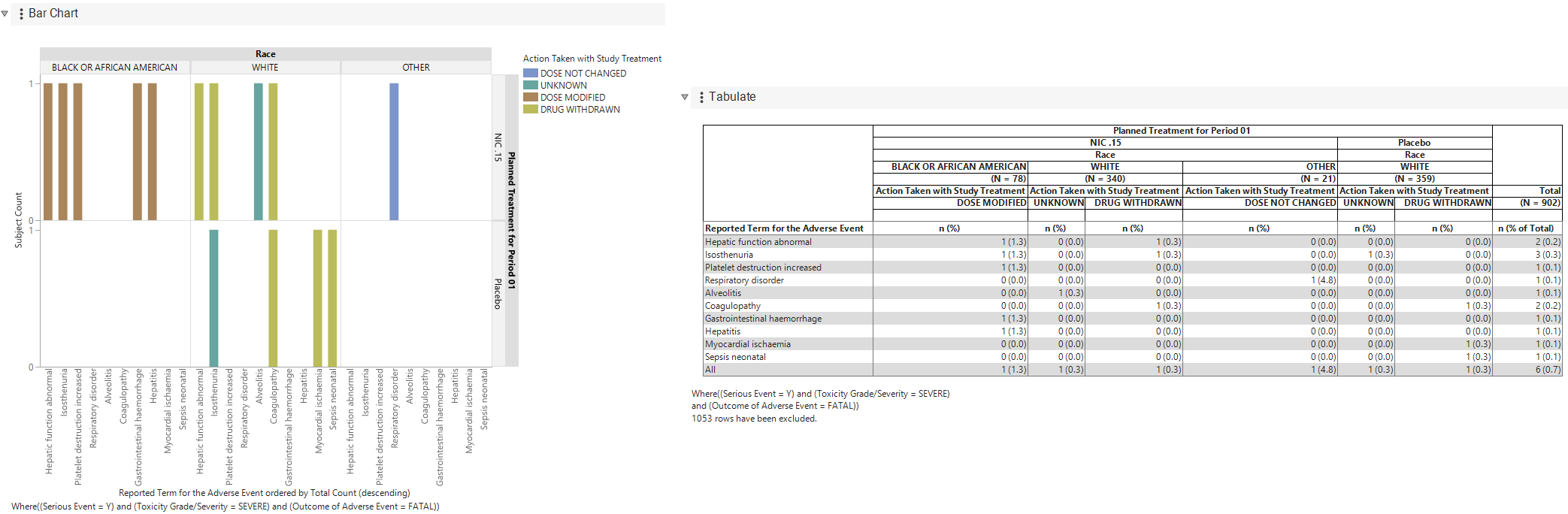
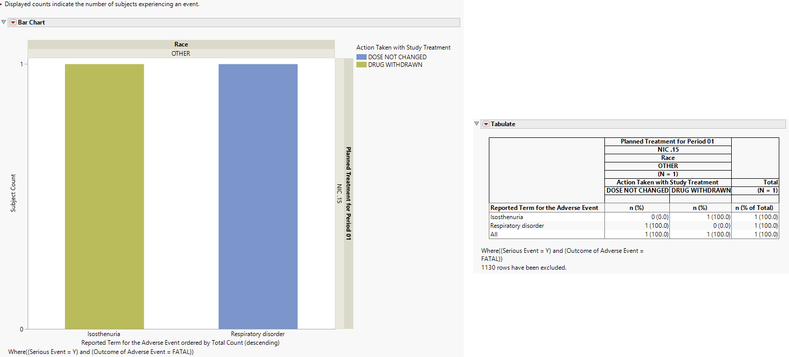
The bar chart and tabulate summarize these serious adverse events by treatment group and race and by action taken with study treatment. From the tabulate we observe that six subjects in total experienced these events. Since there are more than six rows, we know that some subjects experienced more than one of these serious adverse events. This report counts multiple events of the same reported term once per subject. We observe from the bar chart the dose was modified, or the drug was withdrawn in response to all but three of these events.
We observe for one subject with a Respiratory disorder event in the NIC.15 group, the dose was not changed. By selecting that bar in the bar chart or that cell in the tabulate, we can then select the Review Subject Filter button to subset the report to the data for that subject. This is shown below, revealing that subject had Peripheral Oedema, Anoxia, and Atrial Flutter, as well as Respiratory disorder.
Figure 6: Filtered Bar Chart and Tabulate
Options
Data
Treatment or Comparison Variable
View/Hide Details.
Specifies the variable used to define the groups to be comparec in the report. This variableis typically a planned or actual treatment variable, such as ARM, ACTARM, TRTxxA, or TRTxxP, but it can also be another variable that defines meaningful comparison groups, such as SEX or RACE.
Select None to display the data without grouping by a treatment or comparison variable.
Include missing Treatment or Comparison Variable values
View/Hide Details.
Check this option to add a Missing category for any missing values in the specified Treatment or Comparison variable. If missing values are detected, a Missing section will be added to the graph and columns for Missing will be added to the tabulate.
By Variables
View/Hide Details.
Use this field to specify one or more By variables from ADSL to use in your analysis.

Selecting a By variable will split the bar chart and tabulate by the grouping variables selected in this option as well as by the variable selected for the comparison or treatment variable.
By Variables
By variables are optional (in most reports)variable specifications whose values define groups of observations, such as hour, month, or year. BY variables can enable analyses to be performed separately on different groups as defined by that variable. Choosing a BY variable such as gender (ADSL variable = SEX), for example, groups the subjects by gender and conducts two separate analyses: one for males and one for females.
Alternatively, specifying a BY variable enables you to animate an image so that you can see how response values change according to some grouping, like over time.
To Specify One or More By Variables:
| 8 | Click  to open the Add window (shown below) that lists each variable contained in domain and SUPPxx (if merged) specific to this report to open the Add window (shown below) that lists each variable contained in domain and SUPPxx (if merged) specific to this report |
Note: In Demographics Distribution only, variables are taken from ADSL, in addition to the report-specific DS and SUPPPDS (if available) data sets.
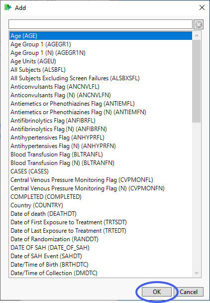
| 8 | Select the variables you want to include in the analysis and click to add those variables to the text box. |
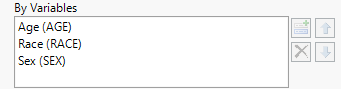
In this example, AGE Group 1, RACE, and SEX were selected and added.
Note: If no BY variables are specified, the analysis is conducted across all the subjects
Term and Group Level
View/Hide Details.
This option allows for changing between MedDRA terms with the option to choose a single MedDRA term or a grouping of two MedDRA terms like Dictionary-Derived term grouped by Body System or Organ Class. Switching this option swaps out the term plotted on the x-axis of the graph as well as the term in the first column of the tabulate.
Dictionary-Derived Term, grouped by Body System or Organ Class is selected by default.
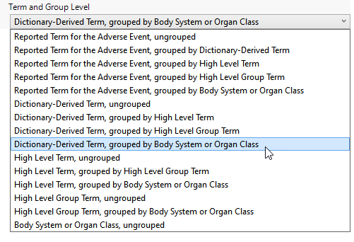
Possible term and group levels are listed in the following table:
|
Term and Group Level |
Corresponding Variable |
Function |
|||
|
Body System or Organ Class |
AEBODSYS in AE |
|
|||
|
High Level Group Term (HLGT) |
AEHLGT in AE |
|
|||
|
High Level Term (HLT) |
AEHLT in AE |
|
|||
|
Dictionary-Derived Term |
AEDECOD in AE |
|
|||
|
Reported Term for the Adverse Event |
AETERM in AE |
|
Event Type
View/Hide Details.
Use this feature to specify the inclusion of particular events in the analysis. The selection limits the report to only adverse events of that type.
By default, all events are included in the analysis.

Available options are listed in the following table:
|
Option: |
Select when you want to: |
|||
|
All event types |
|
|||
|
Pre treatment events |
|
|||
|
Treatment emergent adverse events |
Note: For information about how treatment emergent adverse events (TEAEs) are defined, please refer to How does JMP Clinical determine whether an Event Is a Treatment Emergent Adverse Event?. |
|||
|
On treatment events |
|
|||
|
Off treatment follow up events |
|
Note: When crossover is detected, only those events that occur within the specified treatment period dates are shown. This is true even when All Event Types has been selected. For example, pre-treatment events are not assigned to a treatment and therefore not shown in the report.
Ignore available treatment emergent flags
View/Hide Details.
This option applies only if the selected event type specifies treatment-emergent events. If this option is not checked, then the report will check for existing treatment emergent flags in the data and subset based on those flags. If the option is checked, then the Algorithm JMP Clinical uses to define treatment emergence will be applied.
Stack
View/Hide Details.
Use this widget to distinguish different levels within each of the adverse events summarized by the bars in the plots.
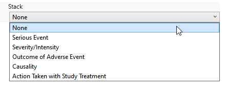
By default this option is set to None, but can be changed to seriousness, severity, and other adverse event characteristics. When something other than none is selected, the bars in the bar chart will be stacked by the selected variable and the tabulate will split each demographic grouping column by the stack variable.
Potential options are listed in the following table:
|
Option: |
Select when you want to: |
|
None |
Display all of the occurrences of each adverse events with no indications of levels within each class. |
|
Serious Event |
Display each adverse event bar in two colors - one representing serious events, the other color representing non-serious events. |
|
Severity/Intensity |
Display each adverse event bar in three colors - one representing mild events, the second color representing severe events, and the third color representing moderate events. |
|
Outcome of the Adverse Event |
Display each adverse event bar in six colors. Colors represent the following: Recovered/Resolved, Recovered/Resolved with Sequelae, Recovering/Resolving, Not Recovering/Not Resolved, Fatal, and Unknown. |
|
Causality |
Display each adverse event bar in four colors. Colors represent the following: not related to the treatment, unlikely related to the treatment, possibly related to the treatment, and related to the treatment |
| Action Taken with Study Treatment | Display each adverse event bar in fivecolors. Colors represent the following: Dose Not Changed, Not Applicable, Unknown, Dose Modified, and Drug Withdrawn. |
| Period |
This option is displayed only when multiple treatment periods have been detected and displayed. Pre-treatment is been assigned to period=0. Displayed counts indicate the number of subjects experiencing an event in each period. Note: This is selected by default when crossover data is detected. |
Note: The options available are dependent on the presence of the relevant variables in the data. For example, Severity is listed only when AESEV is present in the data tables.
Show Counts or Percents
View/Hide Details.
This option enables you to specify whether to view the result in terms of total counts or as percentages of the total. This option only impacts the bar chart. Selecting counts will display subject counts on the left side y-axis of the bar chart and selecting percents will swap the axis out for percentages.
Additional Filters - Adverse Events
View/Hide Details.
The Adverse Events field is an optional parameter that enables you to filter rows from the AE data set to choose the appropriate records to subset to adverse events of interest. Risk indicators are calculated using this subset of adverse events only.

This filter uses JMP WHERE clauses to Select Rows that meet the specified criteria. To use this filter, you must enter the JSL (JMP Scripting Language) expressions that constitute the WHERE clause in the appropriate text box for specific filtering of AEs. Note: This is an advanced concept that not only requires some basic knowledge of the JSL where clause syntax (similar to, but different from, SQL), but also an understanding of the exact variables in the tables in the study.
To filter subjects with a specific event or finding, one could also use the Subpopulation Builder on any domain of interest. For example, filter to all subjects that exhibit cardiac failure ( :Customized Query 01 Name == "Cardiac failure" ) and run all reports on those.
To specify an Adverse Events filter:
| 8 | Click  to open the Where Clause Builder to construct the desired filter. to open the Where Clause Builder to construct the desired filter. |
| 8 | Click  to clear the filter. to clear the filter. |
Display
Report Data Filters
View/Hide Details.
The report filter limits the bar chart and the tabulate to only those records that meet the filter selection. For example, if the lower bound of the Overall Percent Occurrence is set to 5, then only adverse events occurring in at least 5% of all subjects will be displayed. The filter builds upon itself, so if Serious Event equals Y and Outcome of Event equals Fatal are both selected, then only serious events that were fatal will be displayed.
Refer to Data Filter for more information.
Note: Filter specifications are reapplied when any widget options are changed.
Action Buttons
Action buttons provide you with an easy way to drill down into your data. The following action buttons are generated by this report:
Click here to display the list and description of the Report Action buttons.
| • | Click  to rerun the report using default settings. to rerun the report using default settings. |
| • | Click  to view the associated data tables. Refer to Show Tables for more information. to view the associated data tables. Refer to Show Tables for more information. |
| • | Click  to generate a standardized PDF- or RTF-formatted report containing the plots and charts of selected sections. to generate a standardized PDF- or RTF-formatted report containing the plots and charts of selected sections. |
| • | Click  to generate a JMP Live report. Refer to Create Live Report for more information. to generate a JMP Live report. Refer to Create Live Report for more information. |
| • | Click  to take notes, and store them in a central location. Refer to Add Notes for more information. to take notes, and store them in a central location. Refer to Add Notes for more information. |
| • | Click  to read user-generated notes. Refer to View Notes for more information. to read user-generated notes. Refer to View Notes for more information. |
| • | Select one or more subjects, then click  to apply the Review Subject Filter and filter all reports in the review builder on the selected subjects. to apply the Review Subject Filter and filter all reports in the review builder on the selected subjects. |
| • | Select a group of subjects and click  to specify Derived Population Flags that enable you to distinguish the selected group of subjects from the general population. to specify Derived Population Flags that enable you to distinguish the selected group of subjects from the general population. |
Note: For information about how treatment emergent adverse events (TEAEs) are defined in JMP Clinical, please refer to How does JMP Clinical determine whether an Event Is a Treatment Emergent Adverse Event?.
Default Settings
Refer to Set Study Preferences for default Subject Level settings.