Findings Time Trends
The Findings Time Trends report allows findings data, typically laboratory tests, to be summarized over time by treatment. Time typically involves both visits and time points. By default, the summarization for laboratory tests involves calculating the mean change from baseline and 95% confidence intervals, to determine whether laboratory test mean post-baseline values are trending up or down across visits. Other summarizations include the percent change from baseline and percent of baseline as well as the observed results, the latter including the upper limit of normal and lower limit of normal cutoff lines for the individual tests. A line graph with the means of each treatment group are displayed first, with a bar graph below, showing the number of records for the subjects containing the baseline and post-baseline values involved in the calculations. Finally, a line graph for each laboratory test for each subject over visit is displayed, allowing the investigator to evaluate each data point for every subject on the trial.
Methodology
No testing is performed. Analysis is restricted to calculating simple statistics of post-baseline findings results or their log transformed and/or normalized values against baseline values.
If findings test category (xxCAT) exists (where xx represents the two-letter domain abbreviation -- for example, LB), plots are first ordered by xxCAT. Next, if findings test subcategory (xxSCAT) exists, plots are secondarily ordered by xxSCAT. If xxCAT is missing, plots are ordered by test short name (xxTESTCD), which is required. Findings tests with a missing xxCAT value are assigned to the “OTHER” category.
Note: Findings tests with a missing numeric result (xxSTRESN), as well as those taken on only one day, are excluded from these plots.
Tip: You can collapse categories (and simultaneously exclude them from any report that you create) by clicking on the gray triangles located to the left of the category labels.
Each plot displays the measurements taken across time for each subject in a study for a quantitative findings test. The value of xxTEST is displayed in the outline box for each plot and the test short name (xxTESTCD) is displayed along with the measurement units (where applicable) on the Y axis. The Y axis can represent the observed test result, the change from baseline, percent change from baseline, or percent of baseline, depending on the selection made for the Plot findings measurements as: parameter on the report dialog. Time, as either Study Day, Study Week, or Visit, is plotted on the X axis (according to yourTime Scale selection). Time trend lines connect the points of measurement; each marker point represents the findings measurement for each subject at the measured time point. If multiple measurements were taken for a subject on the same Study Day, Study Week, or Visit, the point represents the mean measurement for that subject.
Usage and Interpretation
The Findings Time Trends report was run with Nicardipine sample data set under several scenarios to demonstrate usage and interpretation of results.
Note: Click on the figures below to enlarge.
Example 1: Mean Change from Baseline in BUN Over Time by Treatment
In this example, report options were set as shown in the following table:
| Option Type | Option | Setting | |
|---|---|---|---|
| Display | Laboratory Test Results | Blood Urea Nitrogen (mMol/L) | 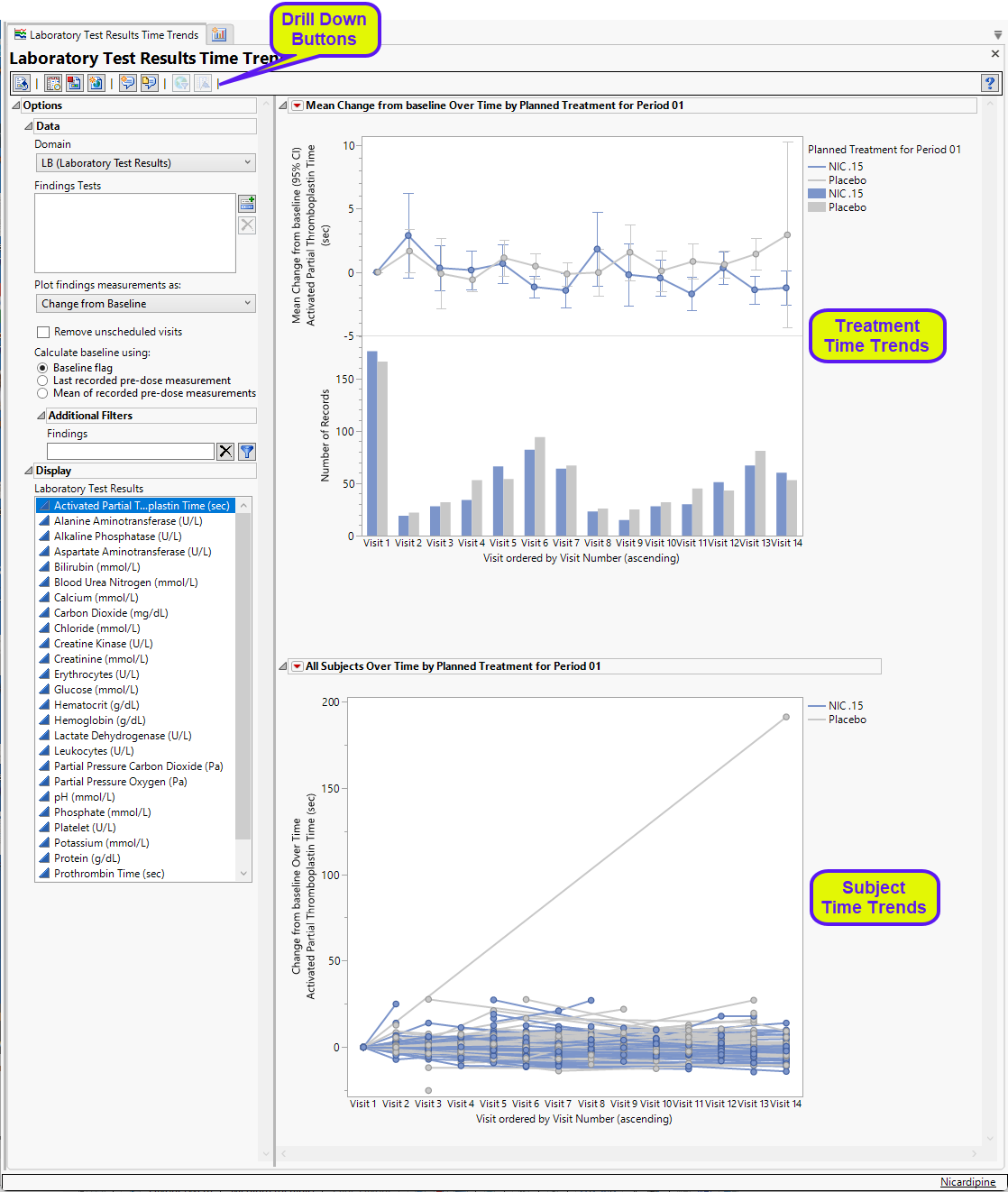
|
| All other options set to default. | |||
Laboratory Test Results (LB) is the selected domain, unscheduled visits have been excluded, and the baseline value is calculated based on the baseline flag. Change from baseline is the selected finding measurement.
This report example summarizes the change from baseline in Blood Urea Nitrogen (BUN). It allows us to evaluate average within-subject changes over time and compare trends across treatment groups for BUN measurements taken across the study. While no statistical testing is performed, there are 95% confidence intervals included around the mean changes for each of the treatment groups to evaluate the potential treatment differences at each follow-up visit. The number of records included in each mean is summarized in a bar chart below the graph.
Figure 1: Mean Change from Baseline for BUN
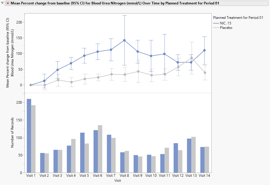
In this example we observe (Figure 1) that the mean BUN compared to baseline increased slightly over time in all treatment groups, with the Nicardipine treatment showing modestly greater increases compared with placebo. The mean change in the Nicardipine group ranged from 0.3 to 4.6 mmol/L over the study follow-up period. Differences between the Nicardipine and placebo groups were small and accompanied by overlapping variability, suggesting no clear or clinically meaningful separation. The gradual increase over time may indicate a mild cumulative effect; however, the magnitude of change is limited and should be interpreted with consideration of possible influential outliers as well as in context with other renal markers such as creatinine and eGFR.
Figure 2: BUN Change from Baseline for All Subjects
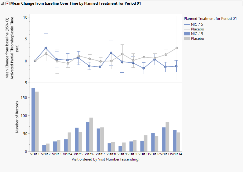
The all-subjects plot shown in this report (Figure 2) gives individual subject trajectories of BUN change from baseline values over time. This plot (also known as a spaghetti plot) shows the wide spread of values indicating heterogeneity across subjects. There appear to be individuals with larger increases in BUN compared with the majority which influence the upward shift in the mean observed in the mean change from baseline plot. This reinforces that the observed mean differences are likely small relative to with-group variability and appear to be driven by a small subset of subjects, rather than a consistent shift across the cohort.
The interactive nature of these plots allows the user to select a line or point on the graph to identify the subject or group of subjects included in that graphed element. The user can then create a subject filter on the selected subject(s) to do further exploration. Subjects with the largest increases may be of interest to evaluate further in the context of other renal safety markers and adverse event profiles.
Figure 3:
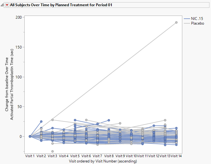
In this example, we selected two lines (use shift click to select multiple items) in the all-subjects graphs (bold lines in Figure 3) and then clicked Show Subjects ( ) which surfaced a window listing the selected subjects. Further exploration of these subjects’ safety profiles can then be done using the Review Subject Filter with other JMPClinical Safety reports, such as Acute Kidney Injury, Patient Profiles and the various Adverse Events reports.
Example 2. Mean Observed Result for Bilirubin (mMol/L) over Time by Treatment
 View/Hide Details.
In this example, report options were set as shown in the following table:
| Option Type | Option | Setting | |
|---|---|---|---|
| Data | Plot findings measurements as | Observed Result | 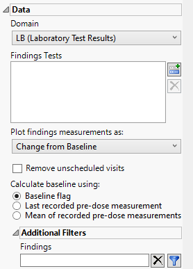
|
| Removed unscheduled visits | unchecked | ||
| Display | Laboratory Test Results | Bilirubin (mMol/L) | |
| All other options set to default. | |||
This report example summarizes the observed values of Bilirubin across the studies. It allows for the evaluation of trends over time and across treatment groups for Bilirubin measurements taken during the study as well as assessment of individual subject patterns. While no statistical testing is performed, 95% confidence intervals are included around the mean result for each of the treatment groups to evaluate the potential treatment differences at each follow-up visit. The number of records included in each mean is summarized in a bar chart below the graph.
Figure 4: Mean Observe Result for Bilirubin
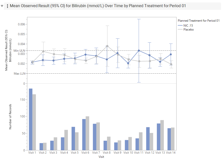
From this plot (Figure 4) we observe a similarity in the baseline values (Visit 1), suggesting similar baseline distributions between the treatment groups. We also note the substantially smaller number of records available at follow-up visits (ranging between 21-100 records per treatment group), compared to the number at baseline, which had over 160 per treatment group. The large confidence intervals at visits 8 and visits 11 may be due to the influence of individual outliers or the smaller sample sizes. We see the mean Bilirubin values appear to fluctuate over time rather than remaining stable. The maximum Lower Limit of Normal (LLN) and minimum Upper Limit of Normal (ULN) are noted as dashed lines as points of reference. (**Geoff to provide some more details on Max LLN and min ULN here. ) At Visit 8 the mean Bilirubin estimate exceeds the minimum ULN.
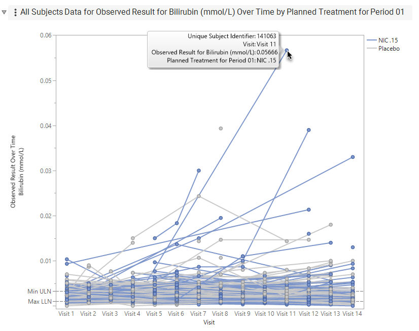
The All-Subjects plot (Figure 5) shows there is considerable inter-subject variability. A limited number of subjects demonstrate notable bilirubin elevations that exceed the general population trend and warrant subject level review. For example, at Visit 11, hovering on the outlier in the graph reveals that a value of 0.05666 was observed for subject 141063, and that value appears to have increased greatly from the previous value observed for that subject at Visit 4. This warrants additional subject level review and assessment of clinical relevance, for example consideration of Hy’s Law, which can be explored with the Hy’s Law Screening report.
Options
Data
Treatment or Comparison Variable
View/Hide Details.
Specifies the variable used to define the groups to be comparec in the report. This variableis typically a planned or actual treatment variable, such as ARM, ACTARM, TRTxxA, or TRTxxP, but it can also be another variable that defines meaningful comparison groups, such as SEX or RACE.
Select None to display the data without grouping by a treatment or comparison variable.
Domain
View/Hide Details.
Use this widget to specify whether to analyze measurements from either the Electrocardiogram (EG), Laboratory (LB), or Vital Signs (VS) findings domains.
LB is selected by default.
Findings Tests
View/Hide Details.
Use this widget to select specific Findings tests. If you leave this field blank, all tests are run.
| 8 | Click  to open the Add window (shown below) that lists available test names (shown below). to open the Add window (shown below) that lists available test names (shown below). |
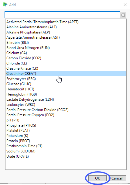
| 8 | Select the desired test(s) and click to add them to the text box. |
Show all Findings Tests
View/Hide Details.
Check this box will show all the graphs for every findings tests instead of one graph with a column switcher.
This box is checked by default.
By Variables
View/Hide Details.
Use this field to specify one or more By variables from ADSL to use in your analysis.

Selecting a By variable will split the bar chart and tabulate by the grouping variables selected in this option as well as by the variable selected for the comparison or treatment variable.
By Variables
By variables are optional (in most reports)variable specifications whose values define groups of observations, such as hour, month, or year. BY variables can enable analyses to be performed separately on different groups as defined by that variable. Choosing a BY variable such as gender (ADSL variable = SEX), for example, groups the subjects by gender and conducts two separate analyses: one for males and one for females.
Alternatively, specifying a BY variable enables you to animate an image so that you can see how response values change according to some grouping, like over time.
To Specify One or More By Variables:
| 8 | Click to open the Add window (shown below) that lists each variable contained in domain and SUPPxx (if merged) specific to this report |
Note: In Demographics Distribution only, variables are taken from ADSL, in addition to the report-specific DS and SUPPPDS (if available) data sets.
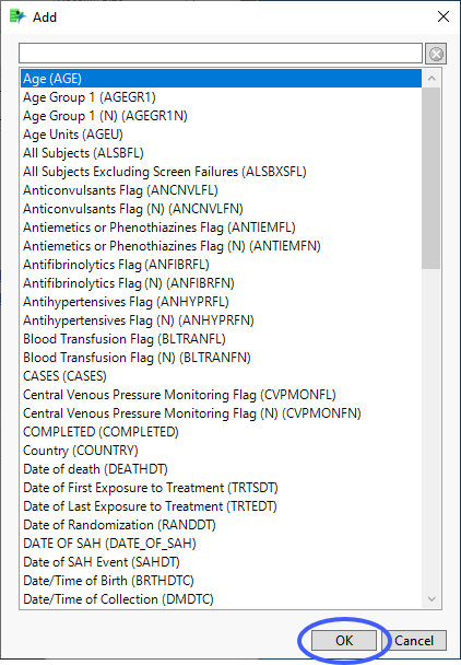
| 8 | Select the variables you want to include in the analysis and click to add those variables to the text box. |
In this example, AGE Group 1, RACE, and SEX were selected and added.
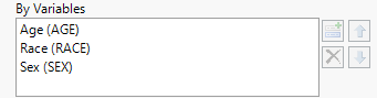
Note: If no BY variables are specified, the analysis is conducted across all the subjects
Plot findings measurements as:
View/Hide Details.
Use this widget to specify whether to plot the results either as observed or how they relate to the baseline measurement.
Available options are listed in the following table:
|
Option |
Description |
|
Observed result |
Plots observed values of the xxSTRESNvariable at or within time points or specified time periods. |
|
Change from baseline |
Plots the change from the findings baseline measurements. |
|
Percent change from baseline |
Plots 100*((xxSTRESN - Baseline)/Baseline) across trial time points. |
|
Percent of baseline |
Plots 100*(xxSTRESN/Baseline). |
Remove unscheduled visits
View/Hide Details.
You might or might not want to include unscheduled visits when you are analyzing findings by visit.
By default, this box is checked. When it is checked, records are excluded from the analysis if the VISIT variable exists and contains the text "unscheduled" for those records. If the box is not checked all records are included regardless of the VISIT status.
For some reports, you may have to specify Visits as the Time Scale to enable this field.
Include missing visits/time points
View/Hide Details.
Check the box to include missing visits/time points in the plots.
Calculate baseline as:
View/Hide Details.
Use this widget to use the flagged baseline record, last recorded pre-dose measurement or the mean of all the measurements taken during the baseline time window as the baseline measurement.
By default, the flagged baseline record is used.
The following test measurements are considered when forming the baseline measurement:
| • | those flagged as baseline, and |
| • | those taken prior to Study Day 1 |
Choose Last recorded pre-dose measurement to use the last recorded pre-dose test measurement (out of the test measurement pool generated from the above list) as the baseline measurement.
Choose Mean of recorded pre-dose measurements to average these pre-dose test measurements to form the baseline measurement.
Note: When the selected option to calculate baseline is to use the baseline flag and there are two records flagged as baseline, JMP Clinical uses the last record. This differs from JMP Clinical version 8.1, wherein the mean of the flagged baseline values was used.
Snapshot Records to Include
View/Hide Details.
Use this widget to specify which updated snapshot records to include in your analysis. This option is surfaced only in studies where the number of snapshots is greater than 0.
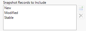
The default state of this option is to show new, modified and stable - effectively all - snapshot records. To see specific records you must remove undesired records from the analysis. For example, to surface only the new records, select both Modified and Stable and click  . Click
  to restore deleted records.
Note: JMP Clinical now relies on the JMP Compare Data Tables platform to detect new records. When duplicate rows appear, the platform evaluates them based on their row order. As a result, records are no longer labeled as Non‑Unique or Previously Non‑Unique, and the corresponding options to include those records have been removed.
Additional Filters - Findings
View/Hide Details.
This filter lets you restrict your analysis to only those subjects that meet specific criteria at the level of the specified Findings domain (EG, LB, or VS) .

This filters uses JMP WHERE clauses to Select Rows that meet the specified criteria. To use this filter, you must enter the JSL (JMP Scripting Language) expressions that constitute the WHERE clause in the appropriate text box for specific filtering of findings. Note: This is an advanced concept that not only requires some basic knowledge of the JSL where clause syntax (similar to, but different from, SQL), but also an understanding of the exact variables in the tables in the study.
Risk indicators are calculated using this subset only.
To specify a Findings filter:
| 8 | Click  to open the Where Clause Builder to construct the desired filter. to open the Where Clause Builder to construct the desired filter. |
| 8 | Click  to clear the filter. to clear the filter. |
Note: To filter subjects with a specific event or finding, one could also use the Subpopulation Builder on any domain of interest. For example, filter to all subjects that exhibit cardiac failure ( :Customized Query 01 Name == "Cardiac failure" ) and run all reports on those.
Display
Test Results/Vital Signs
View/Hide Details.
This option lists all of the tests performed over the course of the study. The list is specific to the selected Findings domain and changes when you change the selected domain.
| 8 | Select one or more tests to display only the results for the selected domain(s). |
Action Buttons
Action buttons provide you with an easy way to drill down into your data. The following action buttons are generated by this report:
Click here to display the list and description of the Report Action buttons.
| • | Click  to rerun the report using default settings. to rerun the report using default settings. |
| • | Click  to view the associated data tables. Refer to Show Tables for more information. to view the associated data tables. Refer to Show Tables for more information. |
| • | Click  to generate a standardized PDF- or RTF-formatted report containing the plots and charts of selected sections. to generate a standardized PDF- or RTF-formatted report containing the plots and charts of selected sections. |
| • | Click  to generate a JMP Live report. Refer to Create Live Report for more information. to generate a JMP Live report. Refer to Create Live Report for more information. |
| • | Click  to take notes, and store them in a central location. Refer to Add Notes for more information. to take notes, and store them in a central location. Refer to Add Notes for more information. |
| • | Click  to read user-generated notes. Refer to View Notes for more information. to read user-generated notes. Refer to View Notes for more information. |
| • | Select one or more subjects, then click  to apply the Review Subject Filter and filter all reports in the review builder on the selected subjects. to apply the Review Subject Filter and filter all reports in the review builder on the selected subjects. |
| • | Select a group of subjects and click  to specify Derived Population Flags that enable you to distinguish the selected group of subjects from the general population. to specify Derived Population Flags that enable you to distinguish the selected group of subjects from the general population. |
| • | Select one or more points (from the same visit or different visits) on the box plot and click to surface a table listing the findings results for the selected subject(s) from the selected visit(s). |
Default Settings
Refer to Set Study Preferences for default Subject Level settings.