Profile Subjects
Profiling subjects is a powerful way to view all of the data for one or more subjects, enabling you to view their entire history and determine potential causes for unexpected events or findings.
This report can be accessed by clicking the  down option present in various JMP Clinical reports.
Important: Before clicking , you must select the subjects of interest by clicking in a graph or selecting rows in the corresponding table.
For example, run the Demographics Distribution report for the Nicardipine study and select subjects less than 20 years old from the Age distribution histogram. Clicking the action button then generates the window shown below. Output is organized into panes and sections. Each tab contains one or more plots, data panels, data filters, or other elements that facilitate your analysis.
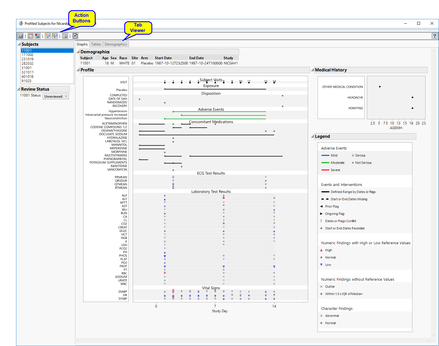
The Profile Subjects window contains the following elements:
Panes
These panes contain options that enable you to customize the profiles that are generated. Click the triangle ( ) next to each pane to expand that pane.
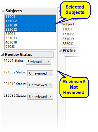
Subjects
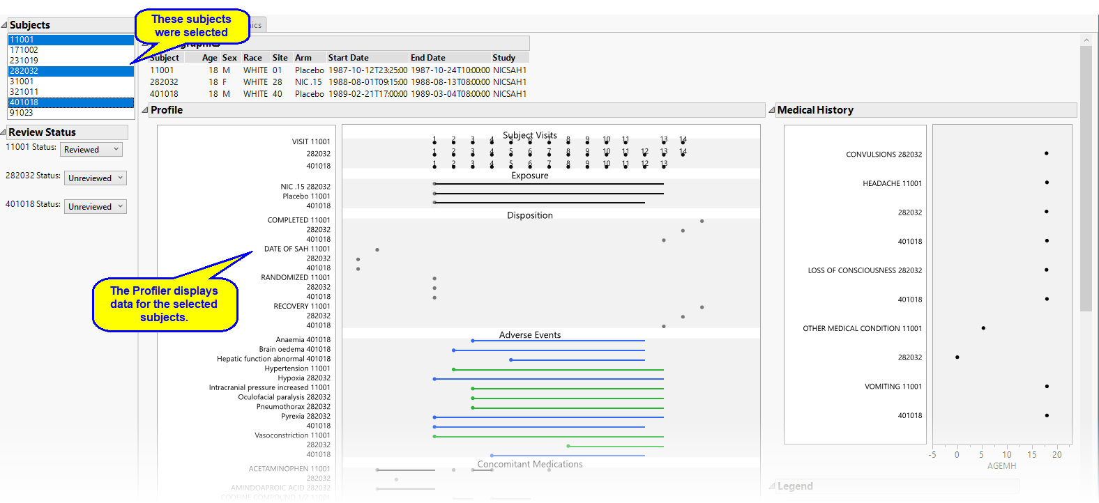
This pane enables you to select which subjects to profile. Hold the key to select multiple subjects or the key to select contiguous subjects among those listed. Shown below is a partial Profile display for three selected subjects.
Review Status
This pane enables you to record whether selected subjects have been reviewed. Use the drop-down menu to record review status. For example, four subjects have been selected in the example shown below. One subject (11001) has been reviewed, the remaining three have not.
Tabs
The following sections are generated by this report and are viewed as tabs:
| • | Graphs. |
| • | Tables |
| • | Demographics |
Action Buttons
| • | Click  to add this profile to your review. to add this profile to your review. |
| • | Click  to view the associated data tables. Refer to View Data for more information. to view the associated data tables. Refer to View Data for more information. |
| • | Click  to generate a standardized pdf- or rtf-formatted report containing the plots and charts of selected sections. to generate a standardized pdf- or rtf-formatted report containing the plots and charts of selected sections. |
| • | Click  to take notes, and store them in a central location. Refer to Add Notes for more information. to take notes, and store them in a central location. Refer to Add Notes for more information. |
| • | Click  to read user-generated notes. Refer to View Notes for more information. to read user-generated notes. Refer to View Notes for more information. |
| • | Click  to create a new patient narrative for the selected subjects. to create a new patient narrative for the selected subjects. |
| • | Click  to open the Manage Display Templates dialog. This dialog enables you to specify domain elements and colors along with other saved attributes such as display mode and frame sizes of the subject profile graphs and tables. to open the Manage Display Templates dialog. This dialog enables you to specify domain elements and colors along with other saved attributes such as display mode and frame sizes of the subject profile graphs and tables. |
Graphs

The Graphs tab contains the following elements:
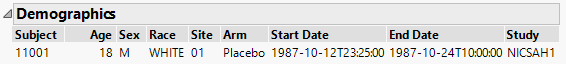
| • | One Demographics table. |
This is a simple table of the basic demographics for the currently selected subjects.
| • | One Subject Profile. |
This is the principal display. Time1 is displayed along the x-axis and data values from available domains are grouped along the y-axis. When duration information is available, points are joined with a horizontal line. The color and shape of points is domain dependent and is described in the Legend pane in the lower right corner.
| • | One Medical History pane. |
This pane shows the medical history of the currently selected subjects, with values on the y-axis and time on the x-axis. The time scale on the x-axis is now in years and extends before the beginning of the study.

Note: If both age (AGE) and birthdate (BRTHDTC) are unavailable, or if the start date of an event (MHSTDTC) is unavailable, then the age of medical history (AGEMH) is displayed as 0.
| • | One Legend. |
This pane describes the colors and symbols used in the primary display.
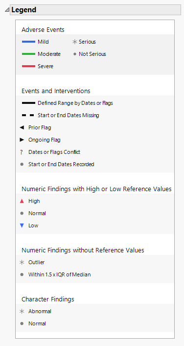
The top panel (shown below) denotes symbols and colors used for adverse events. Blue, green, or red bars indicate that the events are mild, moderate, or severe, respectively, as specified by the values in the SDTM variable aesev
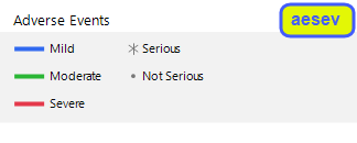
. When you specify aetoxgr instead of aesev in your AE or ADAE domain, the color scale has four levels instead of three (shown below). These colors correspond to the standard toxicity grade.
Note: For both cases (aesev and aetoxgr) shown above, the colors can be changed at the Study level using the Set Value Order and Color in Studies option.
The asterisk ( ) and filled-circle (
 ), in both cases, indicate whether the condition is serious or not serious, respectively, as specified by the values in the variable aeser.
Note: Serious conditions are generally, but not necessarily, severe.
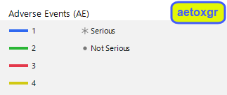
The middle panel (shown below) denotes line formats and symbols used for dates and times of different events and interventions.
Events or interventions with a defined range are indicated by a solid line spanning the ranges. Events or interventions with unknown start or end dates are indicated by a dashed line. Flagged events are indicated by left (prior) or right (ongoing) arrows. Conflicts are indicated by and question mark. Start and End dates are denoted by a filled-circle ( ).
).
When processing the flag variables xxSTRF and xxENRF, the patient profiler checks for the following keywords: "NOT RECOVERED/NOT RESOLVED", "NOT RECOVERED/RESOLVED", "NOT RECOVERED", "NOT RESOLVED", "RECOVERING/RESOLVING", "RECOVERING", "RESOLVING", "CONTINUING", "ONGOING". If one of these keywords is specified and also a corresponding start or end date is specified, the profile will display a "?" to represent a data conflict.
The bottom panel (shown below) denotes symbols used for numeric findings.
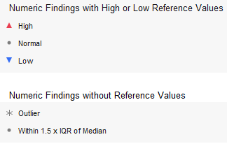
Findings that exceed the specified maximum reference value (also defined as the upper limit of normal or ULN) are indicated by an upward arrow (![]() ). Findings that fall below the specified minimum reference value (also defined as the lower limit of normal or LLN) are indicated by a downward arrow (
). Findings that fall below the specified minimum reference value (also defined as the lower limit of normal or LLN) are indicated by a downward arrow (![]() ). Findings between the ULN and LLN are indicated by a filled-circle (
). Findings between the ULN and LLN are indicated by a filled-circle ( ). The color of the filled-circle symbol indicates where the value falls within the distribution observed for the study population, as indicated by the color scale located on the right side of the primary display (for example,
  ). The ends of the color scale are based on the values of the variables XXSTNRLO and XXSTNRHI for the specified subject. XXNRIND is used to flag normal/abnormal findings values. If these variables are missing or are empty, then the ends of the color scale are the 10th to 90th percentiles of all subjects in the study. The normal range is considered to be the median value over all subjects +/- 1.5 x the interquartile range (IQR). Findings falling within that range are are indicated by a filled-circle (
 ). Findings falling outside of that range are considered outliers and are indicated by an asterisk (
 ). As before, the color of the symbols indicates where the value falls within the distribution observed for the study population.
Tables
The Tables tab is shown below:
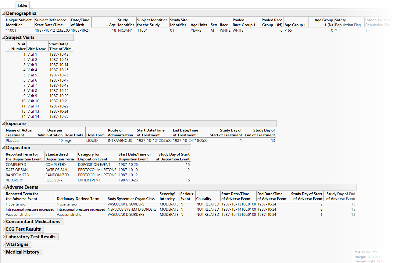
The Tables tab lists and summarizes subject-level data for all profiled subjects in tabular form.
Demographics
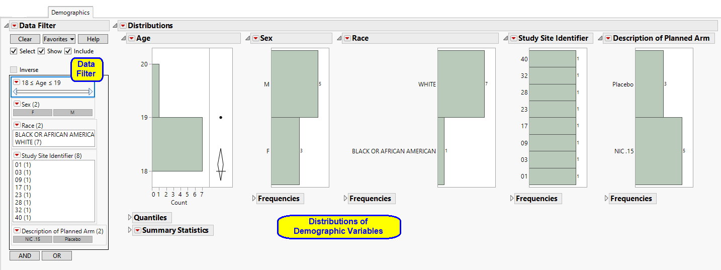
The Demographics tab contains the following elements:
| • | One Data Filter. |
This enables you to filter subjects further and focus on specific subsets.
| • | Distributions of Demographic Variables. |
These show basic Distribution plots and statistics for the demographic variables for all subjects profiled in the current view.