This example uses the Cheese.jmp sample data table, which is taken from the Newell cheese tasting experiment, reported in McCullagh and Nelder (1989). The experiment records counts more than nine different response levels across four different cheese additives.
|
1.
|
|
2.
|
Select Analyze > Fit Y by X.
|
|
3.
|
The Response values range from one to nine, where one is the least liked, and nine is the best liked.
|
4.
|
|
5.
|
|
6.
|
Click OK.
|
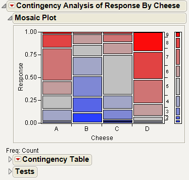
From the mosaic plot in Mosaic Plot for the Cheese Data, you notice that the distributions do not appear alike. However, it is challenging to make sense of the mosaic plot across nine levels. A correspondence analysis can help define relationships in this type of situation.
|
7.
|
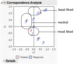
Example of a Correspondence Analysis Plot shows the correspondence analysis graphically, with the plot axes labeled c1 and c2. Notice the following:
|
8.
|
From the red triangle menu next to Correspondence Analysis, select 3D Correspondence Analysis.
|
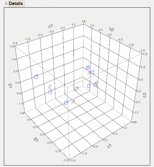
From Example of a 3-D Scatterplot, notice the following: