|
1.
|
Select Graph > Graph Builder.
|
|
2.
|
|
3.
|
Adjust the frame size so that the frame is square by right-clicking the plot and selecting Size/Scale > Size to Isometric.
|
|
4.
|
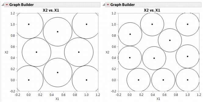
Right-click the plot and select Customize. When the Customize panel appears, click the plus sign to see a text edit area and enter the following script:
For Each Row(Circle({:X1, :X2}, 0.518/2)) where 0.518 is the minimum distance number that you noted in the Design Diagnostics panel. This script draws a circle centered at each design point with radius 0.259 (half the diameter, 0.518), as shown on the left in Sphere-Packing Example with Eight Runs (left) and 10 Runs (right). This plot shows the efficient way JMP packs the design points. |
Remember to change 0.518 in the graphics script to the minimum distance produced by 10 runs. When the plot appears, again set the frame size and create a graphics script using the minimum distance from the diagnostic report as the diameter for the circle. You should see a graph similar to the one on the right in Sphere-Packing Example with Eight Runs (left) and 10 Runs (right). Note the irregular nature of the sphere packing. In fact, you can repeat the process a third time to get a slightly different picture because the arrangement is dependent on the random starting point.