Alternatively, you can define the Map Role column property for the column of interest. This property tells JMP how to connect the values in the column with map shape data. It is especially useful when you create custom maps. See Custom Map Files in Create Maps.
|
•
|
To color the map shapes by the values of a summary statistic, drag the column of interest to the Color zone. The categorical or continuous color theme selected in your Preferences is applied to each shape.
|
|
•
|
To size the map shapes by the values of a summary statistic, drag the column of interest to the Size zone. This scales the map shapes according to the summary statistic value of the size variable, minimizing distortion.
|
For more details, see the Create Maps topic. For examples, see Examples of Creating Maps in Create Maps, or run the associated scripts in these sample data tables: PopulationByMSA.jmp or SAT.jmp.
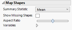
Figure 2.41 Map Shapes Options
Tip: If you have multiple graphs, you can color or size each graph by different variables. Drag a second variable to the Color or Size zone, and drop it in a corner. In the Variables option, select the specific color or size variable to apply to each graph.
The Parallel element  connects the values in a row across two or more variables. Drag two or more variables together to either the X or Y zone. The variable names appear as axis labels in the zone to which they were dragged.
Figure 2.42 Example of Categorical Bands Using Titanic.jmp
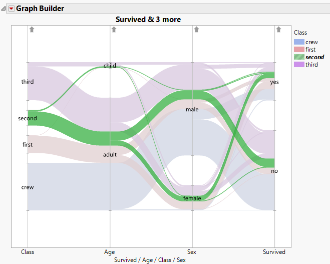
In Figure 2.42, the band containing all second-class passengers is selected. The parallel plot shows that most were adults, there were more males than females, and slightly fewer survived than did not survive.
|
•
|
To color the curves by the values of a variable, drag the column of interest to the Color zone. The categorical or continuous color theme selected in your Preferences is shown in the Legend zone.
|
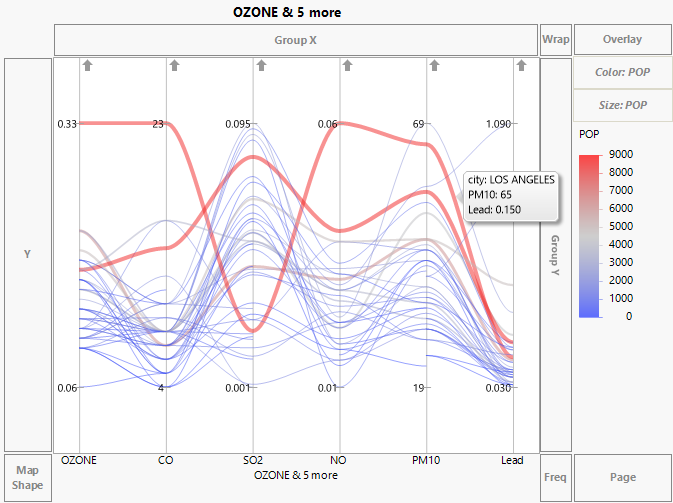
Figure 2.43 shows a parallel plot for six variables in the Cities.jmp data table. The variable POP is used both as a Color and Size variable. The curve for Los Angeles is labeled.
Figure 2.43 Parallel Plot for Pollution Data in Cities.jmp
Tip: You can add reference lines for specification limits. For information, see Spec Limits in the Using JMP book.
By default, the scales for the values of the variables are adjusted so that the minimum and maximum values are plotted at the same level. For example, in Figure 2.43, the values of each of the variables have an identical vertical spread. Each vertical line is labeled by the minimum and maximum values of the variables.
In Figure 2.43, the scales for CO and PM10 differ greatly from the scales of the other variables. When your variables are measured on very different scales, this scaling enables you to see differences clearly.
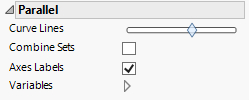
Figure 2.44 Parallel Options
Tip: If you have multiple graphs, you can color or size each graph by different variables. Drag a second variable to the Color or Size zone, and drop it in a corner. In the Variables option, select the specific color or size variable to apply to each graph.