The Cube Plots option displays predicted values for the extremes of the factor ranges. These values appear on the vertices of cubes (Figure 3.53). The vertices are defined by the smallest and largest observed values of the factor. When you have multiple responses, the multiple responses are shown stacked at each vertex.
|
1.
|
|
2.
|
Select Analyze > Fit Model.
|
|
3.
|
|
4.
|
Make sure that the Degree box has a 2 in it.
|
|
5.
|
|
6.
|
Click Run.
|
|
7.
|
From the Response Y red triangle menu, select Factor Profiling > Cube Plots.
|
Figure 3.53 Cube Plots
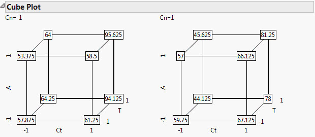
Note that there is one cube for Cn = –1 and one for Cn =1. To change the layout so that the factors are mapped to different cube coordinates, click a factor name in the first cube. Drag it to cover the factor name for the desired axis. For example, in Figure 3.53, if you click T and drag it over Ct, then T and Ct (and their corresponding coordinates) exchange places. To see the levels of Cn in a single cube, exchange it with another factor in the first cube by dragging it over that factor.