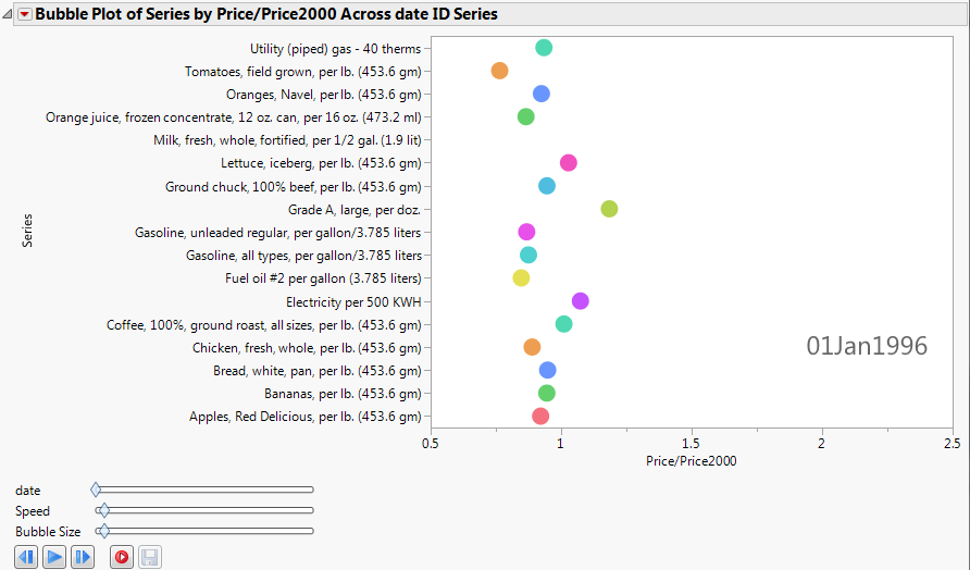
This example uses the blsPriceData.jmp sample data table, which shows the price of commodities over several years. Because the value of the US dollar changes over time, a column named Price/Price2000 shows the ratio of a commodity’s price at any given time to the price in the year 2000.
|
1.
|
|
2.
|
Select Graph > Bubble Plot.
|
|
3.
|
|
4.
|
|
5.
|
|
6.
|
Click OK.
|
The report window appears. (Figure 7.15 uses the JMP default colors.)
Figure 7.15 Static Example of Animated Bubbles
|
8.
|
In the Y Axis Settings window, select Show Grid.
|
|
9.
|
Click OK.
|