This example uses the SATByYear.jmp sample data table, which contains SAT verbal and math test scores for a selection of the US population in 2004.
|
1.
|
|
2.
|
Select Graph > Bubble Plot.
|
|
3.
|
|
4.
|
|
5.
|
|
6.
|
|
7.
|
Click OK.
|
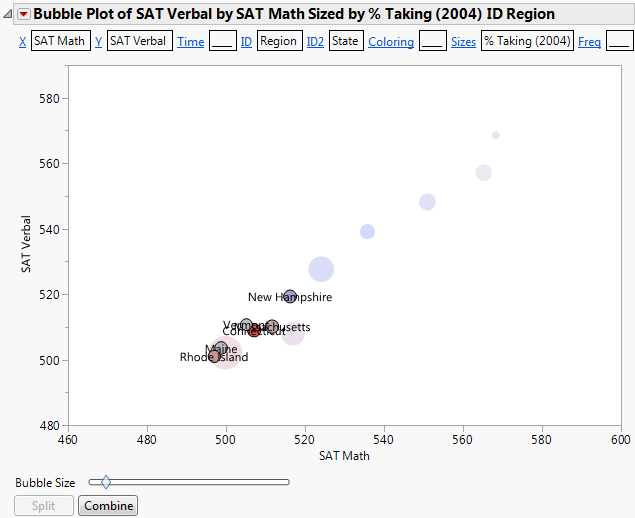
The report window appears. (Figure 7.11 uses the default JMP colors.)
Figure 7.11 The Static Bubble Plot Report Window
From Figure 7.11, you draw the following conclusions:
|
1.
|
From the red triangle menu, select Show Roles.
|
|
2.
|
Click on the ID link.
|
|
3.
|
Region is now the primary ID variable.
|
4.
|
Click on the ID2 link.
|
|
5.
|
State is now the secondary ID variable.
|
7.
|
Click Split.
|
Now the bubbles are split by the secondary ID variable, which is State. You now see each state within the Southwest region.
Figure 7.13 Example of Southwest Region Split by State
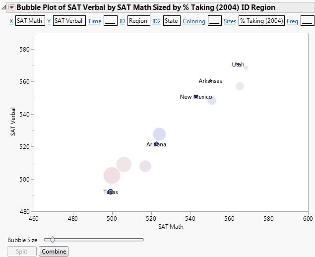
From Figure 7.13, you see that there is significant variation between the scores from the Southwest states.
|
8.
|
Click Combine to combine the southwest states again.
|
|
10.
|
Click Split.
|
Figure 7.14 Example of New England Region Split by State