|
1.
|
|
2.
|
Select Graph > Graph Builder.
|
|
3.
|
Figure 3.7 Country Assigned to the Y Zone

Tip: The countries are ordered in ascending alphabetical (starting point is at the bottom). To change the sorting order, use the Value Ordering or Row Order Levels properties. For details, see Value Ordering or Row Order Levels in the Using JMP book. Alternatively, you can sort using the values of a continuous variable. For details, see Order the Levels of a Categorical Variable in Graph Builder.
|
4.
|
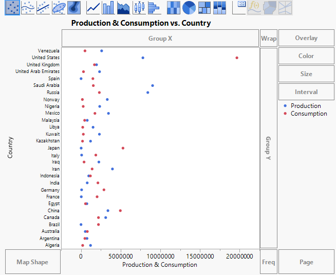
Figure 3.8 Country versus Production and Consumption
 .
.
|
6.
|
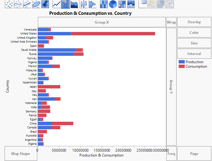
Figure 3.10 Stacked Bars for Production and Consumption
|
7.
|
This makes Consumption negative. A column called -Consumption appears in the list of columns. The column name is italicized to indicate that it is a virtual column. Use this column to plot the consumption bar in terms of negative values.
|
8.
|
|
9.
|
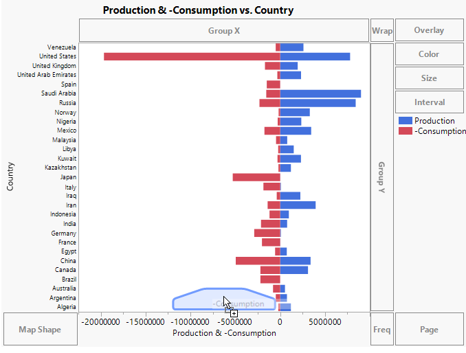
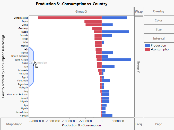
Negative consumption (-Consumption) is plotted on the left in red, and Production is on the right in blue. Next, use the Consumption column as an ordering variable to sort the countries by their oil consumption.
|
10.
|
Select Consumption and drag it to the right of the Y axis. Do not drop the variable until a blue polygon appears. See Figure 3.12.
|
Figure 3.12 Polygon for Ordering Countries by Consumption
|
11.
|
(Optional) Click Done.
|
The levels of Country are now ordered by Consumption. The countries that consume the most oil appear at the top of the graph. You can also see each country’s oil production.