|
1.
|
The table has a row for each day in the month of April. The column named April is the numeric day of the month, and the remaining columns are various weather statistics.
|
2.
|
|
3.
|
|
4.
|
|
5.
|
Click OK.
|
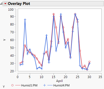
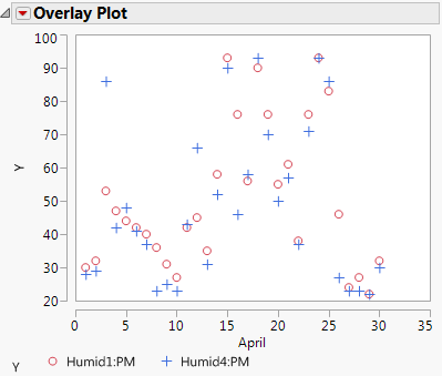
The plot shown in Figure 4.2 appears. Initially, this platform overlays all specified Y columns. The legend below the plot shows individual markers and colors that identify each Y column.
Figure 4.2 Plot with Legend
To help you quickly differentiate between the Ys, select Y Options > Connect Points from the Overlay Plot red triangle menu. Adjacent points are connected for each Y variable, as shown in Figure 4.3.
Figure 4.3 Plot with Connected Points