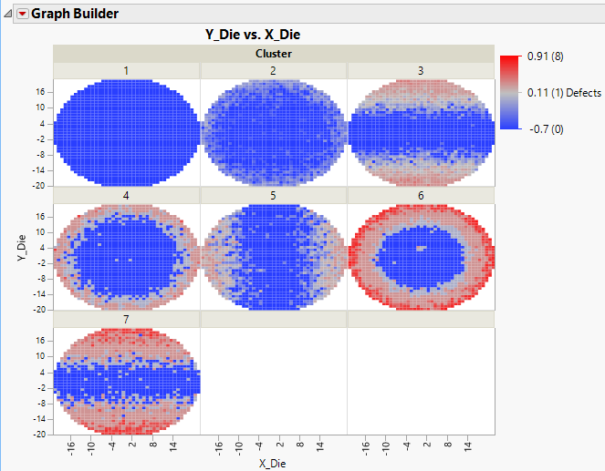
In this example, you have defect data on wafers. The X Die and Y Die columns give a location on the die, and Defects gives the number of defects at each location. Because die defects often occur in patterns, you use cluster analysis to cluster wafers into groups that might have the same type of defect pattern. Once you have done this, you want to visualize the defect patterns for each cluster.
|
1.
|
|
2.
|
Run the Spatial Cluster of Defects script.
|
This script fits a hierarchical cluster analysis model that includes spatial measures (Angle, Radius, Streak Angle, and Streak Distance). See Spatial Measures in the Multivariate Methods book for more information.
|
3.
|
Click the Hierarchical Clustering red triangle and select Save Clusters.
|
Seven clusters are constructed. The cluster numbers are saved to a column called Cluster in the Wafer Stacked.jmp data table.
|
4.
|
Go back to Wafer Stacked.jmp.
|
|
5.
|
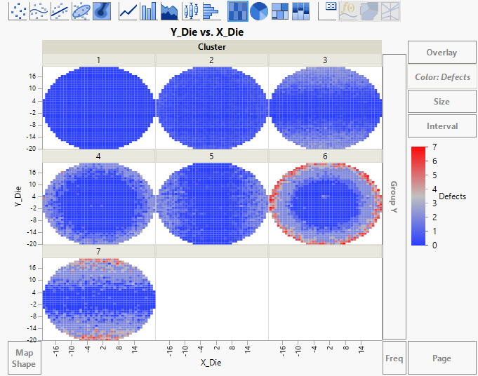
Select Graph > Graph Builder.
|
|
6.
|
|
7.
|
 and click the Points element
  .
.|
9.
|
|
10.
|
|
12.
|
|
13.
|
Select Log for Scale Type.
|
This scale is linear for the logarithm of Defects. Because the distribution of Defects is highly skewed, using the Log scale highlights the variation patterns, but at the expense of being able to easily compare magnitudes in the original scale.
|
14.
|
Click OK.
|
|
15.
|
(Optional) Click Done.
|
Figure 3.32 Heatmap for Wafer Clusters