|
1.
|
|
2.
|
Select Analyze > Specialized Modeling > Fit Curve.
|
|
3.
|
|
4.
|
|
5.
|
|
6.
|
Click OK.
|
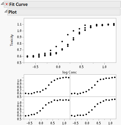
The Fit Curve Report appears as shown in Figure 11.2. The Plot report contains an overlaid plot of the fitted model of each formulation.
Figure 11.2 Initial Fit Curve Report
|
7.
|
To see a legend identifying each drug formulation, right-click one of the graphs and select Row Legend. Select Formulation for the column and click OK. The plot shown in Figure 11.3 appears.
|
Figure 11.3 Fit Curve Report with Plot Legend
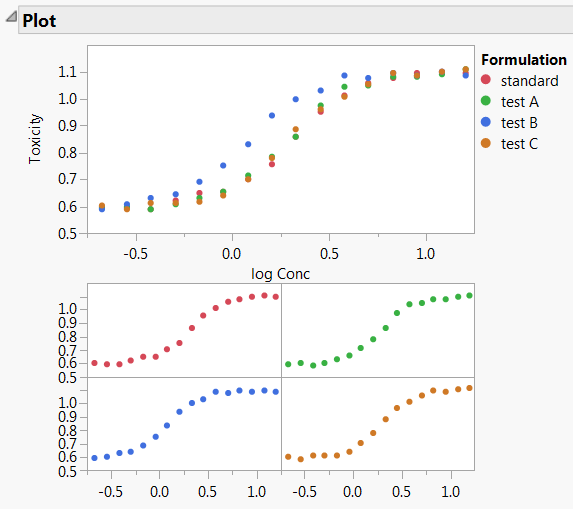
The curves appear S-shaped, so a sigmoid curve would be an appropriate fit. Table 11.1 shows formulas and graphical depictions of the different types of models that the Fit Curve platform offers.
|
8.
|
Select Sigmoid Curves > Logistic Curves > Fit Logistic 4P from the Fit Curve red triangle menu.
|
Figure 11.4 Logistic 4P Report
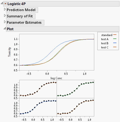
The Logistic 4P report appears (Figure 11.4). There is also a separate plot for each drug formulation. The plot of the fitted curves suggests that formulation B might be different, because the test B curve starts to rise sooner than the others. Inflection point parameters cause this rise.
|
9.
|
Select Compare Parameter Estimates from the Logistic 4P red triangle menu.
|
Figure 11.5 Parameter Comparison Report
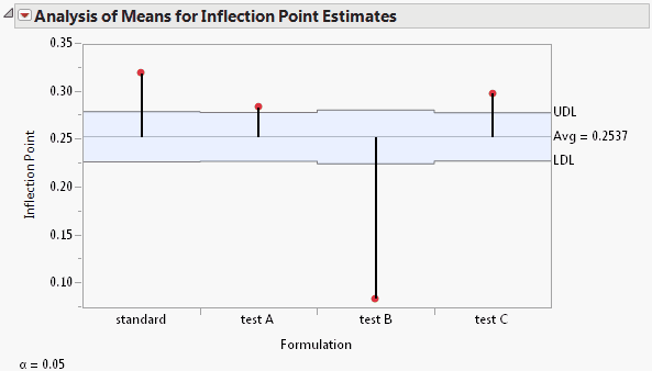
Notice that the Inflection Point parameter for the test B formulation is significantly lower than the average inflection point. This agrees with the plots shown in Figure 11.4. Drug formulation B has a lower toxicity ratio than the other formulations.