The examples in this section,Show Behavior over Time and Show Bounds around Group Means use area plots to show behavior over a period of time, and to show upper and lower bounds around group means.
|
1.
|
|
2.
|
Click the green triangle next to the Split into Series script.
|
|
3.
|
Select Graph > Graph Builder.
|
|
4.
|
|
5.
|
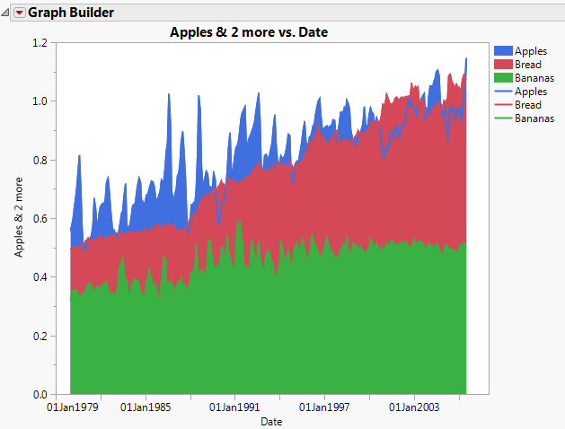
Figure 3.19 Area Plot for Apples, Bananas, and Bread by Date
|
7.
|
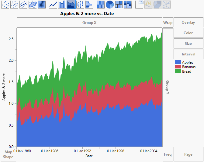
Change the Area Style to Overlaid.
|
Because banana prices are uniformly smaller than prices for apples and bread, the layer for Bananas is at first entirely hidden behind the other two layers. The apples price is hidden behind the bread price for some months. Use the Line element to see prices for all three clearly.
Figure 3.20 Overlaid Area Style
The layers for the plot are ordered by the order of entry of variables, as shown in the legend. The graph shows that banana prices are uniformly smaller than both apple and bread prices. On average, apple prices dominate bread prices up to the year 2000. After this, bread prices are generally higher than apple prices. Also note that the price of bread increases at a smoother rate than prices for apples and bananas. The line plots for Apples and Bananas are very jagged, with a lot of spikes and dips from year to year.
|
9.
|
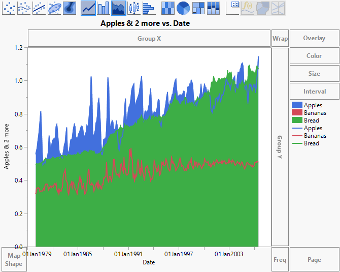
In the Area options, click the triangle next to Variables. Select Y Bananas so that it is highlighted, and click the down arrow once.
|
Note: When selecting Y Bananas, be sure to leave the check box marked. Otherwise, the variable is removed from the graph.
|
10.
|
In the Line options, click the triangle next to Variables. Select Y Bananas so that it is highlighted, and click the down arrow once.
|
|
11.
|
(Optional) Click Done.
|
Figure 3.21 Overlaid Area Showing All Layers