|
1.
|
|
2.
|
Select Graph > Legacy > Chart.
|
|
3.
|
|
4.
|
|
5.
|
Select Mean from the menu of statistics.
|
|
6.
|
Click OK.
|
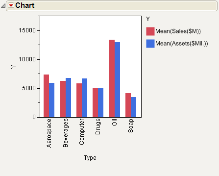
The bar chart in Figure 13.11 compares the mean of sales and assets for each type of company.