Assessing the Impact of Lost Runs
An experiment was conducted to explore the effect of three factors (Silica, Sulfur, and Silane) on tennis ball bounciness (Stretch). The goal of the experiment is to develop a predictive model for Stretch. A 15-run Box-Behnken design was selected using the Response Surface Design platform. After the experiment, the researcher learned that the two runs where Silica = 0.7 and Silane = 50 were not processed correctly. These runs could not be included in the analysis of the data.
Use the Evaluate Design platform to assess the impact of not including those two runs. Obtain diagnostics for the intended 15-run design and compare these to the actual 13-run design that is missing the two runs.
Construct the Intended and Actual Designs
Intended Design
1. Select Help > Sample Data Library and open Design Experiment/Bounce Data.jmp.
2. Select DOE > Design Diagnostics > Evaluate Design.
3. Select Silica, Sulfur, and Silane and click X, Factor.
You can add Stretch as Y, Response if you wish. But specifying the response has no effect on the properties of the design.
4. Click OK.
Leave your Evaluate Design window for the intended design open.
Tip: Place the Evaluate Design window for the intended design in the left area of your screen. After the next steps, you will place the corresponding window for the actual design to its right.
Actual Design with Missing Runs
In this section, you will exclude the two runs where Silica = 0.7 and Silane = 50. These are rows 3 and 7 in the data table.
1. In Bounce Data.jmp, select rows 3 and 7, right-click in the highlighted area, and select Hide and Exclude.
2. Select DOE > Design Diagnostics > Evaluate Design.
3. Click Recall.
4. Click OK.
Leave your Evaluate Design window for the actual design open.
Tip: Place the Evaluate Design window for the actual design to the right of the Evaluate Design window for the intended design to facilitate comparing the two designs.
Comparison of Intended and Actual Designs
You can now compare the two designs using these methods:
• Fraction of Design Space Plot
Power Analysis
In each window, do the following:
1. Open the Power Analysis outline.
The outline shows default values of 1 for all Anticipated Coefficients. These values correspond to detecting a change in the anticipated response of 2 units across the levels of main effect terms, assuming that the interaction and quadratic terms are not active.
The power calculations assume an error term (Anticipated RMSE) of 1. From previous studies, you believe that the RMSE is approximately 2.
2. Type 2 next to Anticipated RMSE.
When you click outside the text box, the power values are updated.
You are interested in detecting differences in the anticipated response that are on the order of 6 units across the levels of main effects, assuming that interaction and quadratic terms are not active. To set these uniformly, use a red triangle option.
3. Click the Evaluate Design red triangle and select Advanced Options > Set Delta for Power.
4. Type 6 as your value for delta.
5. Click OK.
Figure 15.2 shows both outlines, with the Design and Anticipated Responses outline closed.
Figure 15.2 Power Analysis Outlines, Intended Design (Left) and Actual Design (Right)
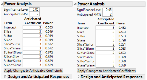
The power values for the actual design are uniformly smaller than for the intended design. For Silica and Sulfur, the power of the tests in the intended design is almost twice the power in the actual design. For the Silica*Sulfur interaction, the power of the test in the actual design is 0.231, compared to 0.672 in the intended design. The actual design results in substantial loss of power in comparison with the intended design.
Prediction Variance Profile
1. In each window, open the Prediction Variance Profile outline.
2. In the window for the actual design, place your cursor on the scale for the vertical axis. When your cursor becomes a hand, right-click. Select Edit > Copy Axis Settings.
This action creates a script containing the axis settings. Next, apply these axis settings to the Prediction Variance Profile plot for the intended design.
3. In the Evaluate Design window for the intended design, locate the Prediction Variance Profile outline. When your cursor becomes a hand, right-click. Select Edit > Paste Axis Settings.
The plots are shown in Figure 15.5, with the plot for the intended design at the top and for the actual design at the bottom.
Figure 15.3 Prediction Variance Profile, Intended Design (Top) and Actual Design (Bottom)
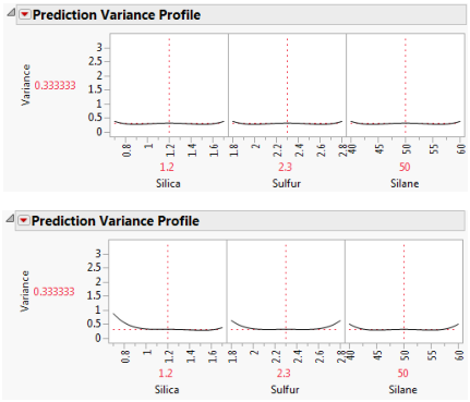
The Prediction Variance Profile plots are profiler views of the relative prediction variance. You can explore the relative prediction variance in various regions of design space.
Both plots show the same relative prediction variance in the center of the design space. However, the variance for points near the edges of the design space appears greater than for the same points in the intended design. Explore this phenomenon by moving all three vertical lines to points near the edges of the factor settings.
4. In both windows, click the Prediction Variance Profile red triangle and select Maximize Variance.
Figure 15.4 shows the maximum relative prediction variance for the intended and actual designs.
Figure 15.4 Prediction Variance Profile Maximized, Intended Design (Top) and Actual Design (Bottom)
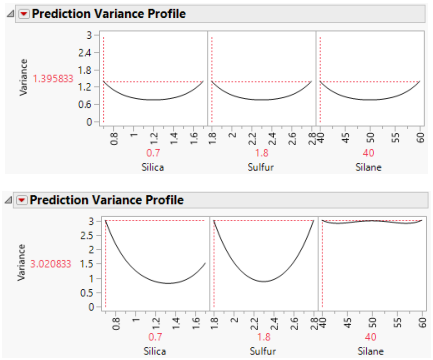
For both designs, the profilers identify the same point as one of the design points where the maximum prediction variance occurs: Silica=0.7, Sulfur=1.8, and Silane=40. The maximum prediction variance is 1.396 for the intended design, and 3.021 for the actual design. Note that there are other points where the prediction variance is maximized. The larger maximum prediction variance for the actual design means that predictions in parts of the design space are less accurate than they would have been had the intended design been conducted.
Fraction of Design Space Plot
1. In each window, open the Fraction of Design Space Plot outline.
2. In the window for the intended design, right-click in the plot and select Edit > Copy Frame Contents.
3. In the window for the actual design, locate the Fraction of Design Space Plot outline.
4. Right-click in the plot and select Edit > Paste Frame Contents
Figure 15.5 shows the plot with annotations. Each Fraction of Design Space Plot shows the proportion of the design space for which the relative prediction variance falls below a specific value.
Figure 15.5 Fraction of Design Space Plots
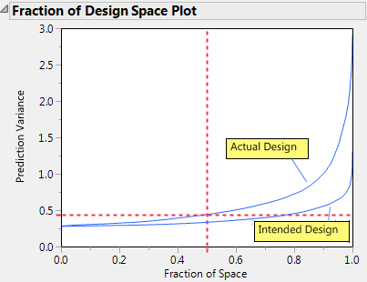
The relative prediction variance for the actual design is greater than that of the intended design over the entire design space. The discrepancy increases with larger design space coverage.
Estimation Efficiency
In each window, open the Estimation Efficiency outline.
Figure 15.6 Estimation Efficiency Outlines, Intended Design (Left) and Actual Design (Right)
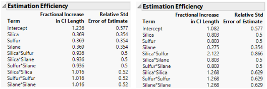
In the actual design (right), the relative standard errors for all parameters either exceed or equal the standard errors for the intended design (left). For all except three of the non-intercept parameters, the relative standard errors in the actual design exceed those in the intended design.
The Fractional Increase in CI Length compares the length of a parameter’s confidence interval as given by the current design to the length of such an interval given by an ideal design of the same run size. The length of the confidence interval, and consequently the Fractional Increase in CI Length, is affected by the number of runs. See Fractional Increase in CI Length. Despite the reduction in run size, for the actual design, the terms Silane, Silica*Silane, and Sulfur*Silane have a smaller increase than for the intended design. This is because the two runs that were removed to define the actual design had Silane set to its center point. By removing these runs, the widths of the confidence intervals for these parameters more closely resemble those of an ideal orthogonal design, which has no center points.
Color Map on Correlations
In each report, do the following:
1. Open the Color Map On Correlations outline.
The two color maps show the effects in the Model outline. Each plot shows the absolute correlations between effects colored using the JMP default white to black intensity scale. Ideally, you would like zero or very small correlations between effects.
Figure 15.7 Color Map on Correlations, Intended Design (Left) and Actual Design (Right)
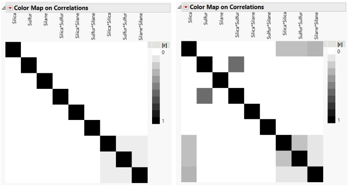
The absolute values of the correlations range from 0 (white) to 1 (black). Hover over a cell to see the value of the absolute correlation. The color map for the actual design shows more absolute correlations that are large than does the color map for the intended design. For example, the correlation between Sulfur and Silica*Sulfur is < .0001 for the intended design, and 0.5774 for the actual design.
Design Diagnostics
In each report, open the Design Diagnostics outline.
Figure 15.8 Design Diagnostics, Intended Design (Left) and Actual Design (Right)
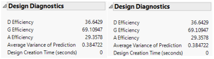
The intended design (left) has higher efficiency values and a lower average prediction variance than the actual design (right). The results of the Design Evaluation analysis indicate that the two lost runs have had a negative impact on the design.
Note that both the number of runs and the model matrix factor into the calculation of efficiency measures. In particular, the D-, G-, and A- efficiencies are calculated relative to the ideal design for the run size of the given design. It is not necessarily true that larger designs are more efficient than smaller designs. However, for a given number of factors, larger designs tend to have smaller Average Variance of Prediction values than do smaller designs. For more information on how efficiency measures are defined, see Design Diagnostics.