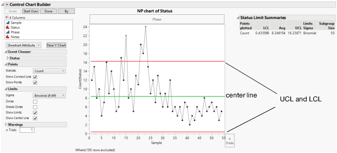
Control Chart Builder Window
The analysis produces a chart that can be used to determine whether a process is in a state of statistical control. The report varies depending on which type of chart you select. Control charts update dynamically as data is added or changed in the data table. Figure 3.7 displays the Control Chart Builder window for the Bottle Tops.jmp sample data table.
To create the chart:
1. Select Help > Sample Data Library and open Quality Control/Bottle Tops.jmp.
2. Select Analyze > Quality and Process > Control Chart Builder.
3. Drag Status to the Y zone.
4. Drag Sample to the Subgroup zone (at bottom).
Figure 3.7 Control Chart Builder Window
You can drag other variables into the various zones to augment the analysis and use the Control Chart Builder Options to further examine the data. Some of the right-click chart options (for example, show or hide points, limits, warnings, and zones; select statistic and sigma options) also appear on the left hand side of the chart for easy access.
Control charts have the following characteristics:
• Each point plotted on the chart represents an individual process measurement or summary statistic. Subgroups should be chosen rationally, that is, they should be chosen to maximize the probability of seeing a true process signal between subgroups.
• The vertical axis of a control chart is scaled in the same units as the summary statistic.
• The horizontal axis of a control chart identifies the subgroup samples and is time ordered. Observing the process over time is important in assessing if the process is changing.
The green line is the center line, or the average of the data. The center line indicates the average (expected) value of the summary statistic when the process is in statistical control. Measurements should appear equally on both sides of the center line. If not, this is possible evidence that the process average is changing.
• The two red lines are the upper and lower control limits, labeled UCL and LCL. These limits give the range of variation to be expected in the summary statistic when the process is in statistical control. If the process is exhibiting only routine variation, then all the points should fall randomly in that range.
Note: You can hide the lower control limits on dispersion, attribute, and rare event charts by deselecting the Show Lower Control Limit preference in File > Preferences > Platforms > Control Chart Builder.
• A point outside the control limits signals the presence of a special cause of variation.
Options in the Control Chart Builder window create control charts that can be updated dynamically as samples are received and recorded or added to the data table. When a control chart signals abnormal variation, action should be taken to return the process to a state of statistical control if the process degraded. If the abnormal variation indicates an improvement in the process, the causes of the variation should be studied and implemented.
When you double-click the axes, the appropriate Axis Specification window appears for you to specify the format, axis values, number of ticks, gridline, reference lines, and other options to display.