Example of a Contour Plot with a Color Variable
This example uses body fat data collected from men. You want to get an understanding of how the relationship between abdomen circumference and thigh circumference varies by weight.
1. Select Help > Sample Data Library and open Body Fat.jmp.
2. Right-click row 1 and select Hide and Exclude.
The data in this row is an outlier, which is why we want to hide and exclude it from the graph.
3. Select Graph > Graph Builder.
4. Select Abdomen circumference and drag it to the Y zone.
5. Select Thigh circumference and drag it to the X zone.
6. Select Weight (lbs) and drag it to the Color zone.
7. Click the Contour element ![]() .
.
8. Drag the Points element into the plot.
9. In the Points options under Variables, de-select Color Weight (lbs).
10. (Optional) Click Done.
Figure 4.4 Contour Plot with a Color Variable
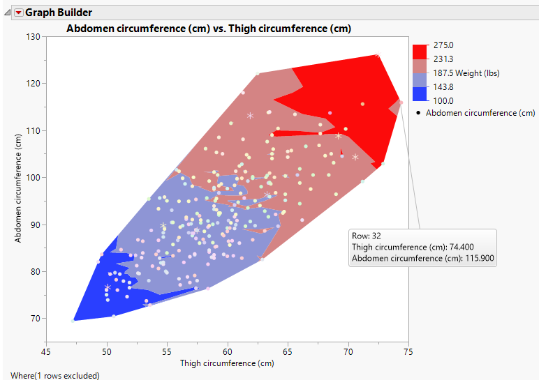
The contour colors correspond to the weight, as shown in the Weight (lbs) legend. The graph shows that thigh and abdomen circumference are related; as one increases, so does the other. The colored contours indicate how weight fits in the relationship. Individuals with large measurements of abdomen and thigh circumference are also generally the heaviest. Notice that one individual (row 32) does not quite fit the pattern.