Example of a Contour Plot
You have data about diamonds, including their carat weight and price. Examine the relationship between carat weight and price.
1. Select Help > Sample Data Library and open Diamonds Data.jmp.
2. Select Graph > Graph Builder.
3. Select Price and drag it to the Y zone.
4. Select Carat Weight and drag it to the X zone.
Figure 4.2 Points Showing Diamond Characteristics
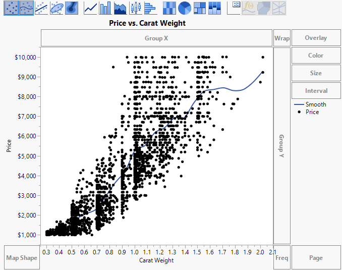
You can see that the points are difficult to interpret. Some points overlap, making the density unclear.
Replace the points with a contour plot of their density.
5. Right-click the plot and select Points > Change to > Contour.
6. (Optional) Click Done.
Figure 4.3 Contour Plot of Diamond Characteristics
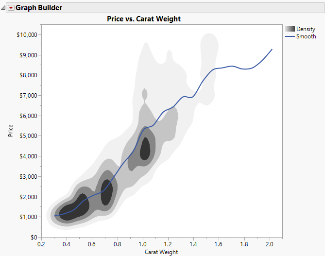
The darker areas indicate a higher density of observations. Use the crosshairs tool to verify the following:
• Most people in the sample purchased diamonds with a carat weight of about 0.34 to 0.57, 0.67 to 0.75, and 0.97 to 1.05.
• Most people who purchased diamonds with a carat weight around 0.5 paid about $100-$2,000.
• Most people who purchased diamonds with a carat weight of 0.70 paid about $1,600-$2,700.
• Most people who purchased diamonds with a carat weight of 1.0 paid about $3,800-$4,800.