Example of a Packed Bar Chart
The following example uses NOAA data on weather and climate events in the U.S. that had the greatest economic impact during the years 1980 to 2018.
1. Select Help > Sample Data Library and open Billion Dollar Events.jmp.
2. Select Graph > Graph Builder.
3. Select Unique Event and drag it to the Y zone.
4. Select Cost and drag it to the X zone.
5. Select the Bar element  .
.
6. In the Bar options panel:
a. For the Bar Style, select Packed.
b. Change Packed Primaries to 10.
c. Move the Packed Labeling slider down until it’s about halfway.
Figure 4.13 Most Costly Events in a Packed Bar Chart
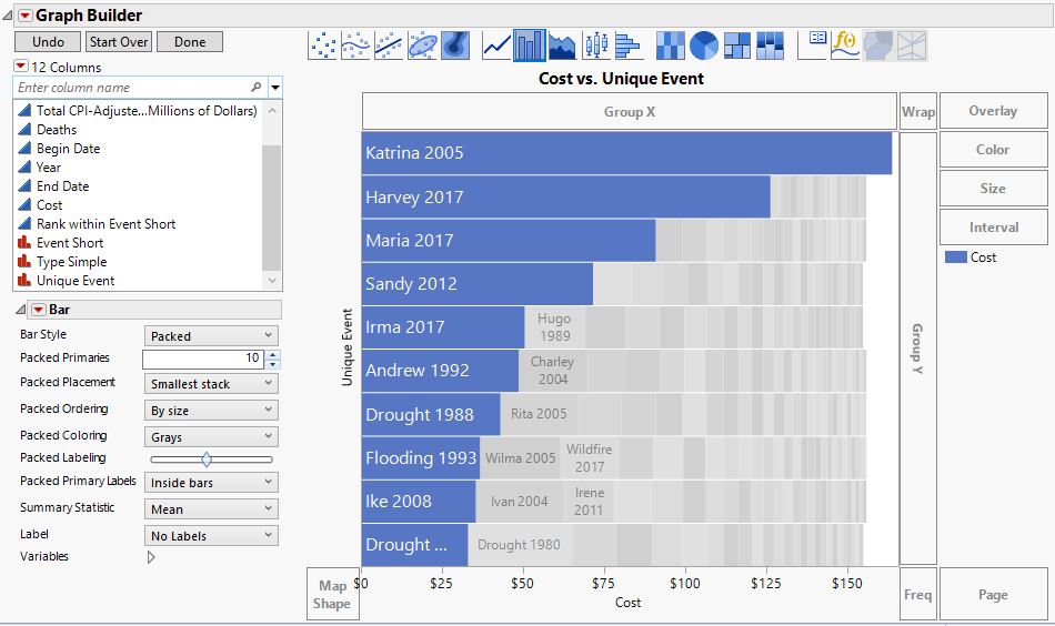
The top categories appear as a bar chart with blue bars. Secondary categories are labeled and in gray. You can hover over any event for more details.
In this example, you can clearly see that Katrina in 2005 had the largest impact, followed by Harvey and Maria in 2017.