Example of a Violin Plot
This example uses fuel economy data collected for hybrid cars. You want to get an understanding of how the distributions of highway miles per gallon (Hwy MPG) and city miles per gallon (City MPG) differ by engine type.
1. Select Help > Sample Data Library and open Hybrid Fuel Economy.jmp.
2. Select Graph > Graph Builder.
3. Select Engine and drag it to the X zone.
4. Select City MPG and drag it to the Y zone.
5. Select Hwy MPG and drag it to the top of the Y zone.
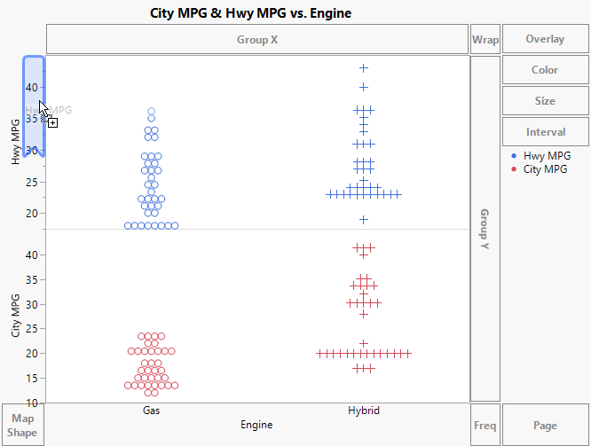
Figure 4.5 Dragging Hwy MPG to the Y Zone
6. Press Ctrl, select the Contour element ![]() , and drag it into the graph.
, and drag it into the graph.
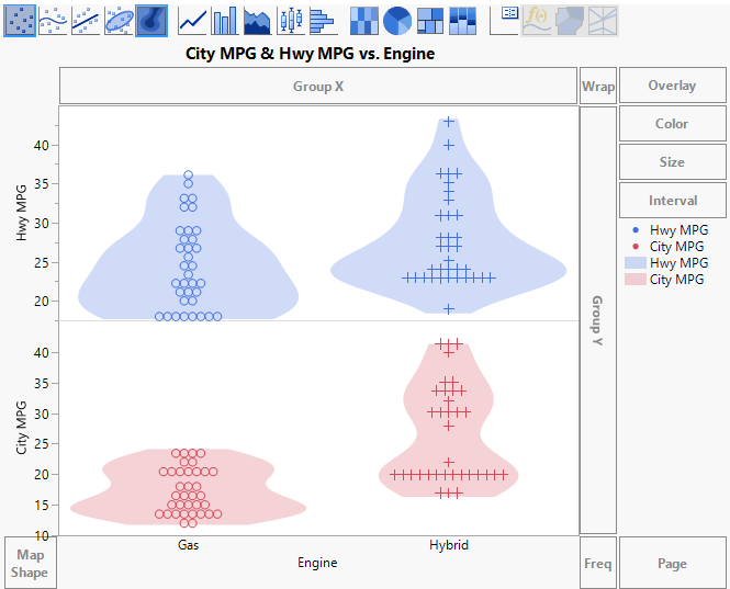
Figure 4.6 Points and Violin Plot
7. (Optional) Click Done.
The violin plots are essentially one-dimensional contour plots. They show density outlines of the observations and give information similar to what a histogram or box plot would provide. In this example, the violin plots show you the individual distributions for city and highway MPG for both engine types. You can see that the difference in City MPG for gas and hybrid vehicles is greater than the difference in Hwy MPG.