 Example of Functional Data Explorer
This example analyzes weekly weather data collected from 16 weather stations across the United States. Run the Weather Station Locations script in the data table to view a map of the locations. Daily temperatures are summarized as weekly averages. Not every weather station has a weekly temperature measurement for every week of the year. This is an example of sparse functional data.
1. Select Help > Sample Data Library and open Functional Data/Weekly Weather Data.jmp.
2. Select Analyze > Specialized Modeling > Functional Data Explorer.
3. Select TMAX and click Y, Output.
4. Select Week of Year and click X, Input.
5. Select NAME and click ID, Function.
6. Click OK.
Figure 15.2 Initial Functional Data Explorer Report
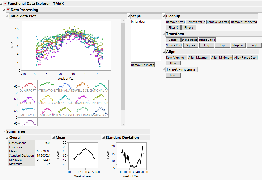
The initial Functional Data Explorer report contains plots of the raw data, summary statistics, and summary plots for the functional mean and functional standard deviation of the data. There are also buttons for data processing options. Data processing options are also accessible from the Data Processing red triangle menu. Prior to modeling, it is often a good idea to standardize your output data.
7. Click the Standardize button under the Transform menu.
The data plots and summary statistics are updated based on the specified transformation. Standardized is added to the Steps list.
8. Click the Functional Data Explorer red triangle and select Models > Fourier Basis.
Figure 15.3 Fourier Basis Model Report
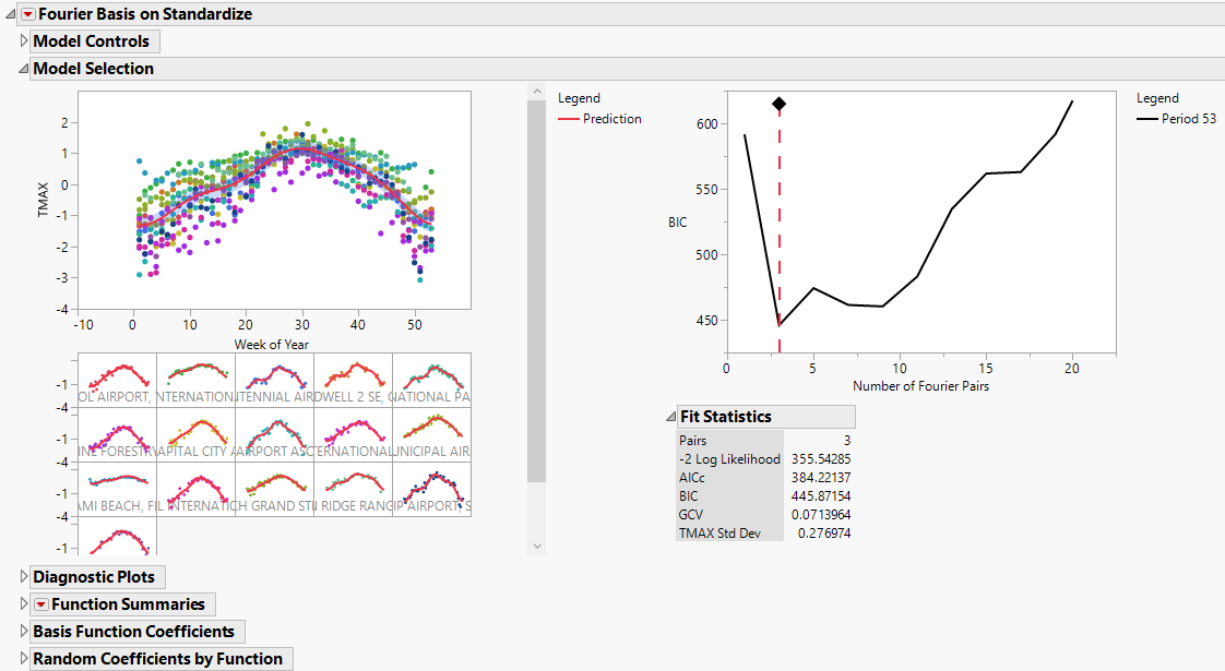
The Fourier Basis report includes several reports that contain information about the selected model. In the Model Selection report, the displayed model is the best fitting model according to the BIC fit criterion. For the weather data, the Fourier Basis model that is chosen has a period of 53 and three basis function pairs. Fit statistics and coefficients are also available for the model. Scroll down to view the Functional PCA report.
Figure 15.4 Functional PCA Report
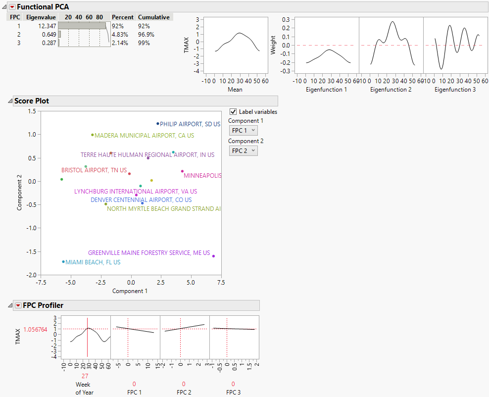
The Functional PCA report shows that while it takes three eigenvalues to explain almost 99% of the variation in the data, the first eigenvalue alone explains 92%. You can use the score plot to detect functions that are outliers from the other functions. In the score plot, most of the locations are clustered together except for the Miami Beach, FL US and Greenville Maine Forestry Service, ME US locations. Scroll to the individual function plots. The function for the Miami Beach location is flatter, indicating less temperature variability than the rest of the locations. The function for the Greenville Forestry location has a lower maximum, indicating consistently colder temperatures than the rest of the locations.
Tip: Deselect the Label variables option in the Score Plot report to better identify outliers.