Example of Overlaying Histograms with Transparency
You are interested in finding out how blood pressure is related to a measure of diabetes disease progression. Progression can be Low or High. To see the relationship between blood pressure and disease progression, overlay histograms for these two responses.
1. Select Help > Sample Data Library and open Diabetes.jmp.
2. Select Graph > Graph Builder.
3. Select BP and drag it to the Y zone.
4. Select Y Binary and drag it to the Overlay zone.
5. Click the Histogram element icon ![]() .
.
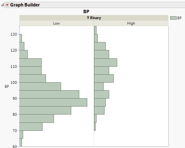
Figure 4.32 Blood Pressure Histograms Overlaid by the Levels of Y Binary
The histograms indicate that higher blood pressure readings are associated with the High level of disease severity.
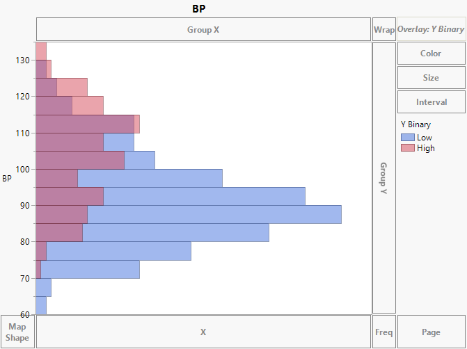
6. Click the Overlay zone and drag Y Binary to the Group X zone.
7. (Optional) Click Done.
Figure 4.33 Individual Blood Pressure Histograms for the Levels of Y Binary
Now you see individual histograms for each of the severity levels.
Overlaid histograms can be useful in seeing overlap, as well as differences, in responses over a small number of categories.