Example of Wafer Maps Based on a Cluster Analysis
In this example, you have defect data on wafers. The X Die and Y Die columns give a location on the die, and Defects gives the number of defects at each location. Because die defects often occur in patterns, you use cluster analysis to cluster wafers into groups that might have the same type of defect pattern. Once you have done this, you want to visualize the defect patterns for each cluster.
1. Select Help > Sample Data Library and open Wafer Stacked.jmp.
2. Run the Spatial Cluster of Defects script.
This script fits a hierarchical cluster analysis model that includes spatial measures (Angle, Radius, Streak Angle, and Streak Distance). See Spatial Measures in Multivariate Methods.
3. Click the Hierarchical Clustering red triangle and select Save Clusters.
Seven clusters are constructed. The cluster numbers are saved to a column called Cluster in the Wafer Stacked.jmp data table.
4. Go back to Wafer Stacked.jmp.
5. Select Graph > Graph Builder.
6. Select X_Die and drag it to the X zone.
7. Select Y_Die and drag it to the Y zone.
8. Deselect the Smoother element  and click the Points element
  .
.
9. Select Cluster and drag it to the Wrap zone.
Because there are seven clusters, there are seven plots.
10. Select Defects and drag it to the Color zone.
11. Click the Heatmap element ![]() .
.
Figure 4.34 Locations Colored by Mean Defects for Each Cluster
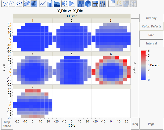
The heatmap is colored by the mean number of Defects.
12. Right-click the color bar in the legend and select Gradient.
13. Select Log for Scale Type.
This scale is linear for the logarithm of Defects. Because the distribution of Defects is highly skewed, using the Log scale highlights the variation patterns, but at the expense of being able to easily compare magnitudes in the original scale.
14. Click OK.
15. (Optional) Click Done.
Figure 4.35 Heatmap for Wafer Clusters
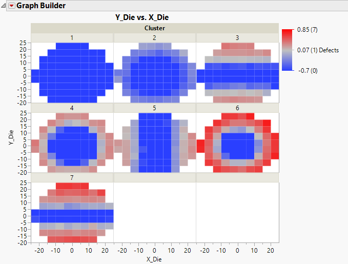
The plots show various patterns of defects. Notice that these same plots also appear in the Hierarchical Clustering report’s Cluster Summary outline.