Example Using a Formula
In this example, you have data on the US population between 1790 and 2000. You fit a nonlinear model to the US population as a function of year and you want to plot this nonlinear formula.
1. Select Help > Sample Data Library > Nonlinear Examples and open US Population.jmp.
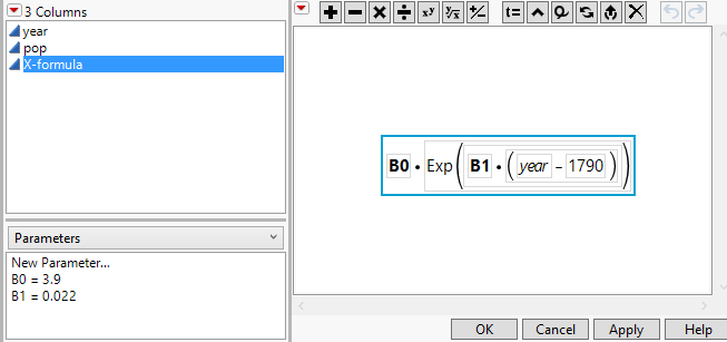
2. In the Columns panel, click the formula icon ![]() next to X-formula.
next to X-formula.
The formula appears in the formula editor panel. The values of the parameters B0 and B1 appear in the Parameters panel on the left. Use the function element to plot this formula.
Figure 4.43 Formula for Nonlinear Fit to Population
3. Click Cancel.
4. Select Graph > Graph Builder.
5. Select year and drag it to the X zone.
6. Select X-formula and drag it to the Y zone.
Figure 4.44 Points for Function Evaluated at Specified Years, with Smoother
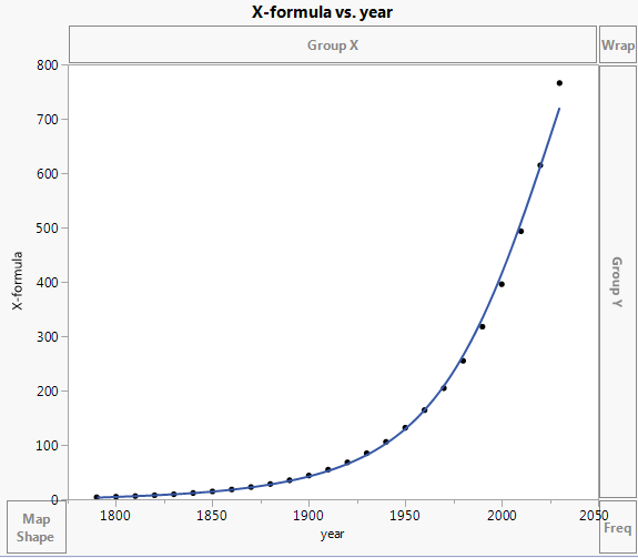
Points are plotted for the years up to 2030. The points are the values of the function, X-formula, evaluated at the years in the year column. The function can be evaluated at the years for which pop is missing: 2010, 2020, and 2030. The smoother that is shown is only an approximation to the function. You want to see the function itself.
7. Click the Formula element  .
.
Figure 4.45 Graph of Function
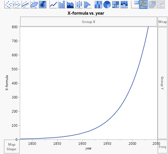
The Smoother and points are removed and a plot of the function itself appears. The function extends indefinitely to future years.
Next, rescale the axes to see the function plotted even further into the future.
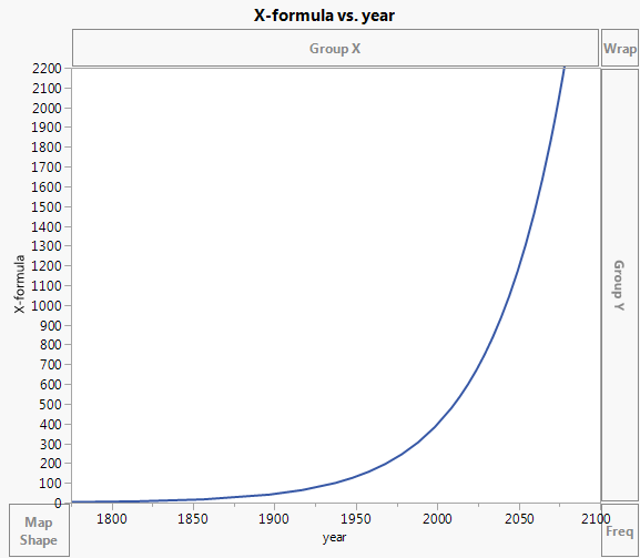
8. Double-click the Y axis.
9. In the Y Axis Settings window, enter 2200 for the Maximum value, and then click OK.
10. Double-click the X axis.
11. In the X Axis Settings window, enter 2100 for the Maximum value, and then click OK.
Figure 4.46 Graph of Function to Year 2100
To see that this function predicts the US population to be about 2,200 million people in the year 2078, you could use the crosshairs tool. But to see this more clearly, plot a reference line at year 2078.
12. Double-click the X axis.
13. In the Reference Lines panel, type 2078 next to Value and also next to Label.
14. Click Add.
15. Click OK.
Figure 4.47 Projected US Population at Year 2078
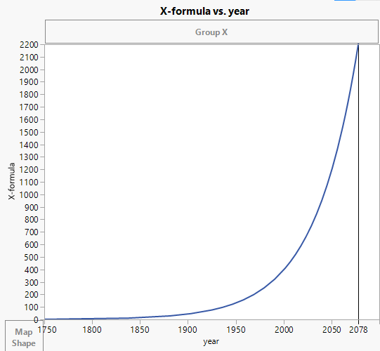
With the reference line, it is easy to see that at year 2078, the US population is projected to be about 2,200 million.
But you realize that making predictions based on this model for the year 2078 is dangerous extrapolation much beyond the range of the data. To see this clearly, add the population values for the years for which you have data to your plot.
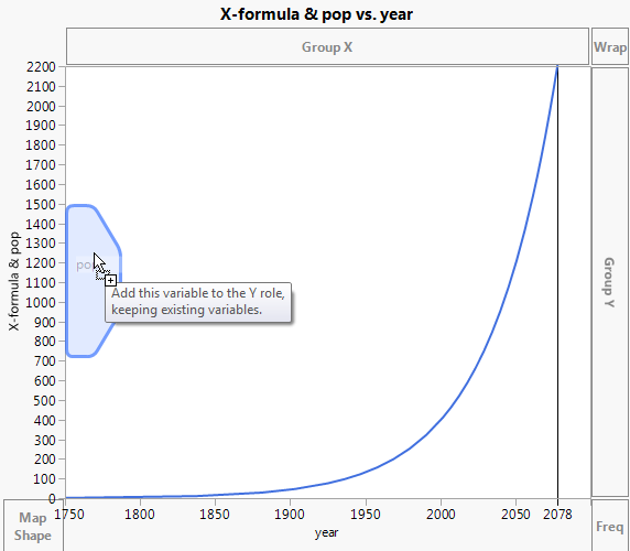
16. Drag pop just inside the Y axis to merge it with X-formula in the Y zone.
Figure 4.48 Merging pop with X-formula in the Y Zone
17. Drag the Bar element ![]() into the plot.
into the plot.
Figure 4.49 Bars Showing Values for pop and X-formula
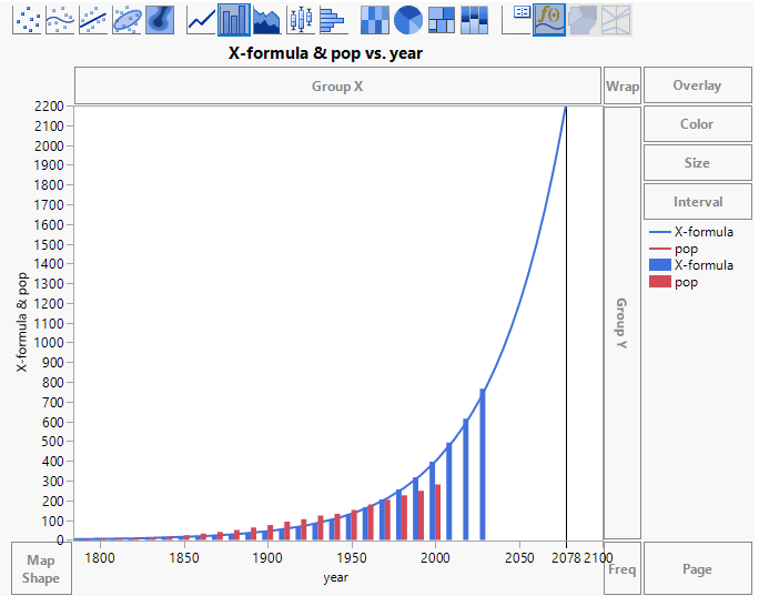
The height of each blue bar is the projected value of the US population for the given year. The height of each red bar is the actual US population. These are plotted for the years where you have data. Notice that the year 2078 is well beyond the range of years for which you have data.
18. In the Bar options, click Variables and de-select Y X-formula.
The plot now shows only the function and bars that represent the actual population in the years for which you have data.
19. (Optional) Click Done.
Figure 4.50 Model Predictions to Year 2078 and Bars for Years with Data
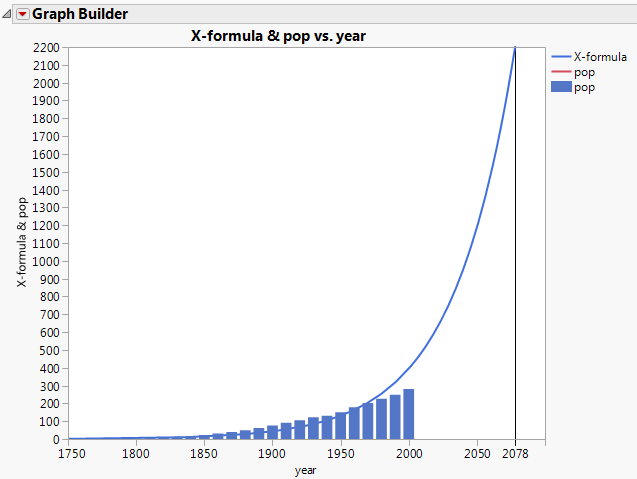
You plotted the nonlinear function that was fit to the data from 1790 to 2000. You added bars showing the population for years for which you have data, which helps you see that using this function to predict values in the distant future is unwise.