Example Using a Heatmap to Apply Background Colors
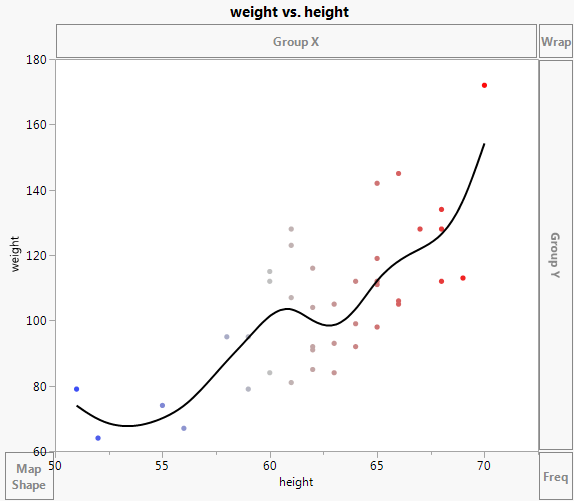
You can use a heatmap to apply a background color when you use the Wrap or Group zones. In this example, using height, weight, and age data from children, you color age panels using a height legend.
1. Select Help > Sample Data Library and open Big Class.jmp.
2. Select Graph > Graph Builder.
3. Select height and drag it to the X zone.
4. Select weight and drag it to the Y zone.
5. Select height and drag it to the Color zone.
Figure 4.36 Graph of height and weight Colored by height
6. Select the Heatmap element ![]() .
.
7. Drag the Smoother element  into the plot.
8. Drag the Points element  into the plot.
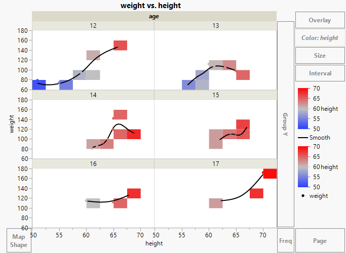
9. Select age and drag it to the Wrap zone.
Figure 4.37 Heatmap, Smoother, and Points, Wrapped by age
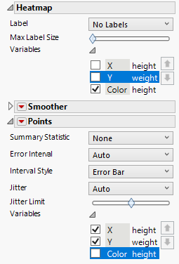
10. In the Heatmap options, click Variables. De-select X height and Y weight.
11. In the Points options, click Variables. De-select Color height.
Figure 4.38 Variables Options
12. Double-click the X axis for height. In the X Axis Settings window, change the Minimum to 40, and click OK.
13. Double-click the Y axis for weight. In the Y Axis Settings window, change the Maximum to 200, and click OK.
13. (Optional) Click Done.
Figure 4.39 Scatterplots by Age with Background Color Showing Height
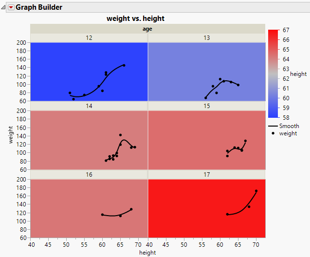
The panel colors are based on the average heights for students in each age group. As expected, the tallest students are the 17-year-olds. The plot in that panel shows how their weights vary by height.