Visualizing the Sphere-Packing Design
To visualize the nature of the Sphere-Packing technique, create a plot with Graph Builder. Using the table you just created, proceed as follows:
1. Select Graph > Graph Builder.
2. Specify X1 as X and X2 as Y.
3. Adjust the frame size so that the frame is square by right-clicking the plot and selecting Graph > Size/Scale > Size to Isometric.
4. Right-click the plot and select Customize. When the Customize panel appears, click the plus sign to see a text edit area and enter the following script:
For Each Row(Circle({:X1, :X2}, 0.518/2))
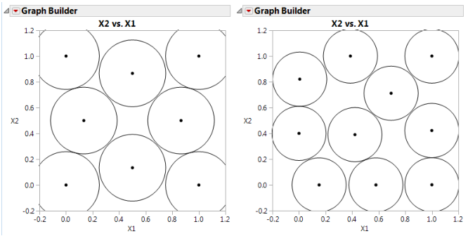
where 0.518 is the minimum distance number that you noted in the Design Diagnostics panel. This script draws a circle centered at each design point with radius 0.259 (half the diameter, 0.518), as shown on the left in Figure 21.9. This plot shows the efficient way JMP packs the design points.
5. Now repeat the procedure exactly as described in the previous section, but with a sample size of 10 instead of eight.
Remember to change 0.518 in the graphics script to the minimum distance produced by 10 runs. When the plot appears, again set the frame size and create a graphics script using the minimum distance from the diagnostic report as the diameter for the circle. You should see a graph similar to the one on the right in Figure 21.9. Note the irregular nature of the sphere packing. In fact, you can repeat the process a third time to get a slightly different picture because the arrangement is dependent on the random starting point.
Figure 21.9 Sphere-Packing Example with Eight Runs (left) and 10 Runs (right)