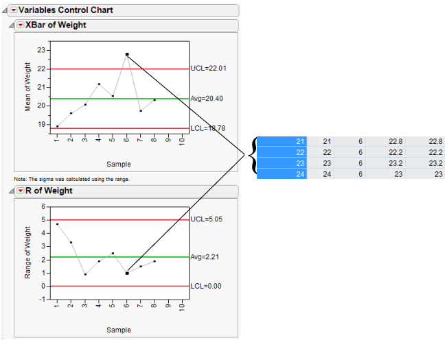
XBar Chart and R Chart Example
The following example uses the Coating.jmp data table. The quality characteristic of interest is the Weight column. A subgroup sample of four is chosen. An XBar chart and an R chart for the process are shown in Figure 12.18.
1. Select Help > Sample Data Library and open Quality Control/Coating.jmp.
2. Select Analyze > Quality and Process > Legacy Control Charts > XBar.
Note the selected chart types of XBar and R.
3. Select Weight and click Process.
4. Select Sample and click Sample Label.
5. Click OK.
Sample six indicates that the process is not in statistical control. To check the sample values, click the sample six summary point on either control chart. The corresponding rows highlight in the data table.
Note: If an S chart is chosen with the XBar chart, then the limits for the XBar chart are based on the standard deviation. Otherwise, the limits for the XBar chart are based on the range.
Figure 12.18 Variables Charts for Coating Data
6. Right-click in the XBar of Weight plot and select Chart Options > Box Plots.
7. Double-click the Y axis (Mean of Weight) and change the Minimum value to 16, and then click OK.
Figure 12.19 Box Plots for Coating Data
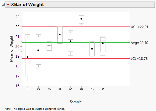
The box plots show that the sixth sample has a small range of high values.