Contour
The Contour element ![]() shows regions of density (or value contours when used with a Color variable). Density contours are useful when you have a scatterplot with many points where the mass of points makes it difficult to see patterns in density. Multiple contour types are available. The default is a smooth bivariate nonparametric density surface that is fit to reflect the density of the data points. The nonparametric density surface estimates the bivariate probability density function at each point, providing a continuous analog of a bivariate histogram.
shows regions of density (or value contours when used with a Color variable). Density contours are useful when you have a scatterplot with many points where the mass of points makes it difficult to see patterns in density. Multiple contour types are available. The default is a smooth bivariate nonparametric density surface that is fit to reflect the density of the data points. The nonparametric density surface estimates the bivariate probability density function at each point, providing a continuous analog of a bivariate histogram.
• For two continuous variables, four contours are plotted by default. These contours are 100%, 75%, 50%, and 25% density contours. You can specify the number of contour levels to display. Alternatively, you can select a Bagplot or High Density Region (HDR) contours.
• For only one continuous variable, a violin plot appears instead of a contour plot. A violin plot illustrates the density of the data by plotting symmetric kernel densities around a common vertical axis. The kernel density estimates the probability density function at each point, providing a continuous analog of the histogram. The violin plot is similar to a box plot with symmetric kernel densities replacing the box and whiskers. Alternatively, you can select High Density Region (HDR) contours.
• If you add a Color variable to a Contour plot, the plot shows value contours that reflect the levels of the Color variable. The value contours are computed using Delaunay triangulation. You can select an option (Transform) to show a plot where the X and Y ranges have been normalized.
Contour Options
Figure 3.29 Contour Options for a Contour Plot or a Violin Plot
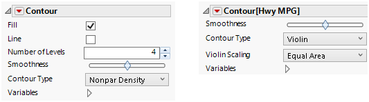
Fill
(Not available for Bagplots.) Fills in the contours.
Line
(Not available for Bagplots.) Adds lines around the contours.
Number of Levels
(Available for Nonpar Density.) For density contours, specifies the number of contours that appear. The number can be between 1 and 1000, the default is 4 contours.
Boundary
(Available only when you have a Color variable.) Adds a line around the outside boundary of the contour.
Alpha
(Available only when you have a Color variable.) Controls the hull of value contours. Increasing alpha can eliminate some of the long, skinny, or large triangles where interpolation may be undesirable.
Smoothness
(Not available for Bagplots.) Smooths the underlying data and the contours.The smoother is a normalized value between -1 and 1. The value given can be interpreted as a smoothing radius. The original data is interpolated to a grid, and then a Gaussian smoother is applied.
Transform
(Available only when you have a Color variable.) Transforms the triangulation to use a normalized scale for X and Y by selecting Range Normalized. This causes both the X and Y values to be scaled to [0,1] before computing the Delaunay triangulation. This option might be desirable in cases where the X and Y units are very different. In these cases, if points are stretched in one dimension and not the other, Delaunay triangulation tries to minimize long, skinny triangles, which can obscure some features.
Contour Type
Enables selection of contour types
Nonpar Density
A smooth bivariate nonparametric density surface.
Bagplot
Draws a Bagplot, also known as a bivariate boxplot. A Bagplot consists of two polygons, a set of outlier points, and a median point. All computations are based on first computing the Tukey depth (bivariate depth) of each point in the data. The median point is the average of all points at maximum depth, which is plotted as an asterisk. The inner polygon is the bag, which contains at most 50% of the data points. Not shown in the plot is the fence, which is the bag polygon inflated three times relative to the median point. The outer polygon is the convex hull of all points contained within the fence. This is referred to as the loop. Points that lie outside the fence are designated outliers, and are shown as points on the plot. For more information about Bagplots, see Rousseeuw (1999).
HDR
Draws a high density region contour. These are shaded regions for the 99% probability region and the 50% probability region, Outliers are shown for items that fall outside of the threshold. For more information about high density regions see Hyndman (1996).
Violin
Draws violin plot of the density of the data by plotting symmetric kernel densities around a common vertical axis.
Outliers
(Available for Bagplot and HDR contours.) Plots outliers.
Violin Scaling
For multiple violin plots, choose a scaling option. Equal area or width means that the areas or maximum width of the violins are the same. Weighted area means that the areas of the violins are proportional to the number of observations in each violin.
Variables
Shows or hides graph elements for variables, or re-orders the display of variables.
Note: These options do not apply to variables in the Group X, Group Y, Wrap, or Page zones.
Check boxes are followed by the zone designation and the name of the variable. Use check boxes to do the following:
– Show or hide the elements corresponding to a variable in a zone.
– Add or remove the effect of applying the Color, Size, Shape, or Freq variable to the variable in the zone.
Tip: If you have multiple graphs, you can color or size each graph by different variables. Drag a second variable to the Color or Size zone, and drop it in a corner. In the Variables option, select the specific color or size variable to apply to each graph.
Use arrows to re-order the display if there are multiple variables in a zone. Highlight a variable name and click an arrow to reposition it.
For an example using Variables, see Example of an Area and Line Chart in the Graph Builder Examples section.
Red Triangle Option for Contour
Adapt to Axis Scale
For log and other axis transformations, applies computations on the transformed coordinates.