Example of a Bubble Plot with a Categorical Y Variable
All of the examples shown so far use continuous Y variables. If you use a categorical (nominal or ordinal) Y variable, the bubble plot appears differently.
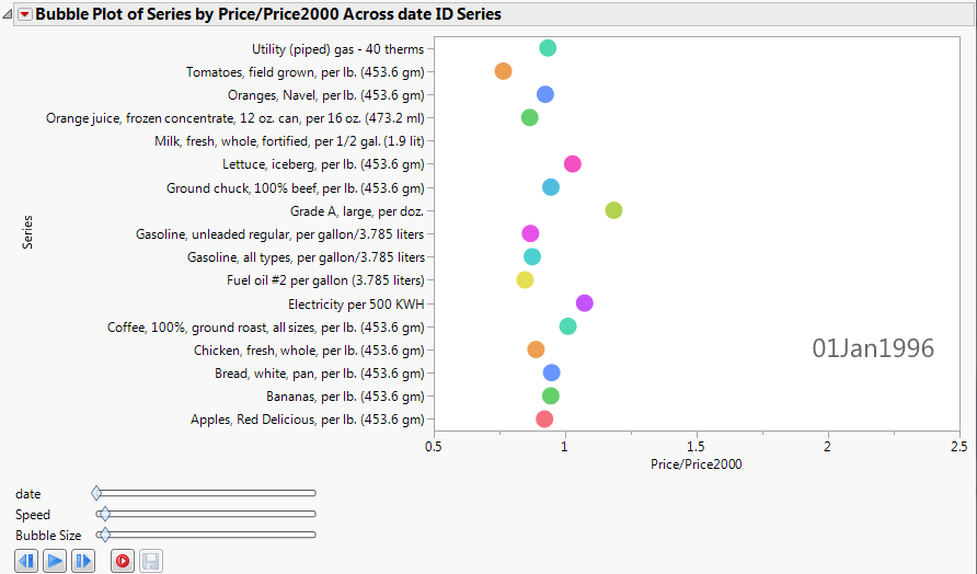
This example uses the blsPriceData.jmp sample data table, which shows the price of commodities over several years. Because the value of the US dollar changes over time, a column named Price/Price2000 shows the ratio of a commodity’s price at any given time to the price in the year 2000.
1. Select Help > Sample Data Library and open blsPriceData.jmp.
2. Select Graph > Bubble Plot.
3. Select Series and click Y.
4. Select Price/Price2000 and click X.
5. Select date and click Time.
6. Click OK.
The report window appears. (Figure 5.15 uses the JMP default colors.)
This produces a bubble plot that, when animated by clicking the play button, shows the price bubbles moving side to side according to their price ratio.
Figure 5.15 Static Example of Animated Bubbles
For easier readability, add grid lines as follows:
7. Double-click the categorical axis.
8. In the Y Axis Settings window, select Show Grid.
9. Click OK.
To animate the bubble plot, click the play button. The price bubbles move side to side, according to their price ratio.