Graph Builder
Use Graph Builder to interactively create and modify graphs. Most graphs in JMP are created by launching a platform and specifying variables. If you want to create a different type of graph, you launch a specific platform from the Graph menu. However, with Graph Builder, you can change the variables and change the type of graph at any time.
Use Graph Builder to accomplish the following tasks:
• Change variables by dragging and dropping them in and out of the graph.
• Create a different type of graph with a few mouse clicks.
• Partition the graph horizontally or vertically.
Figure 4.21 Example of a Graph That Was Created with Graph Builder
Note: Only some of the Graph Builder features are covered here. See Graph Builder in Essential Graphing.
Scenario
This example uses the Profit by Product.jmp data table, which contains profit data for multiple product lines.
A business analyst wants to explore the following question:
• How is the profitability different between product lines?
To answer this question, use a line plot that displays revenue, product cost, and profit data across different product lines.
Create the Graph
1. Select Help > Sample Data Library and open Profit by Product.jmp.
2. Select Graph > Graph Builder.
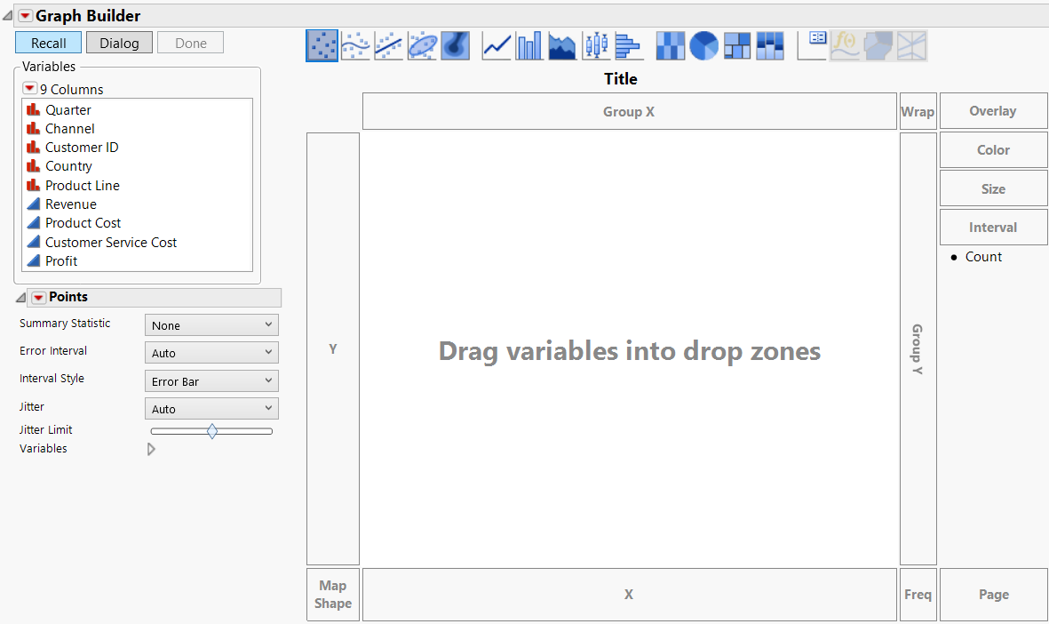
Figure 4.22 Graph Builder Workspace
3. Click Quarter and then drag and drop it onto the X zone to assign Quarter as the X variable.
4. Click Revenue, Product Cost, and Profit, and drag and drop them onto the Y zone to assign all three variables as Y variables.
The X and Y zones are now axes.
Note: You can also click variables and then click a zone to assign them. However, after a zone becomes an axis, drag and drop additional variables onto the axis rather than clicking on the variables and axis.
Figure 4.23 After Adding Y and X Variables
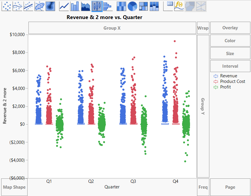
Based on the variables that you are using, Graph Builder shows side-by-side box plots.
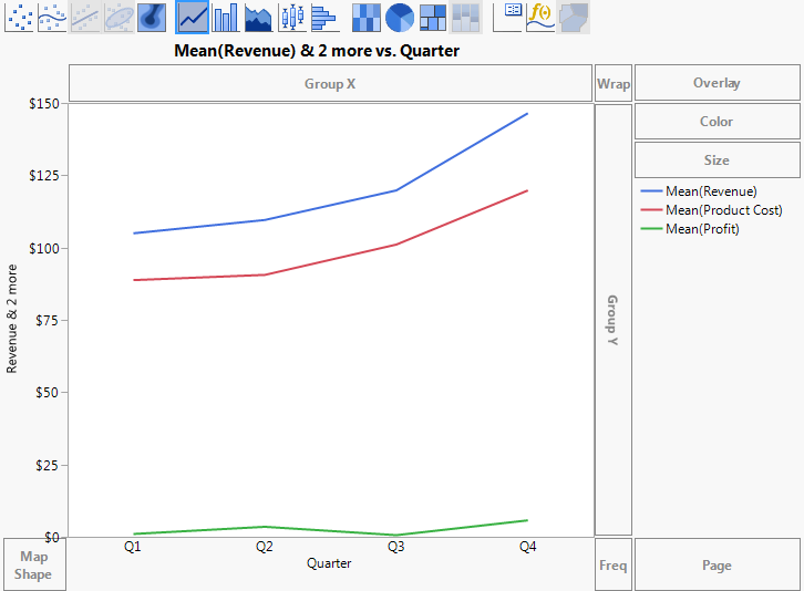
5. To change the box plots to a line plot, click the Line icon ![]() .
.
Figure 4.24 Line Plot
6. To create a separate chart for each product, click Product Line, and drag and drop it into the Wrap zone.
A separate line plot is created for each product.
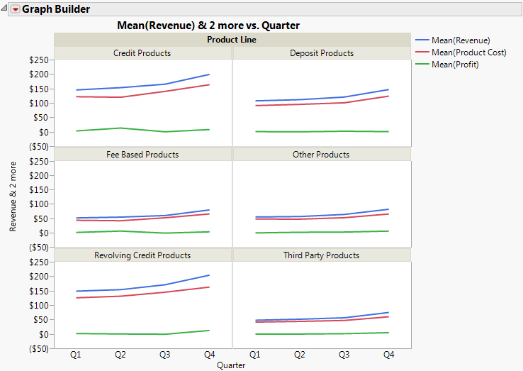
Figure 4.25 Final Line Plots
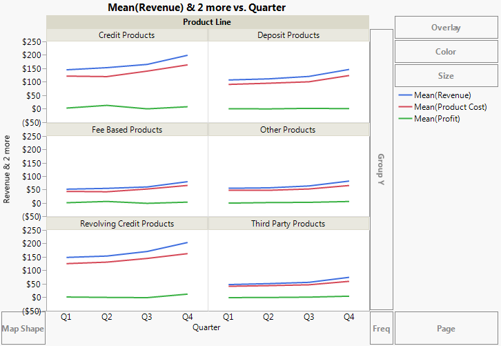
Interpret the Graph
Figure 4.25 shows revenue, cost, and profit broken down by product line. The business analyst was interested in seeing the difference in profitability between product lines. The line plots in Figure 4.25 can provide some answers, as follows:
• Credit products, deposit products, and revolving credit products produce more revenue than fee-based products, third-party products, and other products.
• However, the profits of all the product lines are similar.
The data table also includes data on sales channels. The business analyst wants to see how revenue, product cost, and profit differ between different sales channels.
1. To remove Product Line from the graph, click the title of the graph (Product Line) and drag and drop it into any empty area within Graph Builder.
2. To add Channel as the wrap variable, click Channel and drag and drop it into the Wrap zone.
Figure 4.26 Line Plots Showing Sales Channels
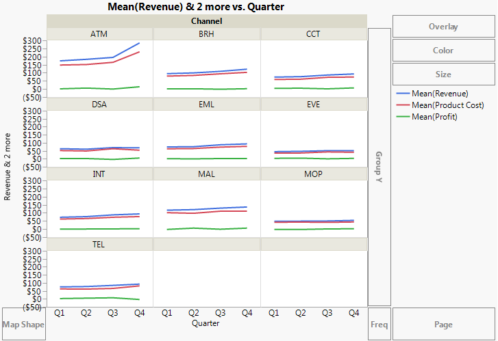
Figure 4.26 provides this answer: revenue and product cost for ATMs are the highest and are growing the most quickly.