Louisiana Parishes Example
In this example you work with custom map files and then create custom maps in two different ways:
• Set up custom map files initially and save them in the predetermined location. JMP finds and uses them in the future with any appropriate data.
• Point to specific predefined map files directly from your data. This step might be required each time you want to specify custom maps.
Set Up Automatic Custom Maps
Suppose that you have downloaded Esri shapefiles from the Internet and you want to use them as your map files in JMP. The shapefiles are named Parishes.shp and Parishes.dbf. These files contain coordinates and information about the parishes (or counties) of Louisiana.
Note: Pathnames in this section refer to the “JMP” folder. On Windows, in JMP Pro, the “JMP” folder is named “JMPPro”.
Save the .shp File
Save the .shp file with the appropriate name and in the correct directory, as follows:
1. In JMP, open the Parishes.shp file from the following default location:
– On Windows: C:/Program Files/SAS/JMP/15/Samples/Import Data
– On macOS: /Library/Application Support/JMP/15/Samples/Import Data
Note: If you cannot see the file, you might need to change the file type to All Files.
JMP opens the file as Parishes. The .shp file contains the x and y coordinates.
2. Save the Parishes file with the following name and extension: Parishes-XY.jmp. Save the file here:
– On Windows: C:/Users/<user name>/AppData/Roaming/SAS/JMP/Maps
– On macOS: /Users/<user name>/Library/Application Support/JMP/Maps
3. Close the Parishes-XY.jmp file.
Save the .dbf File
Perform the initial setup and save the .dbf file, as follows:
1. Open the Parishes.dbf file from the following default location:
– On Windows: C:/Program Files/SAS/JMP/15/Samples/Import Data
– On macOS: /Library/Application Support/JMP/15/Samples/Import Data
Note: If you cannot see the file, you might need to change the file type to All Files.
JMP opens the file as Parishes. The .dbf file contains identifying information.
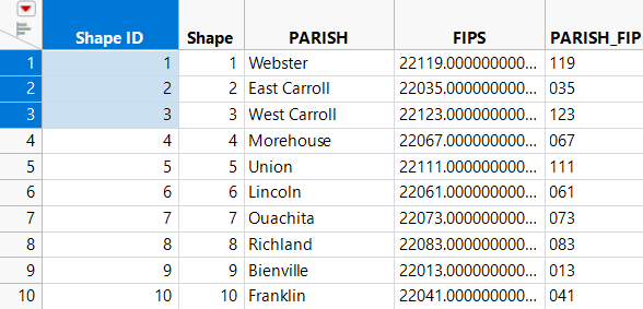
2. In the Parishes file, add a new column. Name it Shape ID. Drag and drop it to be the first column.
3. In the first three rows of the Shape ID column, type 1, 2, and 3 (Note - You can also use Cols > New Columns > Initialize Data > Sequence Data).
4. Select all three cells, right-click, and select Fill > Continue sequence to end of table.
Figure 12.20 Shape ID Column in Parishes File
5. Right-click the PARISH column and select Column Info.
6. Select Column Properties > Map Role.
7. Select Shape Name Definition.
8. Click OK.
9. Save the Parishes file with the following name and extension: Parishes-Name.jmp. Save the file here:
– On Windows: C:/Users/<user name>/AppData/Roaming/SAS/JMP/Maps
– On macOS: /Users/<user name>/Library/Application Support/JMP/Maps
10. Close the Parishes-Name.jmp file.
Create the Map in Graph Builder
Once the map files have been set up, you can use them. The Katrina.jmp data table contains data on Hurricane Katrina’s impact by parish. You want to visually see how the population of the parishes changed after Hurricane Katrina. Proceed as follows:
1. Select Help > Sample Data Library and open Katrina.jmp.
2. Right-click the Parish column and select Column Properties > Map Role.
3. Select Shape Name Use.
4. Click the Map name data table button  and browse to select Parishes-Name.jmp, which you previously created.
This tells JMP where the data tables containing the map information reside.
5. Select PARISH from the Shape definition column list.
In Parishes-Name.jmp, the PARISH column has the Shape Name Definition Map Role property assigned. The column consists of map shape data for each parish.
6. Select Graph > Graph Builder.
7. Drag and drop Parish into the Map Shape zone.
The map appears automatically, since you defined the Parish column using the custom map files.
8. Drag and drop Population into the Color zone.
9. Drag and drop Date into the Group X zone.
Figure 12.21 Population of Parishes Before and After Katrina

10. Select the Magnifier tool to zoom in on the Orleans parish in both maps (Figure 12.22)
Figure 12.22 Orleans Parish
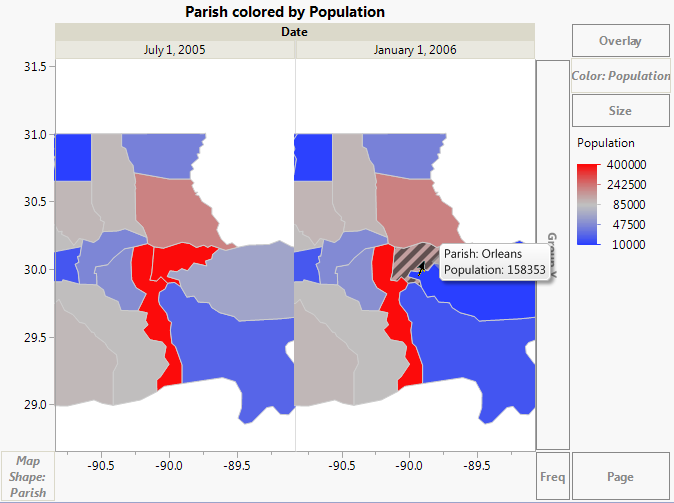
You can clearly see the drop in population as a result of Hurricane Katrina. The population of the Orleans parish went from 437,186 in July 2005 to 158,353 in January 2006.
Point to Existing Map Files Directly from Your Data
Suppose that you already have your custom map files and they are named appropriately. Your map files are US-MSA-Name.jmp and US-MSA-XY.jmp. They are saved in the sample data folder.
The PopulationByMSA.jmp data table contains population data from the years 2000 and 2010 for the metropolitan statistical areas (MSAs) of the United States. This example shows how the data table has been set up to create a map.
Add the Map Role Column Property
1. Select Help > Sample Data Library and open PopulationByMSA.jmp.
2. Right-click the Metropolitan Statistical Area column and select Column Info.
3. Select Column Properties > Map Role.
4. Select Shape Name Use.
5. Next to the Map name data table, type $SAMPLE_DATA/US-MSA-Name.jmp.
This tells JMP where the data tables containing the map information reside.
6. Select MSA_Name from the Shape definition column list.
MSA_Name is the specific column within the US-MSA-Name.jmp data table that contains the unique names for each metropolitan statistical area. Notice that the MSA_Name column has the Shape Name Definition Map Role property assigned, as part of correctly defining the map files.
Note: Remember, the Shape ID column in the -Name data table maps to the Shape ID column in the -XY data table. This means that indicating where the -Name data table resides links it to the -XY data table, so that JMP has everything that it needs to create the map.
Figure 12.23 Map Role Column Property
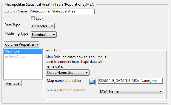
7. Click OK.
Create the Map in Graph Builder
Once the Map Role column property has been set up, you can perform your analysis. You want to visually see how the population has changed in the metropolitan statistical areas of the United States between the years 2000 and 2010.
1. Select Graph > Graph Builder.
2. Drag and drop Metropolitan Statistical Area into the Map Shape zone.
Since you have defined the Map Role column property on this column, the map appears.
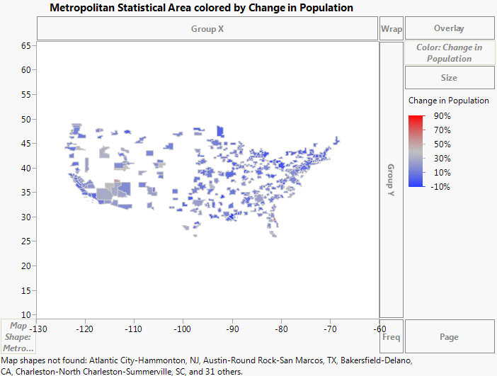
3. Drag and drop Change in Population to the Color zone.
Figure 12.24 Change in Population for Metropolitan Statistical Areas
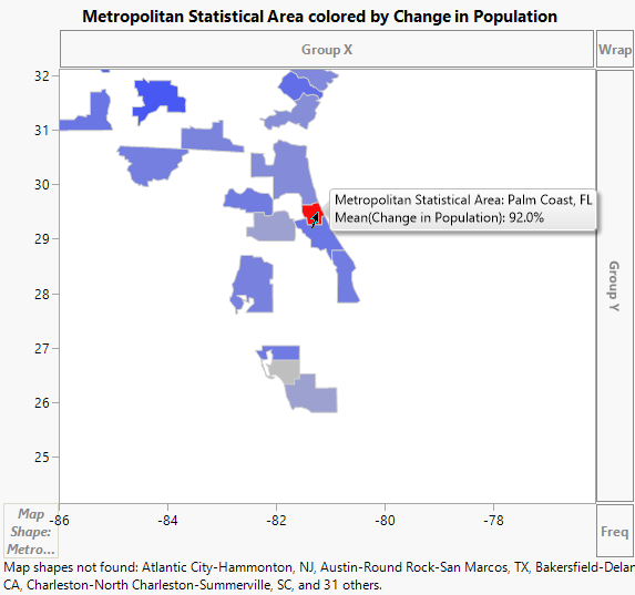
4. Select the Magnifier tool to zoom in on the state of Florida.
5. Select the Arrow tool and click the red area.
Figure 12.25 Population Change of Palm Coast, Florida
6. Select the Magnifier tool and hold down the Alt key while clicking on the map to zoom out.
7. Select the Magnifier tool and zoom in on the state of Utah.
8. Select the Arrow tool and click the area that is slightly red.
Figure 12.26 Population Change of St. George, Utah
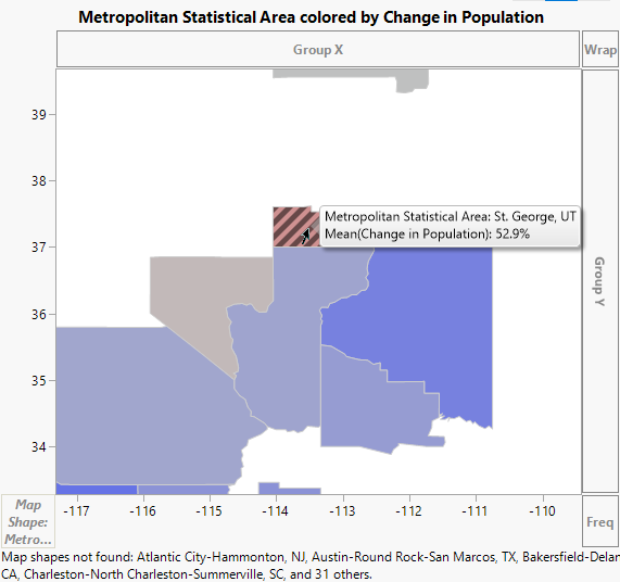
You can see that the areas of Palm Coast, Florida, and St. George, Utah had the most population change between 2000 and 2010. The Palm Coast area saw a population change of 92%, and the St. George area saw a population change of about 53%.