Normal Plot Report
Below the Normal Plot report title, select either a normal plot or a half-normal plot (Daniel 1959). Both plots are predicated on the principle of effect sparsity, namely, the idea that relatively few effects are active. Those effects that are inactive represent random noise. Their estimates can be assumed to have a normal distribution with mean 0 and variance σ2, where σ2 represents the residual error variance. It follows that, on a normal probability plot, estimates representing inactive effects fall close to a line with slope σ.
Normal Plot
If no transformation is required, the vertical coordinate of the normal plot represents the value of the estimate and the horizontal coordinate represents its normal quantile. Points that represent inactive effects should follow a line with slope of σ. Lenth’s PSE is used to estimate σ and a blue line with this slope is shown on the plot.
If a transformation to orthogonality has been applied, the vertical axis represents the Normalized Estimates. These are the Orthog t-Ratio values found in the Parameter Estimate Population report. (The Orthog t-Ratio values are the Orthog Coded estimates divided by the Coded Scale Lenth PSE.)
Because the estimates are normalized by an estimate of σ, the points corresponding to inactive effects should fall along a line of slope 1. A red line with slope 1 is shown on the plot, as well as a blue line with slope equal to the t-Test Scale Lenth PSE.
In all cases, estimates that deviate from normality at the 0.20 level, based on the p-values in the Parameter Estimate Population report, are labeled on the plot.
Half-Normal Plot
The half normal plot shows the absolute values of effects. The construction of the axes and the lines displayed mirror those aspects of normal plot.
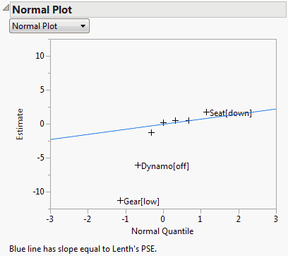
Figure 3.45 shows the Normal Plot report for the Bicycle.jmp sample data table. No transformation is needed for this model, so the plot shows the raw estimates plotted against their normal quantiles. A line with slope equal to Lenth’s PSE is shown on the plot. The plot suggests that Gear, Dynamo, and Seat are active factors.
Example of a Normal Plot
1. Select Help > Sample Data Library and open Bicycle.jmp.
2. Select Analyze > Fit Model.
3. Select Y and click Y.
4. Select HBars through Brkfast and click Add.
5. Click Run.
6. Click the Response Y red triangle and select Effect Screening > Normal Plot.
The following Normal Plot appears.
Figure 3.45 Normal Plot