Area
Note: You can also create an area plot using the Line element ![]() .
.
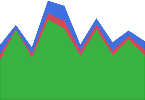
The Area element ![]() shows a contiguous area that represents the area beneath summary statistic values of a variable across the values or categories of another variable. The Area element can be considered a continuous representation of the Bar element.
shows a contiguous area that represents the area beneath summary statistic values of a variable across the values or categories of another variable. The Area element can be considered a continuous representation of the Bar element.
• Both variables might be nominal or ordinal. The summary statistic represents the count of observations in a level of the variable on the axis that is not specified as the Response Axis.
• One of the variables might be continuous and the other nominal or ordinal. The summary statistic represents the value of the specified summary statistic for the continuous variable for the corresponding level of the categorical variable.
• If both variables are continuous, the summary statistic is computed for the continuous variable on the axis that is specified as the Response Axis.
Note: The plot is not affected in any way if rows are hidden and not excluded.
For an example of a graph that uses the Area element, see Example of an Area and Line Chart in the Graph Builder Examples section.
Figure 3.32 Area Options
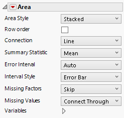
Area Style
Changes how the area is displayed when there are merged variables on the response axis. For area style descriptions, see Table 3.2.
Row order
Connects points with line segments in the order of their row numbers.
Connection
Changes the connection type to a line, curve, step, centered step, horizontal, or vertical line. If you select a curve, you can also change the smoothness.
Summary Statistic
Specifies the statistic that is plotted. The statistic is computed for observations at each distinct value of the variable in the X zone (or the Y zone, if X is specified as the Response Axis).
Error Interval
Adds or removes specified error interval in the graph.
Interval Style
Draws error bars or error bands for the selected error interval.
Missing Factors
Provides options for connections when all values are missing for a setting of the variable on the X axis:
Skip
Skips over the missing factor value, connecting the previous factor to the next factor.
Treat as Missing
Skips over the missing factor value, connecting the previous factor to the next factor. Draws the connection in the style specified for Missing Values.
Treat as zero
Treats the missing factor values as zero.
Missing Values
Provides options for connections when all values are missing for a setting of the variable on the Response axis:
Connect Through
Connects the points adjacent to the missing values with the connector type used for the remaining points.
Connect Faded
Connects the points adjacent to the missing values with a faded connection.
Connect Dashed
Connects the points adjacent to the missing values with a dashed connection.
No Connection
Shows no connection between the points adjacent to the missing values.
Variables
Shows or hides graph elements for variables, or re-orders the display of variables.
Note: These options do not apply to variables in the Group X, Group Y, Wrap, or Page zones.
Check boxes are followed by the zone designation and the name of the variable. Use check boxes to do the following:
– Show or hide the elements corresponding to a variable in a zone.
– Add or remove the effect of applying the Color, Size, Shape, or Freq variable to the variable in the zone.
Tip: If you have multiple graphs, you can color or size each graph by different variables. Drag a second variable to the Color or Size zone, and drop it in a corner. In the Variables option, select the specific color or size variable to apply to each graph.
Use arrows to re-order the display if there are multiple variables in a zone. Highlight a variable name and click an arrow to reposition it.
For an example using Variables, see Example of an Area and Line Chart in the Graph Builder Examples section.
Red Triangle Options for Area
Response Axis
Specifies the axis for the variable that is used as the response in plotting the areas. Available only when both variables have a Continuous modeling type. If only one variable is Continuous, its axis is the response axis. The Auto setting is the Y axis.
Save Formula
Saves fit formulas and upper and lower confidence intervals for a single variable to the data table.
Area Style | Description |
|---|---|
Stacked | Shows areas that correspond to summary statistics for each of the merged variables. The plots are colored and a legend appears in the Legend zone.
|
Overlaid | Shows the area plots for the merged variables superimposed over each other. The plots are colored and a legend appears in the Legend zone.
|
Range | Shows the area corresponding to the difference in the summary statistic for the merged variables.
|