Bar
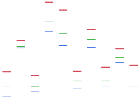
The Bar element ![]() shows a bar chart of summary statistic values of one or more variables across the values or categories of one or more stratifying variables. The graph can display a single variable or multiple variables of any type arranged in the X and Y zones.
shows a bar chart of summary statistic values of one or more variables across the values or categories of one or more stratifying variables. The graph can display a single variable or multiple variables of any type arranged in the X and Y zones.
• If you add a single categorical variable, then each bar shows the count of observations in the corresponding level of the variable.
• If you add two variables, with one in each zone, each bar represents the value of the specified summary statistic for the variable on the specified Response Axis. There is a bar for each value or level of the stratifying variable.
• If you add multiple variables in each zone, multiple bars are plotted for each value or combination of levels of the stratifying variables.
Response Axis Variables with Character Data Type
If the variable on the Response Axis has the Character data type, then this variable is assigned numeric values as follows:
• Integer values are assigned based on the Value Order column property or the default value ordering.
• These integer values range from 0 (highest level in value ordering) to the number of levels minus one (lowest value in value ordering).
• These integer values are used in calculating the Summary Statistic.
Note: If any of the rows used in constructing a bar on the plot are hidden and not excluded, the bar is not shown, but the position that it would occupy remains.
For an example of a graph that uses the bar element, see Example of an Overlaid Histogram and Ridgeline Chart in the Graph Builder Examples section and Example of a Packed Bar Chart in the Graph Builder Examples section.
Figure 3.31 Bar Options
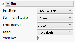
Bar Style
You can change the appearance of the bars that describe the levels of the stratifying variable. Many bar styles are applicable only when there are merged variables on the response axis, or if an overlay variable is present. For bar style descriptions, see Table 3.1. To change bar widths and space, right-click in the graph and select Customize > Bar.
Packed Bar Style Options
Packed Primaries
Specifies the number of primary bars.
Packed Placement
Specifies where the secondary bars are stacked. Options include the following:
First Stack—Start on the top row and fill it before moving to the next row.
Smallest Stack—Place each bar at the stack that is currently the smallest.
Separate Stack—Make a stack called Other where all secondary bars appear.
Packed Ordering
Specifies the order in which secondary bars are placed. Can be by size. The biggest bars appear first or by label, which is in natural order, usually alphabetical.
Packed Coloring
Specifies how the secondary bars are colored. Options include the following:
Bar color—Applies the same color as the primary bar color.
Faded bar color—Applies a faded version of the primary bar color.
Grays—Applies random shades of light gray.
Packed Labeling
Controls the percentage of secondary bars that are labeled.
Packed Primary Labels
Specifies where primary labels should be placed, either inside bars or on the axis.
Summary Statistic
Specifies the statistic that is used as bar labels and controls the response axis scale. Available statistics depend on the type of bar chart used.
Error Interval
Adds or removes error intervals in the graph when applicable, otherwise it is not available. To customize error bars, right-click in the graph and select Customize > Error Bar.
Label
Adds or removes labels of various types in the bar chart. When Label by Value is selected the values are determined by the summary statistic setting.
Variables
Shows or hides graph elements for variables, or re-orders the display of variables.
Note: These options do not apply to variables in the Group X, Group Y, Wrap, or Page zones.
Check boxes are followed by the zone designation and the name of the variable. Use check boxes to do the following:
– Show or hide the elements corresponding to a variable in a zone.
– Add or remove the effect of applying the Color, Size, Shape, or Freq variable to the variable in the zone.
Tip: If you have multiple graphs, you can color or size each graph by different variables. Drag a second variable to the Color or Size zone, and drop it in a corner. In the Variables option, select the specific color or size variable to apply to each graph.
Use arrows to re-order the display if there are multiple variables in a zone. Highlight a variable name and click an arrow to reposition it.
For an example using Variables, see Example of an Area and Line Chart in the Graph Builder Examples section.
Red Triangle Options for Bar
Response Axis
Specifies the axis for the variable that is used as the response in plotting the bars. This option is available only when each axis contains at least one variable with a Continuous modeling type. If only one variable is Continuous, its axis is the response axis. The Auto setting is the Y axis.
Save Formula
Saves fit formulas and upper and lower confidence intervals for a single variable to the data table.
Bar Style | Description |
|---|---|
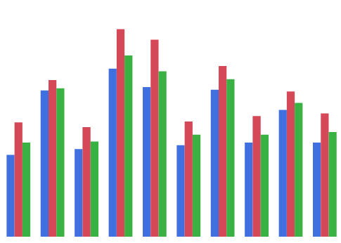
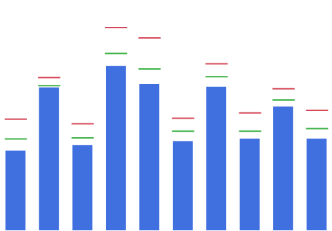
Side by side | When you have two or more merged variables on the response axis, a bar is plotted for each of the merged variables. The bars are arranged next to each other for each level of the stratifying variables. They are colored and a legend appears.
|
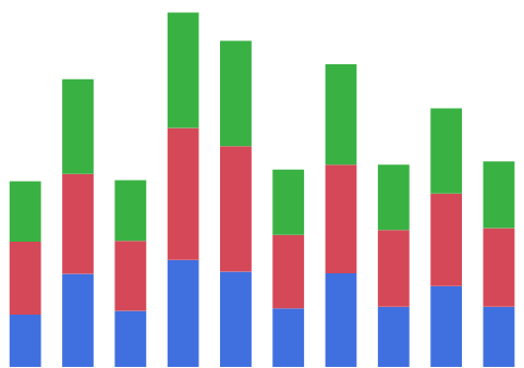
Stacked | When you have two or more merged variables on the response axis, a single bar is plotted for each level of the stratifying variables. Each bar stacks the bars for each of the merged variables. The part of the bar corresponding to each merged variable is colored and a legend appears.
|
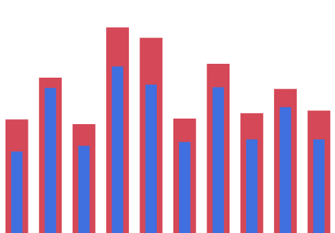
Bullet | When you have two or more merged variables on the response axis, a narrow bar is plotted within a wider and taller bar. The widths of the bars depend on the order of the variables. The part of the bar corresponding to each merged variable is colored and a legend appears. If you have only a single variable, this style plots narrow bars.
|
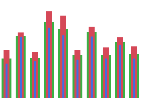
Nested | When you have two or more merged variables on the response axis, the bars for each variable are nested within each other. The narrowest bar corresponds to the first variable listed in the legend, the next narrowest to the second, and so on. Tip: You can change the legend order using the arrows in the Variables panel.
|
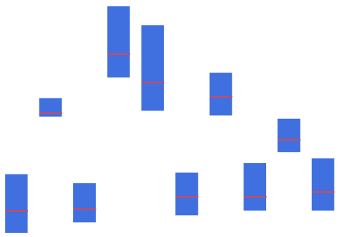
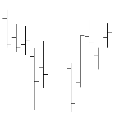
Range | When you have two or more merged variables on the response axis, a rectangle and a line are plotted for each level of the stratifying variables. For each level of the stratifying variables: • The values of the summary statistic are calculated for each of the merged variables. • A rectangle is plotted with bounds equal to the summary statistic values for the first two of variables, as indicated in the legend. • Lines are plotted at the values of the summary statistic for the other variables.
|
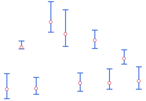
Interval | When you have two or more merged variables on the response axis, a line with boundaries and a circle is plotted for each level of the stratifying variables. For each level of the stratifying variables: • The values of the summary statistic are calculated for each of the merged variables. • A line with boundaries is plotted with bounds equal to the summary statistic values for the first two of variables, as indicated in the legend. • A circle is plotted at the overall values of the summary statistic for the other variables.
|
Side by side intervals | In this style, each pair of variables defines an interval.
|
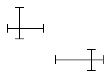
Two-way interval | This style is for two-dimensional bar charts with bars in each direction.
|
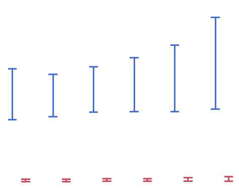
Single | For each level of the stratifying variables, a bar is plotted. When you have two or more merged variables on the response axis, the bar represents the value of the summary statistic for the first variable in the legend and lines are shown for the values of the summary statistic for the remaining variables. Tip: You can change the legend order using the arrows in the Variables panel.
|
Stock | When you have two or more merged variables on the response axis, line segments are plotted at the levels of the stratifying variables. For each level of the stratifying variables: • The values of the summary statistic are calculated for each of the merged variables. • A line segment connecting the summary statistic values for two of the variables, as indicated in the legend. • Bars are plotted at right angles to the line segment at the remaining values of the summary statistic.
|
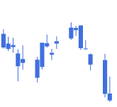
Box Plot | When you have two or more merged variables on the response axis, box plots are shown for the levels of the stratifying variables. For each level of the stratifying variables: • The values of the summary statistic are calculated for each of the merged variables. • An outlier box plot is constructed for these values.
|
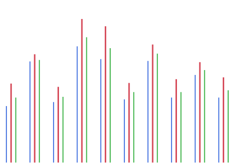
Needle | When you have two or more merged variables on the response axis, needle-shaped bars are plotted side-by-side for each of the merged variables. The bars are colored and a legend appears. This style is useful when you have many levels of the stratifying variables.
|
Float | When you have two or more merged variables on the response axis, bars are plotted at the levels of the stratifying variables. For each level of the stratifying variables: • The values of the summary statistic are calculated for each of the merged variables. • A bar is plotted at each of these values. This style is useful when you have many merged variables.
|
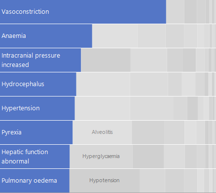
Packed | This bar style shows the top categories as a bar chart and stacks the other categories as bars with an approximately rectangular fill. The top categories are the focus and the other bars provide context. This style is useful when you have many categories and skewed response data.
|