Bubble Plots
A bubble plot is a scatterplot that represents its points as bubbles. You can change the size and color of the bubbles, and even animate them over time. With the ability to represent up to five dimensions (x position, y position, size, color, and time), a bubble plot can produce dramatic visualizations and make data exploration easy.
Figure 4.27 Example of a Bubble Plot
Scenario
This example uses the PopAgeGroup.jmp data table, which contains population statistics for 116 countries or territories between the years 1950 to 2004. Total population numbers are broken out by age group, and not every country has data for every year.
A sociologist wants to explore the following question:
• Is the age of the population of the world changing?
To answer this question, look at the relationship between the oldest (more than 59) and the youngest (younger than 20) portions of the population. Use a bubble plot to determine how this relationship changes over time.
Create the Bubble Plot
1. Select Help > Sample Data Library and open PopAgeGroup.jmp.
2. Select Graph > Bubble Plot.
3. Select Portion60+ and click Y.
This corresponds to the Y variable on the bubble plot.
4. Select Portion 0-19 and click X.
This corresponds to the X variable on the bubble plot.
5. Select Country and click ID.
Each unique level of the ID variable is represented by a bubble on the plot.
6. Select Year and click Time.
This controls the time indexing when the bubble plot is animated.
7. Select Pop and click Sizes.
This controls the size of the bubbles.
8. Select Region and click Coloring.
Each level of the Coloring variable is assigned a unique color. So in this example, all the bubbles for countries located in the same region have the same color. The bubble colors that appear in Figure 4.29 are the JMP default colors.
Figure 4.28 Bubble Plot Launch Window
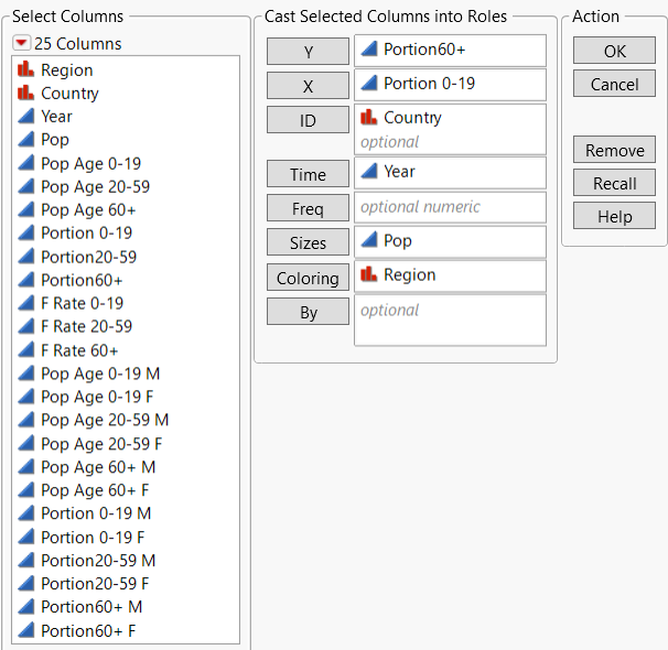
9. Click OK.
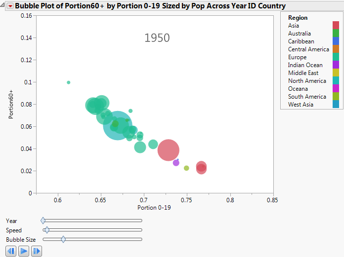
Figure 4.29 Initial Bubble Plot
Interpret the Bubble Plot
Because the time variable (in this case, year) starts in 1950, the initial bubble plot shows the data for 1950. Animate the bubble plot to cycle through all the years by clicking the play/pause button. Each successive bubble plot shows the data for that year. The data for each year determines the following:
• The X and Y coordinates
• The bubble’s sizes
• The bubble’s coloring
• Bubble aggregation
Note: For detailed information about how the bubble plot aggregates information across multiple rows, see Bubble Plots in Essential Graphing.
The bubble plot for 1950 shows that if a country’s proportion of people younger than 20 is high, then the proportion of people more than 59 is low.
Click the play/pause button to animate the bubble plot through the range of years. As time progresses, the Portion 0-19 decreases and the Portion60+ increases.
 plays the animation, turns to a pause button after you click it.
 pauses the animation.
 manually controls the animation back one unit of time.
 manually controls the animation forward one unit of time.
Year
Changes the time index manually.
Speed
Controls the speed of the animation.
Bubble Size
Controls the absolute sizes of the bubbles, while maintaining the relative sizes
The sociologist wanted to know how the age of the world’s population is changing. The bubble plot indicates that the population of the world is getting older.
Interact with the Bubble Plot
Click to select a bubble to see the trend for that bubble over time. For example, in the 1950 plot, the large bubble in the middle is Japan.
To See the Pattern of Population Changes in Japan through the Years
1. Click in the middle of the Japan bubble to select it.
2. Click the Bubble Plot red triangle and select Trail Bubbles > Selected.
3. Click the play button.
As the animation progresses through time, the Japan bubble leaves a trail of bubbles that illustrates its history.
Figure 4.30 Japan’s History of Population Shifts
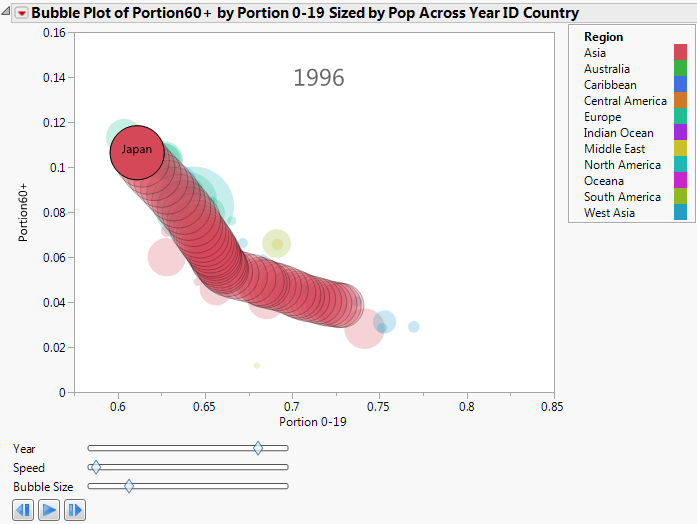
Focusing on the Japan bubble, you can see the following over time:
• The proportion of the population 19 years old or less decreased.
• The proportion of the population 60 years old or more increased.