Example of a Static Bubble Plot
This example uses the SATByYear.jmp sample data table, which contains SAT verbal and math test scores for a selection of the US population in 2004.
1. Select Help > Sample Data Library and open SATByYear.jmp.
2. Select Graph > Bubble Plot.
3. Select SAT Verbal and click Y.
4. Select SAT Math and click X.
5. Select State and click ID.
6. Select % Taking (2004) and click Sizes.
7. Click OK.
The report window appears. (Figure 5.11 uses the default JMP colors.)
Figure 5.11 The Static Bubble Plot Report Window
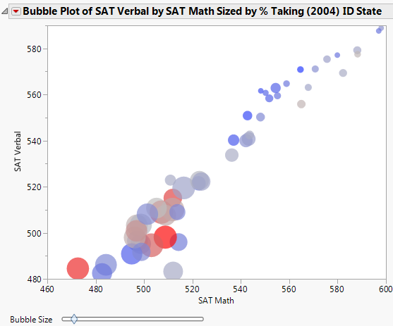
You draw the following conclusions:
• Higher verbal scores appear to be associated with higher math scores, since the two track very closely in the bubble plot. This signifies a correlation between verbal and math scores.
• The larger bubbles represent the US states that have a high percentage of individuals taking the SAT test in 2004. These larger bubbles are all grouped together in the lower left of the graph. This shows that when a state has a high percentage of individuals taking the test, both the math and verbal scores are low.
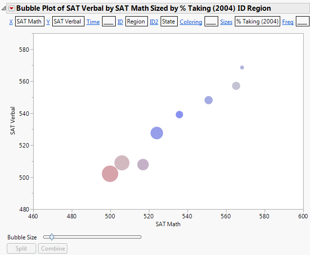
Instead of grouping the bubbles primarily by state, group the bubbles primarily by region as follows:
1. Click the Bubble Plot red triangle and select Show Roles.
2. Click the ID link.
3. Select Region, and click OK.
Region is now the primary ID variable.
4. Click the ID2 link.
5. Select State, and click OK.
State is now the secondary ID variable.
Figure 5.12 Example of Bubble Plot Grouped by Region and State
6. Click the bubble that represents the Southwest region (hover over a bubble or click it to see its label).
7. Click Split.
Now the bubbles are split by the secondary ID variable, which is State. You now see each state within the Southwest region.
Figure 5.13 Example of Southwest Region Split by State
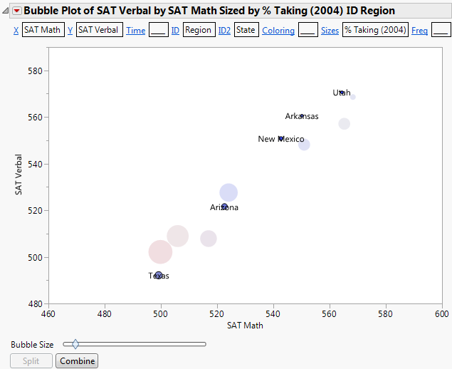
You see that there is significant variation between the scores from the Southwest states.
8. Click Combine to combine the southwest states again.
9. To do a comparison, click the New England bubble (hover over a bubble or click it to see its label).
10. Click Split.
Figure 5.14 Example of New England Region Split by State
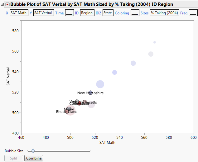
You see that the New England states do not have as much variation as the Southwest states.