Example of Competing Causes
Nelson (1982) discusses the failure times of a small electrical appliance that has a number of causes of failure. One group (Group 2) of the data is represented in the JMP sample data table Appliance.jmp.
1. Select Help > Sample Data Library and open Reliability/Appliance.jmp.
2. Select Analyze > Reliability and Survival > Survival.
3. Select Time Cycles and click Y, Time to Event.
4. Click OK.
5. Click the red triangle next to Product-Limit Survival Fit and select Competing Causes.
6. Click Cause Code, and click OK.
7. Click the Competing Causes red triangle and select Hazard Plot.
Figure 13.11 Competing Causes Report and Hazard Plot
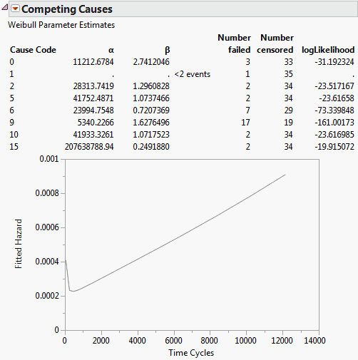
The survival distribution for the whole system is simply the product of the survival probabilities. The Competing Causes table shows the Weibull estimates of Alpha and Beta for each failure cause.
In this example, most of the failures were due to cause 9. Cause 1 occurred only once and could not produce good Weibull estimates. Cause 15 happened for very short times and resulted in a small beta and large alpha. Recall that alpha is the estimate of the 63.2% quantile of failure time, which means that causes with early failures often have very large alphas. If these causes do not result in early failures, then these causes do not usually cause later failures.
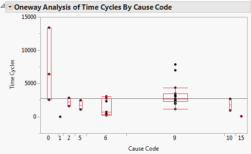
Figure 13.12 shows the Fit Y by X plot of Time Cycles by Cause Code with the Quantiles option in effect. This plot further illustrates how the alphas and betas relate to the failure distribution.
Figure 13.12 Fit Y by X Plot of Time Cycles by Cause Code
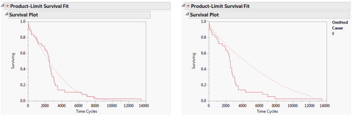
In this example, recall that cause 9 was the source of most of the failures. If cause 9 was corrected, how would that affect the survival due to the remaining causes? Select the Omit Causes option to remove a cause value and recalculate the survival estimates.
Figure 13.13 shows the survival plots with all competing causes and without cause 9. You can see that the survival rate (represented by the dashed line) without cause 9 does not improve much until 2,000 cycles. It then becomes much better and remains improved, even after 10,000 cycles.
Figure 13.13 Survival Plots with Omitted Causes