Options Panel and Right-Click Chart Options
The following options appear on the left hand side of the chart for easy access and when you right-click a chart.
Points
Provides the following options:
Statistic
Changes the statistic plotted on the chart. See Statistic.
Individual Points
Show or hides individual observations in a subgroup. Available only with a subgroup variable or Set Sample Size. This option is not available for Attribute chart types or Rare Event charts.
Box Plots
Shows or hides box plots on the chart.
Show Connect Line
Shows connecting lines between the points.
Show Points
Shows or hides the points on the chart.
Limits
Provides the following options:
Sigma
Specifies the method of computing sigma. See Sigma.
Zones
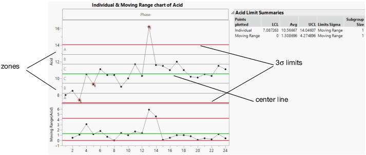
Shows or hides the zones on the chart. The zones are defined as one, two, and three sigmas on either side of the mean. Control Chart Builder does not extend the size of one zone over another. If the limits are not centered around the mean, (UCL-Avg)/3 is used as the width of each zone. Zones are not drawn below the LCL or above the UCL. Available only for Variables and Attribute chart types.
Shade Zones
Shows or hides shading zones by ranges.
Spec Limits
Shows or hides the specification limits on the chart. Appears only if the data table has a Spec Limits column property. See Spec Limits in Using JMP for information about adding this column property. By default, the spec limits are shown if the Spec Limits column property has the Show as Graph Reference Lines option selected.
Add Spec Limits
Enables you to enter specification limits.
Set Control Limits
Enables you to enter control limits for tests. After you click OK in the Set Control Limits window, the specified control limits are set uniformly across groups. Select this option again to remove the specified control limits.
Add Limits
Specifies additional control limits to be plotted on the chart. These limits are not used in tests.
Show Limits
Shows or hides the control limits on the chart.
Show Center Line
Shows or hides the center line on the chart.
Add Dispersion Chart
Adds a dispersion chart to the chart area. Change the chart type with the Points options. A dispersion chart illustrates the variation in the data by plotting one of many forms of dispersion, including the range, standard deviation, or moving range. Available only for Variables chart types.
Note: You can customize the default dispersion chart type using the Dispersion Chart and Summarized Dispersion Chart preferences in File > Preferences > Platforms > Control Chart Builder.
Set Subgroup Size
Sets a subgroup size. Missing values are taken into account when computing limits and sigma.
Warnings
Provides the following options:
Customize Tests
Enables you to design custom tests and select or deselect multiple tests at once. After the option is selected, the Customize Tests window appears for designing the tests. Select a test description, and enter the desired number (n) and label. You can save the settings to preferences and also restore the default settings. Available only for Variables and Attribute chart types.
Tests
Enables you to select which statistical control tests to enable. For more information about tests, see Tests. Available only for Variables and Attribute chart types.
Note: Move your cursor over a flagged point on the chart to see a description of the test that failed.
Westgard Rules
Enables you to select which Westgard statistical control tests to enable. Because Westgard rules are based on sigma and not the zones, they can be computed without regard to constant sample size. For more information about tests, see Westgard Rules. Available only for Variables and Attribute chart types.
Test Beyond Limits
(Called Test 15 in JMP) Enables the test for any points beyond the control limits. These points are identified on the chart. This test works on all charts with limits, regardless of the sample size being equal.
Remove Graph
Removes the control chart.
Note: For a description of the Rows, Graph, Customize, and Edit menus, see Using JMP.
Statistic
You can change the statistic represented by the points on the chart. The options available depend on the chart type selected.
For Variables chart types, you can change the statistic represented by the points on the chart using the following options:
Individual
Creates a chart where each point represents an individual value in the data table.
Average
Creates a chart where each point represents the average of the values in a subgroup.
Range
Creates a chart where each point represents the range of the values in a subgroup.
Standard Deviation
Creates a chart where each point represents the standard deviation of the values in a subgroup.
Moving Range on Means
Computes the difference in the range between two consecutive subgroup means.
Moving Range on Std Dev
Computes the difference in the range between two consecutive subgroup standard deviations.
Moving Range
Creates a chart where each point is the difference between two consecutive observations.
Note: The Average, Range, Standard Deviation, Moving Range on Means, and Moving Range on Std Dev methods appear only if a subgroup variable with a sample size greater than one is specified or a sample size is set.
For Attribute chart types, you can change the statistic represented by the points on the chart using the following options:
Proportion
Creates a chart where each point represents the proportion of items in subgroup samples.
Count
Creates a chart where each point represents the number of items in subgroup samples.
For Rare Event chart types, the statistic represented by the points on the chart uses the Count option.
Sigma
You can change the method for computing sigma for the chart. The options available depend on the chart type selected.
For Variables chart types, you can use the following options:
Range
Uses the range of the data in a subgroup to estimate sigma.
Standard Deviation
Uses the standard deviation of the data in a subgroup to estimate sigma.
Moving Range
Uses the moving ranges to estimate sigma. The moving range is the difference between two consecutive points.
Median Moving Range
Uses the median moving range to estimate sigma, rather than the average moving range.
Levey-Jennings
Uses the standard deviation of all the observations to estimate sigma. If your chart has phases, sigma is calculated for each phase separately.
For Attribute chart types, you can use the following options:
Binomial
Uses the binomial distribution model to estimate sigma. The model indicates the number of successes in a sequence of experiments, each of which yields success with some probability. Selecting Binomial yields either a P or NP chart.
Poisson
Uses the Poisson distribution model to estimate sigma. The model indicates the number of events and the time at which these events occur in a given time interval. Selecting Poisson yields either a C or U chart.
For Rare Event chart types, you can use the following options:
Negative Binomial
Uses the negative binomial distribution model to estimate sigma. The model indicates the number of successes in a sequence of trials before a specified number of failures occur. Selecting Negative Binomial yields a G chart.
Weibull
Uses the Weibull distribution model to estimate sigma. The model indicates the mean time between failures. Selecting Weibull yields a T chart.
Tests
The Warnings option in the right-click menu or on the left hand side of the window displays a submenu for Tests selection. You can select one or more tests for special causes (Western Electric rules) from the menu. Nelson (1984) developed the numbering notation used to identify special tests on control charts. The tests work with both equal and unequal sample sizes.
If a selected test is positive for a particular sample, that point is labeled with the test number. When you select several tests for display and more than one test signals at a particular point, the label of the numerically lowest test specified appears beside the point. You can move your cursor over a flagged point on the chart to see a description of the test that failed.
Tip: To add or remove several tests at once, select or deselect the tests in the Control Panel under Warnings > Tests.
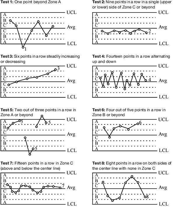
Table 3.8 lists and interprets the eight tests, and Figure 3.9 illustrates the tests. The following rules apply to each test:
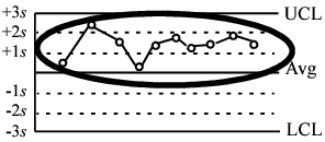
• The area between the upper and lower limits is divided into six zones, each with a width of one standard deviation.
• The zones are labeled A, B, C, C, B, A with zones C nearest the center line.
• A point lies in Zone B or beyond if it lies beyond the line separating zones C and B. That is, if it is more than one standard deviation from the center line.
• Any point lying on a line separating two zones lines is considered belonging to the innermost zone. So, if a point lies on the line between Zone A and Zone B, the point is considered to be in Zone B.
• When a Phase variable is specified, the counts for each test are reset at the start of each phase.
Notes:
• Tests 1 through 8 apply to all Shewhart chart types.
• Tests 1, 2, 5, and 6 apply to the upper and lower halves of the chart separately.
• Tests 3, 4, 7, and 8 apply to the whole chart.
• Once a runs test (one that is based on consecutive observations) is triggered, the counts do not reset to 0 when moving to the next sample.
• Because excluded observations change the sample, the excluded state of a row is not considered for runs tests (ones that are based on consecutive observations).
• If Show Excluded Region is turned off, excluded samples are removed from the analysis.
See Nelson (1984, 1985) for further recommendations on how to use these tests.
Figure 3.8 Zones for Western Electric Rules
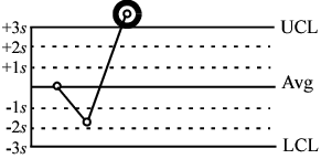
Test 1 | One point beyond Zone A (upper or lower) | Detects a shift in the mean, an increase in the standard deviation, or a single aberration in the process. For interpreting Test 1, any dispersion chart (R, S, or MR) can be used to rule out increases in variation. |
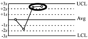
Test 2 | Nine points in a row in a single (upper or lower) side of Zone C or beyond | Detects a shift in the process mean. |
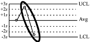
Test 3 | Six points in a row steadily increasing or decreasing (anywhere on the chart) | Detects a trend or drift in the process mean. |
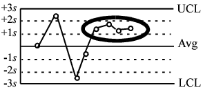
Test 4 | Fourteen points in a row alternating up and down (anywhere on the chart) | Detects systematic effects such as two alternately used machines, vendors, or operators. |
Test 5 | Two out of three points in a row in or beyond Zone A and the point itself is in or beyond Zone A; the two points must be on the same side (upper or lower) | Detects a shift in the process average or increase in the standard deviation. Any two out of three points provide a positive test. |
Test 6 | Four out of five points in a row in or beyond Zone B and the point itself is in or beyond Zone B; the four points must be on the same side (upper or lower) | Detects a shift in the process mean. Any four out of five points provide a positive test. |
Test 7 | Fifteen points in a row in Zone C, above and below the center line | Detects stratification of subgroups when the observations in a single subgroup come from various sources with different means. Also detects a reduction in variation. |
Test 8 | Eight points in a row on both sides of the center line with none in Zones C | Detects stratification of subgroups when the observations in one subgroup come from a single source, but subgroups come from different sources with different means. |
Figure 3.9 Illustration of Special Causes Tests1
Westgard Rules
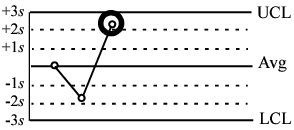
Westgard rules are implemented under the Westgard Rules submenu of the Warnings option when you right-click a chart or on the left hand side of the window. The different tests are abbreviated with the decision rule for the particular test. For example, 1 2s refers to a test where one point is two standard deviations away from the mean.
Notes:
• Once a runs test (one that is based on consecutive observations) is triggered, the counts do not reset to 0 when moving to the next sample.
• Because excluded observations change the sample, the excluded state of a row is not considered for runs tests (ones that are based on consecutive observations).
Rule 1 2S (called Test 9 in JMP) is commonly used with Levey-Jennings charts, where control limits are set 2 standard deviations away from the mean. The rule is triggered when any one point goes beyond these limits.
Rule 1 3S (called Test 10 in JMP) refers to a rule common to Levey-Jennings charts where the control limits are set 3 standard deviations away from the mean. The rule is triggered when any one point goes beyond these limits.
Rule 2 2S (called Test 11 in JMP) is triggered when two consecutive control measurements are farther than two standard deviations from the mean.
Rule R 4S (called Test 12 in JMP) is triggered when one measurement is greater than two standard deviations from the mean and the previous measurement is greater than two standard deviations from the mean in the opposite direction such that the difference is greater than 4 standard deviations.
Rule 4 1S (called Test 13 in JMP) is triggered when four consecutive measurements are more than one standard deviation from the mean.
Rule 10 X (called Test 14 in JMP) is triggered when ten consecutive points are on one side of the mean.