XBar and R Chart Phase Example
A manufacturer of medical tubing collected tube diameter data for a new prototype. The data was collected over the past 40 days of production. After the first 20 days (phase 1), some adjustments were made to the manufacturing equipment. Analyze the data to determine whether the past 20 days (phase 2) of production are in a state of control.
1. Select Help > Sample Data Library and open Quality Control/Diameter.jmp.
2. Select Analyze > Quality and Process > Control Chart Builder.
3. Drag DIAMETER to the Y role.
4. Drag DAY to the Subgroup role (at bottom).
Figure 3.15 Control Charts for Diameter
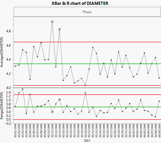
The first 20 days appear to have high variability, and in the Average chart, there are three observations that are outside of the control limits. An adjustment was made to the manufacturing equipment and new control limits were incorporated.
To compute separate control limits for each phase:
5. Drag Phase to the Phase role.
6. In the Average chart, right-click and select Warnings > Test Beyond Limits.
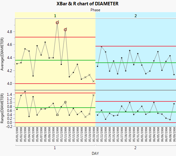
Figure 3.16 Control Charts for each Phase
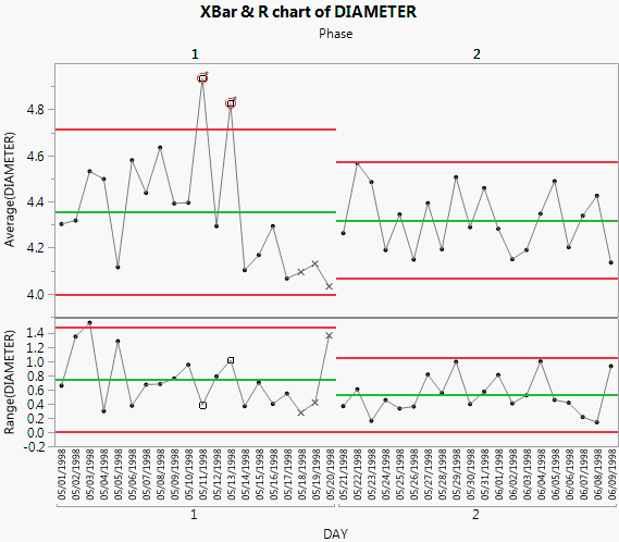
Including the Phase variable means that the control limits for phase 2 are based only on the data for phase 2. None of the phase 2 observations are outside the control limits. Therefore, you can conclude that the process is in control after the adjustments were made.
Add Color to Delineate Phases
If you have distinct phases in your control chart, you can illustrate them by adding different background colors to the different phases.
1. Starting from Figure 3.16, double-click in the X axis.
2. Select Allow Ranges.
3. Enter -0.5 for the Min Value (the scale minimum).
4. Enter 19.5 for the Max Value (the dividing line).
5. Choose a color, say yellow. Change the opacity to 40%.
6. Click Add.
7. Click Allow Ranges.
8. Enter 19.5 for the Min Value (the dividing line).
9. Enter 39.5 for the Max Value (the maximum of the axis).
10. Choose a color, say light blue. Change the opacity to 40%.
11. Click Add.
You can see from the preview how the chart will look.
12. Click OK.
Figure 3.17 Diameter Phases with Color