One-Way Comparative Pareto Plot Example
This example uses the Failure2.jmp sample data table. This table records failures in a sample of capacitors manufactured before cleaning a tube in the diffusion furnace and in a sample manufactured after cleaning the furnace. For each type of failure, the variable clean identifies the samples with the values “before” or “after.”
1. Select Help > Sample Data Library and open Quality Control/Failure2.jmp.
2. Select Analyze > Quality and Process > Pareto Plot.
3. Select failure and click Y, Cause.
4. Select clean and click X, Grouping.
5. Select N and click Freq.
6. Click OK.
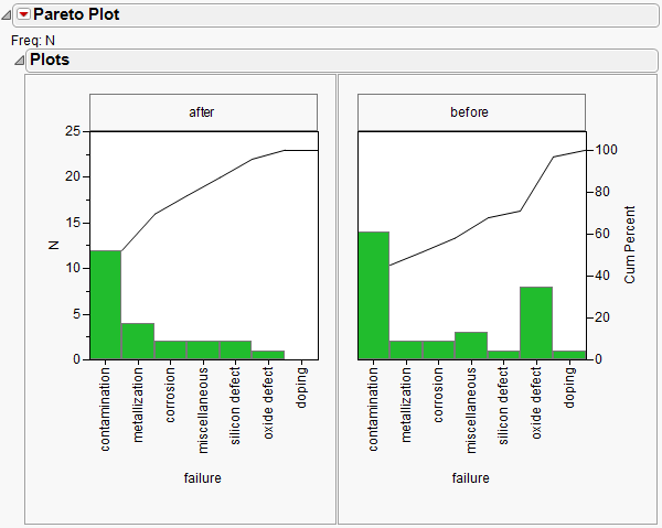
Figure 13.14 displays the side-by-side plots for each value of the variable, clean.
Figure 13.14 One-way Comparative Pareto Plot
The horizontal and vertical axes are scaled identically for both plots. The bars in the first plot are in descending order of the y-axis values and determine the order for all cells.
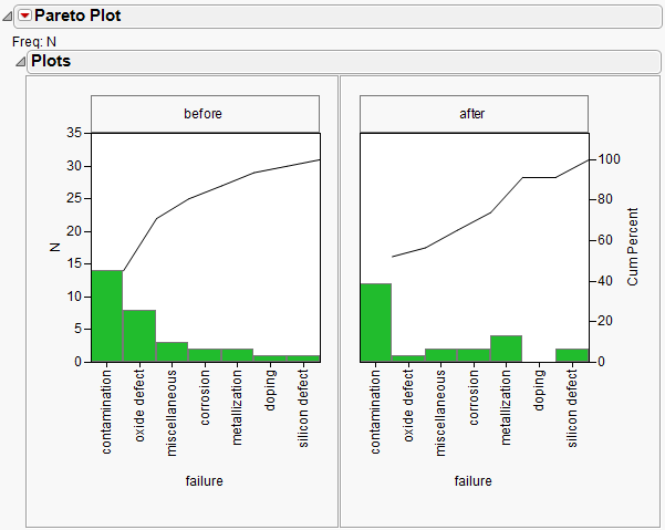
7. Rearrange the order of the plots by clicking the title (after) in the first tile and dragging it to the title of the next tile (before).
A comparison of these two plots shows a reduction in oxide defects after cleaning. However, the plots are easier to interpret when presented as the before-and-after plot shown in Figure 13.15. Note that the order of the causes changes to reflect the order based on the first cell.
Figure 13.15 One-way Comparative Pareto Plot with Reordered Cells

