Example of a Scatterplot
|
Data |
This example uses data from 442 diabetic patients. The data includes baseline clinical and laboratory data as well as a binary measure of diabetes disease progression obtained one year after each patient’s initial visit. This measure classifies disease progression as Low or High. |
|
Techniques |
This example uses two scatterplots with a shared X axis, axis customization, and annotation. |
|
Goal |
The goal of this example is to compare and understand the predicted probabilities of High disease progression from two classification models. |
Run the Classification Models
You want to construct a classification model to predict the disease progression based on clinical and laboratory variables. You will build two different classification models, save prediction formulas, and compare their predicted classifications.
1. Select Help > Sample Data Library and open Diabetes.jmp.
2. Click the green triangle next to the Decision Tree of Y Binary script to build a decision tree prediction model.
3. Click the Partition for Y Binary red triangle and select Save Columns > Save Prediction Formula. You can close this window.
This saves the probability formulas to the data table.
4. In the data table, right-click the Prob(Y Binary= = High) column and select Column Info.
5. Change the column name to Partition Prob High and click OK.
6. Click the green triangle next to the Neural of Y Binary script to build a neural net prediction model.
7. Click the Model NTanH(3) red triangle and select Save Profile Formulas. You can close this window.
This saves the probability formulas to the data table.
8. In the data table, right-click the Probability(Y Binary=High) column and select Column Info.
9. Change the column name to Neural Prob High and click OK.
Create the Initial Graph
You will compare the model predicted probabilities of a patient having a High disease progression.
1. Select Graph > Graph Builder.
2. Select Partition Prob High and drag it to the X zone.
3. Select Neural Prob High and drag it to the X zone, to the right of Partition Prob High. This creates a second X axis.
Figure 4.18 Drag Neural Prob High to the Right of Partition Prob High
4. Select Y Binary and drag it to the Overlay zone.
5. Click the Graph Builder red triangle and select Graph Spacing.
6. Type 6 next to Graph Spacing and click OK.
This increases the spacing between the two X axes.
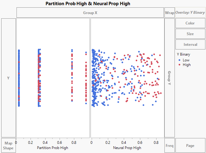
Figure 4.19 Initial Graph of Model Probabilities
Customize the Graph
In both modeling platforms, the default threshold value is 0.50. This means that if a patient has a predicted probability greater than 0.50 of “High”, the model predicts their classification as “High”. Use reference lines to show the threshold value in the graph.
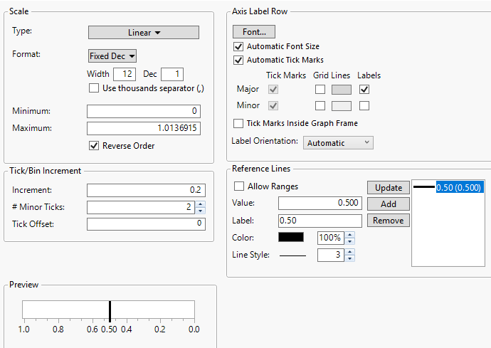
1. Right-click the Partition Prob High X axis and select Axis Settings.
2. In the Scale section, click the box next to Reverse Order.
3. In the Tick/Bin Increment section, set # Minor Ticks to 2.
4. In the Reference Lines section, type 0.50 in the boxes next to Value and Label.
5. In the box next to Line Style, enter 3. The 3 indicates the thickness of the reference line.
6. Click Add.
Figure 4.20 X Axis Settings
7. Click OK.
8. Right-click on the Partition Prob High X axis and select Edit > Copy Axis Settings. Right-click on the Neural Prob High X axis and select Edit > Paste Axis Settings.
9. Click Done.
Annotate the Graph
1. In the main menu, click Tools > Line. Draw a horizontal line to the left of the reference line in the Partition Prob High graph.
Figure 4.21 Line Drawn to the Left of the Partition Prob High Reference Line
2. Right-click the line and select Point to.
The arrow should be pointing away from the reference line.
3. In the main menu, click Tools > Annotate and click on the graph above the arrow.
4. Type Classified as “High” in the text box. See Figure 4.22.
5. Repeat step 1 through step 4 in the Neural Prob High graph.
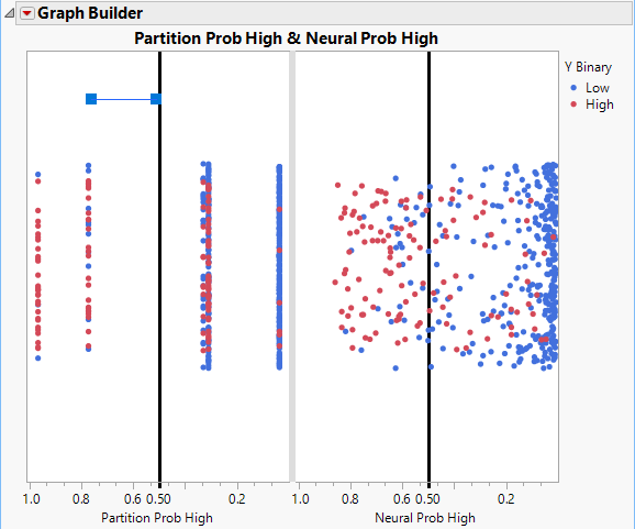
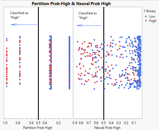
Figure 4.22 Distribution of Predicted Probabilities
The graph shows that the distribution of the predicted probabilities differs between the two models. The partition model has five predicted score levels while the neural model scores are dispersed across the score range. For both models, there is a cluster of blue data points on the far right of each plot. These are low subjects that both models classify correctly as they fall to the right of the threshold.
