Interpreting Parallel Plots
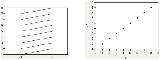
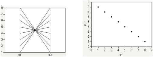
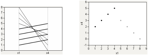
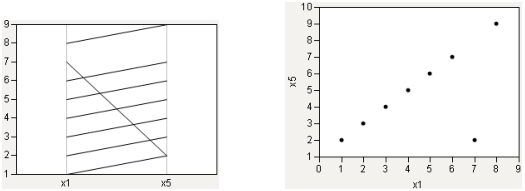
To help you interpret parallel plots, compare the parallel plot with a scatterplot. In each of the following figures, the parallel plot appears on the left, and the scatterplot appears on the right.
Strong Positive Correlation
The following relationship shows a strong positive correlation. Notice the coherence of the lines in the parallel plot.
Figure 7.6 Strong Positive Correlation
Strong Negative Correlation
A strong negative correlation, by contrast, shows a narrow neck in the parallel plot.
Figure 7.7 Strong Negative Correlation
Collinear Groups
Now, consider a case that encompasses both situations: two groups, both strongly collinear. One has a positive slope, the other has a negative slope. In Figure 7.8, the positively sloped group is highlighted.
Figure 7.8 Collinear Groups: Parallel Plot and Scatterplot
Single Outlier
Finally, consider the case of a single outlier. The parallel plot shows a general coherence among the lines, with a noticeable exception.
Figure 7.9 Single Outlier: Parallel Plot and Scatterplot


