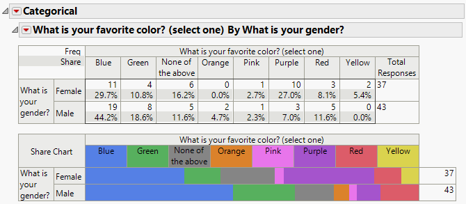
The Categorical Report
The initial Categorical report shows a cross tabulation and a share chart for each set of selected responses.
Figure 3.16 The Initial Categorical Report
The upper left corner of the table lists the quantities (Freq, Share, and Rate when applicable) that are included in each cell of the table. Remove or add these quantities using the options in the Categorical red triangle menu.
• The Frequencies count (labeled Freq) is provided for each category with the total frequency (Total Responses) at the right of the table. When there are multiple responses, the summary columns at the right of the table also include the number of cases or the number of rows (Total Cases) and the number of responders (Total Cases Responding).
• The Share of Responses (Share) is determined by dividing each count (Freq) by the total number of responses.
• The Rate is the frequency of response (Freq) divided by the total number of cases (Total Cases). This quantity appears only for multiple responses and is not shown in Figure 3.16.
In Figure 3.16, the number of responses to the question What is your favorite color? are tabulated by gender. Consider the first row of the table with the results for females:
• The first cell of the table contains 11 responses. This is the count of the female respondents who selected blue as their favorite color.
• There are 37 total responses for females. Of the 37 female responses, 29.7% (11/37) selected blue as their favorite color.
