Use Bar Charts for Categorical Variables
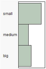
Use a bar chart to visualize the distribution of a categorical variable. A bar chart looks similar to a histogram, since they both have bars that correspond to the levels of a variable. A bar chart shows a bar for every level of the variable, whereas the histogram shows a range of values for the variable.
Figure 4.6 Example of a Bar Chart
Scenario
This example uses the Companies.jmp data table, which contains data on the size and type of a group of companies.
A financial analyst wants to explore the following questions:
• What is the most common type of company?
• What is the most common size for a company?
To answer these questions, use bar charts of Type and Size Co.
Create the Bar Chart
1. Select Help > Sample Data Library and open Companies.jmp.
2. Select Analyze > Distribution.
3. Select Type and Size Co and click Y, Columns.
4. Click OK.
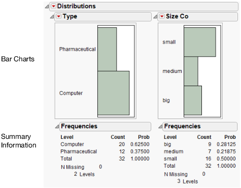
Figure 4.7 Bar Charts of Type and Size Co
Interpret the Bar Charts
The bar charts provide these answers:
• There are more computer companies than pharmaceutical companies.
The bar that represents computer companies is larger than the bar that represents pharmaceutical companies.
• The most common company size is small.
The bar that represents small companies is larger than the bars that represent medium and big companies.
The additional summary output gives detailed frequencies. This report is discussed in Distributions of Categorical Variables.
Interact with the Bar Charts
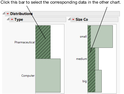
As is the case with histograms, click individual bars to highlight rows of the data table. If more than one graph is created, clicking on a bar in one bar chart highlights the corresponding bar or bars in the other bar chart.
For example, suppose that you want to see the distribution of company size for the pharmaceutical companies. Click the Pharmaceutical bar in the Type bar chart, and the pharmaceutical companies are highlighted on the Size Co bar chart. Figure 4.8 shows that although most companies in this data table are small, most of the pharmaceutical companies are medium or big.
Also, the corresponding rows in the data table are selected.
Figure 4.8 Clicking Bars


