Scatterplot Matrix
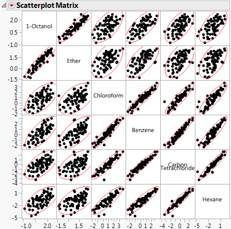
A scatterplot matrix helps you visualize the correlations between each pair of response variables.
Figure 3.4 Scatterplot Matrix
Turning on the Density Ellipses option shows a 95% bivariate normal density ellipse in each scatterplot. Assuming that each pair of variables has a bivariate normal distribution, this ellipse encloses approximately 95% of the points. The narrowness of the ellipse reflects the degree of correlation of the variables. If the ellipse is fairly round and is not diagonally oriented, the variables are uncorrelated. If the ellipse is narrow and diagonally oriented, the variables are correlated.
Tips:
• Re-sizing any cell resizes all the cells.
• Drag a label cell to another label cell to reorder the matrix.
• When you look for patterns in the scatterplot matrix, you can see the variables cluster into groups based on their correlations. Figure 3.4 shows two clusters of correlations: the first two variables (top, left), and the next four (bottom, right).
Scatterplot Matrix Options
The red triangle menu for the Scatterplot Matrix lets you customize the matrix with color and density ellipses and by setting the α-level.
Show Points
Shows or hides the points in the scatterplot.
Fit Line
Shows or hides the regression line and 95% level confidence curves for the fitted regression line.
Density Ellipses
Shows or hides the 95% density ellipses in the scatterplots. Use the Ellipse α menu to change the α-level.
Shaded Ellipses
Colors each ellipse. Use the Ellipses Transparency and Ellipse Color menus to change the transparency and color.
Show Correlations
Shows or hides the correlation of each pair of variables in the upper left corner of each scatterplot.
Matrix Options
(Available only when the Square Matrix Format is selected on the launch window.) Shows a submenu of options to change the appearance of the upper right triangle of the scatterplot matrix. Only one of the following options can be selected at a time.
Significance Circles
Shows or hides correlation circles in the upper right triangle of the scatterplot matrix. The color of each circle represents the correlation between each pair of variables on a scale from red (+1) to blue (-1). The size of each circle represents the significance test between the variables. A larger circle indicates a more significant relationship.
Heat Map
Shows or hides a correlation heat map in the upper right triangle of the scatterplot matrix. The color of each cell in the heat map represents the correlation between each pair of variables on a scale from red (+1) to blue (-1).
Show Histograms
Shows or hides horizontal or vertical histograms in the label cells. Once histograms have been added, select Show Counts to label each bar of the histogram with its count. Select Horizontal or Vertical to either change the orientation of the histograms or remove the histograms.
Ellipse α
Sets the α-level used for the ellipses. Select one of the standard α-levels in the menu, or select Other to enter a different value.
Ellipses Transparency
Sets the transparency of the ellipses if they are colored. Select one of the default levels, or select Other to enter a different value. The default value is 0.2.
Ellipse Color
Sets the color of the ellipses if they are colored. Select one of the colors in the palette, or select Other to use another color. The default value is red.
Nonpar Density
Shows or hides shaded density contours based on a smooth nonparametric bivariate surface that describes the density of data points. Contours for the 10% and 50% quantiles of the nonparametric surface are shown.
