All Pairwise Comparisons
When you select the Multiple Comparisons option, you can choose the initial comparison to be with all pairwise comparisons. The All Pairwise Comparisons option shows either a Tukey HSD All Pairwise Comparisons or Student’s t All Pairwise Comparisons report (Hsu 1996; Westfall et al. 2011). Tukey HSD comparisons are constructed so that the significance level applies jointly to all pairwise comparisons. In contrast, for Student’s t comparisons, the significance level applies to each individual comparison. When making several pairwise comparisons using Student’s t tests, the risk that one of the comparisons incorrectly signals a difference can well exceed the stated significance level.
At the top of the Tukey HSD All Pairwise Comparisons report you find:
Quantile
The critical value for the test. Note that, for Tukey HSD, the quantile is  , where q is the appropriate percentage point of the Studentized range statistic.
Adjusted DF
The degrees of freedom used in constructing the confidence intervals.
Adjustment
Describes the method used to obtain the critical value:
Tukey
Provides exact critical values and p-values. Used when the means are uncorrelated and have equal variances, or when the design is variance-balanced.
Tukey-Kramer
Provides approximate critical values and p-values. Used when exact values cannot be obtained.
For technical details, see the GLM Procedure chapter in SAS Institute Inc. (2020b).
The top of the Student’s t All Pairwise Comparisons report shows the Quantile, or critical value, for the t test and DF, the degrees of freedom used for the t test.
All Pairwise Differences Report
Both Tukey HSD and Student’s t compare all pairs of levels. For each pairwise comparison, the All Pairwise Differences report shows:
• The levels being compared
• Difference - the estimated difference between the means
• Std Error - the standard error of the difference
• t Ratio - the t ratio for the test of whether the difference is zero
• Prob > |t| - the p-value for the test
• Lower and Upper limits for a confidence interval for the difference in means
This report also contains a plot column that shows a visual representation of the confidence interval for each difference between means. Colors indicate which differences are significant.
All Pairwise Comparisons Scatterplot
This plot, sometimes called a diffogram or a mean-mean scatterplot, displays the confidence intervals for all means pairwise differences. (See Figure 3.57 for an example.) Colors indicate which differences are significant.
The plot shows a reference line as an upwardly sloping line on the diagonal. This line represents points where the two means are equal. Each line segment corresponds to a confidence interval for a pairwise comparison. The coordinates of the point displayed on the line segment are the means for the corresponding groups. Hover over one of these points to show a tooltip that identifies the groups being compared and shows the estimated difference. If a line segment crosses the line on the diagonal, then the means can be equal and the comparison is not significant.
The Pairwise Comparisons Scatterplot has the following option:
Show Reference Lines
Displays reference grid lines for the points on the scatterplot. This is not recommended if there are many points in the scatterplot. If there are many points, it is better to hover over the points to view the tooltip labels.
All Pairwise Differences Connecting Letters
Use this option to display a report that illustrates significant and non-significant comparisons with connecting letters. Levels not connected by the same letter are significantly different. Levels connected by the same letter are not significantly different.
Save All Pairwise Differences Connecting Letters Table
This option creates a data table whose columns contain the levels of the effect, the connecting letters, the least squares means, their standard errors, and confidence intervals. The data table contains a script called Bar Chart that produces a colored bar chart of the least squares means with their confidence intervals superimposed. The levels are arranged in decreasing order of least squares means.
Example of Tukey HSD All Pairwise Comparisons
Consider the Lipid Data.jmp sample data table. You are interested in Cholesterol differences for gender and non-smokers versus former smokers (Smoking History equal to no and quit, respectively) across two ages (25 and 35) and average height.
1. Select Help > Sample Data Folder and open Lipid Data.jmp.
2. Select Analyze > Fit Model.
3. Select Cholesterol and click Y.
4. Select Gender, Age, Height, and Smoking History, and click Add.
5. Click Run.
6. Click the red triangle next to Response Cholesterol and select Estimates > Multiple Comparisons.
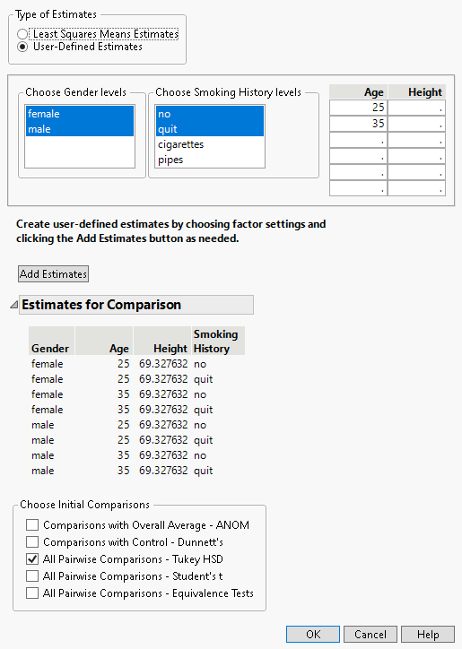
7. From the Type of Estimates list, click User-Defined Estimates.
8. From the Choose Gender levels list, select female (it should already be selected by default) and male.
9. From the Choose Smoking History levels list, select no and quit.
10. In the Age list, enter the ages 25 and 35 in the first two rows.
Do not enter any values in the list entitled Height. Because no values for Height are specified, the mean value of the Height column is used in the multiple comparisons report.
11. Click Add Estimates.
Note that all possible combinations of the levels that you specified appear in the Estimates for Comparison report.
12. In the Choose Initial Comparisons list, select All Pairwise Comparisons - Tukey HSD.
Check that your window is completed as shown in Figure 3.56.
Figure 3.56 Populated Used-Defined Estimates Window
13. Click OK.
The All Pairwise Differences report indicates that two of the 28 pairwise comparisons are significant. The All Pairwise Comparisons Scatterplot shows the confidence intervals for these comparisons in red. You can hover over any of the points to determine which pairwise comparison the point represents. The tooltips also contain the difference between the two levels in the comparison. The two red points represent the points comparing 35-year-old former smokers to 25-year-old non-smokers, for both females and males.
Figure 3.57 All Pairwise Comparisons Scatterplot for User-Defined Comparisons

