Example of Partial Correlations
Use the Multivariate platform to examine the relationship between the thickness of a coating at different intervals of metal bars.
1. Select Help > Sample Data Folder and open Thickness.jmp.
2. Select Analyze > Multivariate Methods > Multivariate.
3. Select all of the Thickness columns and click Y, Columns.
4. Click OK.
5. (Optional) Click the Multivariate red triangle and select Scatterplot Matrix to remove the scatterplot matrix from the report.
This is done to clean up the report, since we will not be using the scatterplot matrix.
6. Click the Multivariate red triangle and select Partial Correlations.
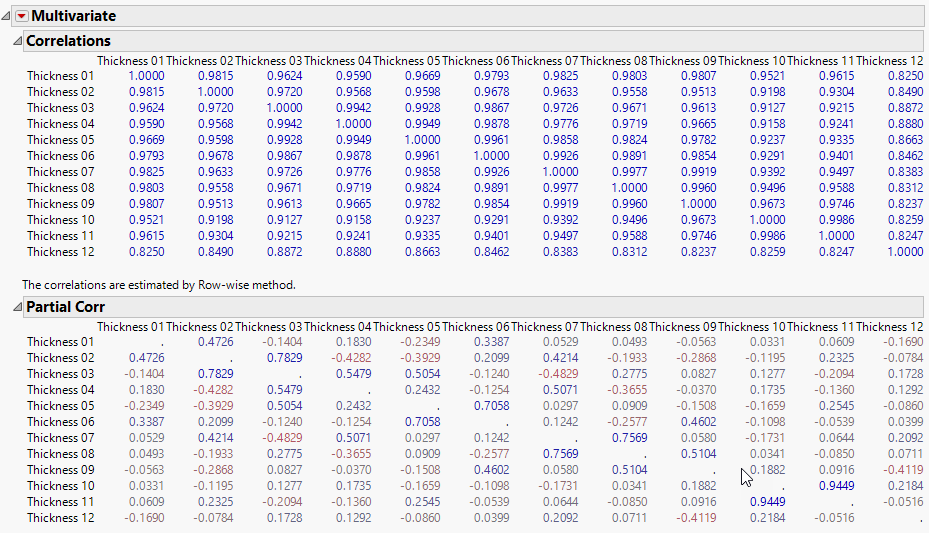
Figure 3.8 Correlations and Partial Correlations for Thickness
The partial correlation matrix shows that there are both positive and negative correlations between variables. This differs from the standard correlation matrix, which showed only positive correlations. This is because the partial correlations measure the strength of the relationship between a pair of variables after adjusting for the effects of all the other variables. This gives a clearer picture of the true relationship between pairs of variables.
7. Click the Multivariate red triangle and select Partial Correlation Diagram.
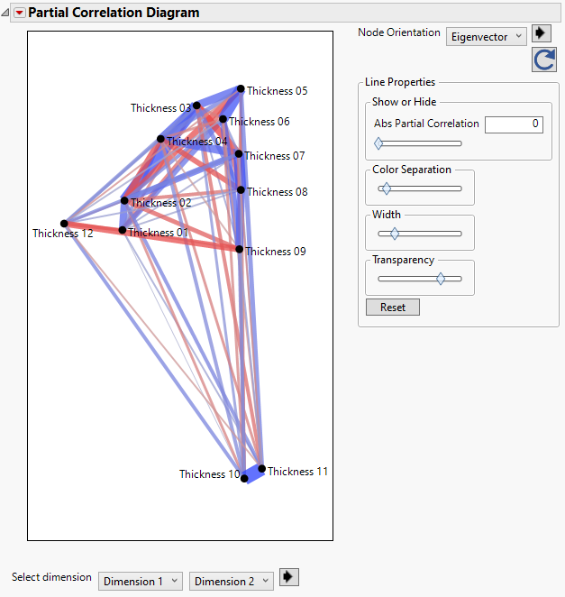
Figure 3.9 Partial Correlation Diagram
The Partial Correlation Diagram gives a visual representation of the partial correlations. The diagram in Figure 3.9 has nodes for each thickness variable whose coordinates correspond to the first and second scaled eigenvectors. Thickness10 and Thickness11 are close together in the first two dimensions and are separate from the rest of the thickness variables. The thick blue line connecting the nodes for Thickness10 and Thickness11 indicates that there is also a strong positive partial correlation between the two variables.
Since the rest of the nodes are grouped together and difficult to interpret, you can adjust the lines that shown by specifying a value for the Abs Partial Correlation. This shows only the lines with a partial correlation greater than the value specified by Abs Partial Correlation.
8. Enter 1 in the box next to Abs Partial Correlation.
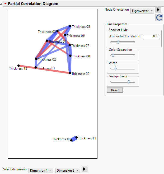
This removes all of the lines from the diagram. To easily see which variables have the strongest partial correlations, use the slider bar under Abs Partial Correlation and drag the diamond slowly to the left. The diagram in Figure 3.10 shows lines connecting variables with partial correlations that are greater than 0.3.
Figure 3.10 Partial Correlations Greater than 0.3


