EWMA Chart Report
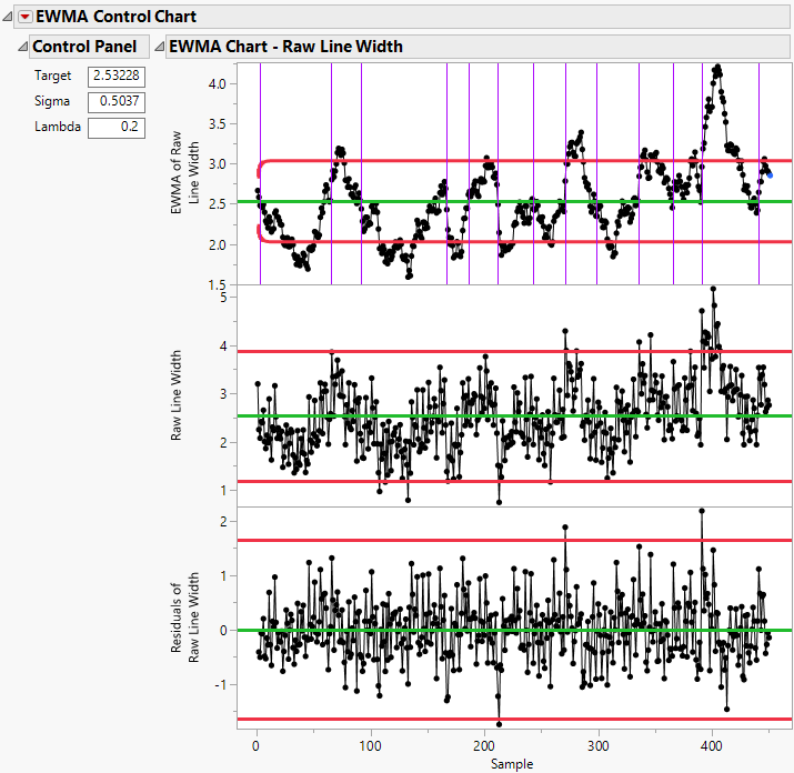
The EWMA Chart report contains three charts: an EWMA chart, an X chart, and a residuals chart. For more information about the interpretation of these charts, see Box et al. (2009).
EWMA Chart
The EWMA chart is an exponentially weighted moving average (EWMA) chart with decision limits that are determined by the current values of the chart parameters:
• If you specified a Subgroup variable and at least one subgroup size is greater than 1, the horizontal axis denotes the subgroups.
• Otherwise, the horizontal axis denotes the samples.
In both cases, the vertical axis denotes the exponentially weighted moving average. If you specified the Center Data option in the launch window, the vertical axis denotes the exponentially weighted moving average with the target value subtracted from it. Each sample or subgroup has a single point on the chart. There is one additional point that is a forecast point, which is shown in blue.
Note: If the last sample (or subgroup) is both hidden and excluded, the line connecting the last sample (or subgroup) to the forecast point is not drawn.
X Chart
The X chart is a Shewhart control chart of the observations:
• If you specified a Subgroup variable and at least one subgroup size is greater than 1, the X chart is an XBar chart of the mean values. The horizontal axis denotes the subgroups. The vertical axis denotes the subgroup means. If you selected the Center Data option in the launch window, the vertical axis denotes the subgroup means with the target value subtracted from them. Each subgroup has a single point on the chart.
• Otherwise, the X chart is an individual measurements chart of the values. The horizontal axis denotes the samples. The vertical axis denotes the measurements. If you selected the Center Data option in the launch window, the vertical axis denotes the measurements with the target value subtracted from them. Each sample has a single point on the chart.
For more information about the limits on the X chart, see “Statistical Details for Control Chart Builder”.
Residuals Chart
The residuals chart shows the differences between the exponentially weighted moving averages and the observed values:
• If you specified a Subgroup variable and at least one subgroup size is greater than 1, the residuals chart is a chart of the differences between each subgroup mean and the EWMA value for the previous subgroup. The ith residual is calculated as ri = Xi - EWMAi-1 where Xi denotes the ith subgroup mean and EWMAi-1 denotes the (i-1)th EWMA value.
• Otherwise, the residuals chart is a chart of the differences between each sample value and the EWMA value for the previous sample. The ith residual is calculated as ri = Xi - EWMAi-1 where Xi denotes the ith sample value and EWMAi-1 denotes the (i-1)th EWMA value.
The limits on the residuals chart are ±3*ResidSigma, where ResidSigma is the standard deviation of the residuals.
The EWMA and residuals charts can be used to identify possible seasonality and autocorrelation in a process. For example, in Figure 11.5, the peaks and valleys in the EWMA chart are evidence of seasonality in the process. The points outside limits in the residuals chart are evidence of autocorrelation. For this example, it would be appropriate to fit a time series model to the process observations and create a control chart for the residuals from the time series model. For more information about using the residuals chart for detecting autocorrelation, see Montgomery and Mastrangelo (1991).
Figure 11.5 Example of Autocorrelation and Seasonality in a Process
